RSS Feeds

MAPS: Netflix’s Multimodal Asset Personalization at Scale
Feed: Netflix TechBlog - Medium (https://netflixtechblog.com/feed)
Published: 2026-08-28 16:01:02 | Created: 2026-08-28 16:10:55

By Emma Yanyang Kong, Aditya Deshpande, Asad Abbasi, Bowei Yan, David Fagnan, Ashish Rastogi, Dhaval Patel, Ray Zhang

Introduction

The Netflix experience is a journey of discovery. Every visual cue, from the artwork on a title to the video previews that autoplay while you browse, is there to connect you with a story you will love. We call these visual cues assets, and choosing the right one for each member is a personalization problem of its own. But which image or video preview of Squid Game should we show you? And what do we do right after a title launches, when there’s far too little interaction data to know which asset we should recommend to each member?

For years, our models answered the first question well and the second poorly. They learned which assets members interacted with, but treated every asset as an opaque ID, blind to what was actually in the artwork or video preview. Right after a title launched, its assets had no history, so we dialed up exploration on its assets to gather interaction data, and otherwise fell back to popularity heuristics that ignore your taste. Only once enough interactions had piled up could personalization take over. This is the classic cold-start problem.

This post shares how multimodal embeddings let our models see and hear the assets they recommend, so personalization can kick in far sooner, close to a title’s launch. Because a new asset arrives with its embedding the model already understands, that embedding carries member taste signals from related assets immediately. Consequently, the model needs far less interaction history before it can personalize. We cover three production systems, artwork personalization, query-aware artwork ranking, and video preview personalization, plus a cheap trick for choosing new embeddings before committing to full end-to-end integration and A/B testing.

Artwork Personalization

A single image is often a member’s first touchpoint with a title, so we create a diverse set of artworks for each title to appeal to different member tastes. We already use personalized artwork based on members’ interaction histories, but this approach breaks down for newer titles and their assets, where there is little or no behavioral data to learn from.

Making the Model See the Artwork

Our solution is to let the model “look” at the picture. We encode each artwork with CLIP, a pretrained image-text embedding model, and fold the result into how the model represents that asset, concatenating the per-asset CLIP image embedding, a 768-dimensional vector, with the asset’s learned ID embedding to give an asset representation:

e_id(a) is the asset’s learned ID embedding, and e_a is its CLIP image embedding. The two are concatenated and passed through an MLP layer to give h_a, the representation the model scores against a member.

This single change transforms how the model handles a brand-new artwork. Instead of treating it as an unseen ID, the model now receives a CLIP embedding the moment the asset is created. That allows a member’s preferences over visual themes, talent, and color palettes to be applied immediately, long before the asset accumulates any interactions of its own. Because those preferences are expressed in image-embedding space rather than tied to specific asset IDs, they transfer seamlessly across titles. If you consistently engage with artwork featuring a particular comedian, the model can carry that signal to their new title and prioritize the asset that places them front and center, even if it has never shown you that exact image before, as in the figure below. In this way, cold-start shifts from being a blind spot to something the embedding space already has an informed opinion about.

Knowledge transfer through CLIP embeddings. A member who has interacted with a comedian’s past stand-up artwork (left) leads the model to favor the new-title asset that features that comedian prominently (green check) over one that does not, even though it has never seen that specific image before.

From Five Models to One

That shift, from scoring an asset by the ID it happens to carry to scoring it by what the image actually contains, powers a second big win, model consolidation. Each title’s artwork spans multiple canvases with different croppings (billboard, vertical-box, horizontal-panel, short-panel, landscape-panel), and historically we trained a separate model per canvas, since an ID-based model has no way to know that the cropped and resized renderings of one scene are related, so signal could not flow between canvases and each faced its own cold-start.

CLIP embeddings break that barrier. Because they are largely invariant to crop, resize, and aspect ratio, those near-identical renderings map to nearly the same vector, as the figure further below shows. A single unified model can therefore pool interaction signal across every canvas, so a member’s affinity learned on a high-traffic canvas immediately informs the artwork we pick on a sparse one. The result is one model in place of five, with the largest gains on the canvases that have the least interaction data.

One source image, many canvases. The same Running Point artwork is cropped and resized across billboard, TV, mobile, and out-of-home placements, each with a different asset ID. Because CLIP embeddings barely change under crop and resize, a single unified model can personalize all of them.

Mixing Five Canvases of Training Data

Consolidation introduced a challenge that the per-canvas models never faced: how to effectively mix data across disparate canvases? The canvases differ widely in impression volume, and the interactions they log are not all worth the same to a member’s long-term experience. Training on pooled raw counts would let the highest-volume canvas and the most frequent interaction types dominate, so the low-data canvases we were trying to help would benefit least. Hand-tuning a weight per canvas would just trade that problem for a set of arbitrary hyperparameters and endless online sweeps to tune them.

Instead we use reward-based weighting, building on Netflix’s long-term reward modeling. Each training example is weighted by the long-term reward score attached to its interaction type:

a_ti is a training example, a positive interaction on asset i of title t. Its weight is set by the interaction type e observed on it, scored by ρ, that type’s long-term reward.

where e(·) is the type of the observed positive interaction and ρ is that type’s long-term reward score. Because interaction types are not distributed evenly across canvases, weighting by long-term value rebalances the canvas mixture on its own, with no weight set by hand. A canvas contributes in proportion to the long-term value of the interactions it drives rather than to how many impressions it happens to get. Consolidation becomes feasible, and the unified model optimizes for long-term member satisfaction instead of whichever short-term action is most frequent.

A Note on Offline Evaluation

Every result presented here must clear two bars: an offline metric evaluation followed by a large-scale online A/B test. The offline metric is the subtle one. Judging a new model on logs from the current production policy is biased, because that policy shows some assets far more often than others. The logged rewards describe what the policy preferred, not what members would have chosen from the full candidate set, so a new model that disagrees with the logging policy looks worse than it is, because the impressions it would have picked are barely represented in the data.

We handle this with inverse propensity scoring (IPS) computed on a dedicated slice of exploration traffic. A small fraction of traffic is served by a randomized policy that samples among a title’s candidate assets from a known distribution, so the propensity of showing a given asset in a given context is logged exactly at serving time rather than estimated after the fact. Reweighting every observation by the inverse of its logged propensity gives:

where D is the exploration slice and r(x, a) is the observed reward, such as a play. Impressions that exploration made rare are upweighted accordingly, and the estimator becomes an unbiased estimate of the reward a candidate policy would have earned had we actually deployed it. Having propensities that are known by construction, rather than modeled after the fact, is in our experience the single biggest reason our offline numbers track online outcomes. We report IPS as a ratio against the production baseline, and a candidate has to win there before it gets any A/B traffic.

Combining Both Ideas Works Better

Two ideas are bundled together here, so we ablated them separately against the old five-model production system.

  • V1, image embeddings only. The five per-canvas models kept as they were, each one augmented with image embeddings.
  • V2, unified model only. A single model trained over all five canvases, but with learned ID embeddings alone and no image content.
  • V3, both together. One unified model over all five canvases, with image embeddings in its asset representation.

As the chart below shows, each idea helped exactly where we expected: on the data-starved short-panel canvas and landscape-panel canvas. V3 was the clear winner. A change inside ±1% is not significant for this offline metric, and those bars are hatched in the chart. Most of what V1 and V2 do on their own sits inside that band.

Relative offline IPS lift by canvas for the three variants, each measured against the prior per-canvas model on that same canvas. Both ideas help where interaction data is scarcest, and V3 is strongest. Hatched bars fall inside the ±1% band, where the change in the offline metric is not significant; V3 values are labeled on the plot.

In the online A/B test across all device platforms, which ran for at least four weeks, the results drew a much clearer line: Neither idea moved our online core member metrics on its own. V1 and V2 were both flat and non-significant, and only V3 won a statistically significant lift. It is what runs in production today.

The two ingredients need each other. V1 tells a per-canvas model what an asset looks like, but one sparse canvas has too few examples to teach it how to use that. V2 supplies plenty of data, but only ID-based data, which a new asset lacks. V3 has both, so mature canvases teach the shared model how CLIP embeddings map to member preference and that mapping transfers straight to the sparse ones. The effects compound rather than add, since the V3 short-panel lift (5.691%) exceeds V1 and V2 combined. The lesson is to look for a second blocking factor before concluding that content features do not help.

Cold-Start Challenge from a New UI Launch

The real test came from the product change that motivated the work. Netflix was preparing its largest TV home-screen redesign in a decade, which would make short-panel the dominant artwork canvas effectively overnight. This was a cold-start problem in its sharpest form. The canvas about to receive the most impressions had the least historical data, and waiting for short-panel interactions to accumulate would have degraded the user experience. Consolidation lets short-panel selection draw on signal pooled from every canvas, and CLIP embeddings let the unified model personalize a short-panel asset that has gathered very few interactions of its own.

We shipped V3 ahead of the launch and measured it with a month-long holdback A/B test, keeping a small control group on the prior per-canvas model. V3 absorbed the shift immediately, with statistically significant gains on both our core discovery metric and streaming hours, and larger gains than in the steady-state ablation. That stronger result is what we expected, since a sudden shift in which canvas dominates is exactly where V3 should help most.

Query-Aware Artwork Personalization

Your general taste is the right signal when browsing, but not when searching. For example, when searching for a specific actor, you want artwork that features them, even if your broader taste says otherwise. On the Netflix Search Page, the member’s intent is explicit and stated in the query, and the displayed artwork should reflect it.

The same CLIP embeddings we added for cold-start hand us this almost for free. Because CLIP projects text and images into one shared embedding space, we can measure how well a query matches a candidate artwork directly by the cosine similarity between the CLIP text embedding of the query and the CLIP image embedding of the asset. We blend that alignment term with the usual personalization score:

Here the personalization term is the score the artwork model above already produces for a member and asset, the second term compares the text embedding of the query against the image embedding of the asset, and the mixing weight α between 0 and 1 is tuned through online A/B testing. The first term is “what we think you like”; the second is “what you just asked for,” and α sets how much each matters.

Crucially, this took no extra modeling effort. The CLIP embeddings already sit in the asset representation from the artwork work above, so they carry the text-image alignment for free, and we get a query-aware ranker by adding a single similarity term at scoring time. The effect is visible in the search results themselves.

Query-aware artwork for a search for a specific actor. Each result surfaces an asset that visually features the searched actor, aligning the artwork with the member’s explicit intent.

Personalizing Video Previews via MediaFM

Video previews raise the bar over still artwork. A video preview unfolds over time, and its appeal comes as much from motion, pacing, dialogue, and soundtrack as from any single frame. Our older video preview personalization models saw none of that. Like the early artwork models, they treated each preview as an opaque ID. Our first content-aware attempt, SeqCLIP, described a video preview by its frames, encoding each with a CLIP embedding and then averaging them into one vector. That captured what a video preview looked like, but a mean of still frames still misses what it sounds like, the dialogue and music that carry so much of a preview’s tone.

To capture the rest, we turned to MediaFM, Netflix’s first in-house multimodal foundation model. Trained on 80 million shots, MediaFM fuses the following three signals per shot into a single embedding:

  • Visual: SeqCLIP
  • Audio: A pretrained speech and audio embedding model
  • Text: Captions encoded via a large-scale text model

Adopting MediaFM required no new infrastructure, since we simply integrate its shot embeddings into the asset representation, exactly as we did with CLIP embeddings for artwork.

The added modalities paid off. We evaluated both embeddings against the ID-only baseline offline with IPS and then in a five-week online A/B test across all device platforms, and both signals gave the same ordering, MediaFM > SeqCLIP > ID-only, and each step of added content awareness helped, with the gains largest on TV. Offline, both content-aware embeddings beat the ID-only baseline on IPS and MediaFM beat SeqCLIP, as the chart below shows. Online, MediaFM came out on top too, delivering a statistically significant lift in our core streaming metric over the ID-only baseline and outperforming SeqCLIP. This shows that the audio and timed-text signals, which a visual-only encoder like SeqCLIP cannot capture, add real value. We have since shipped MediaFM as the default video preview embedding across all platforms.

Relative offline IPS lift for the two content-aware video preview embeddings, each measured against the ID-only baseline at the zero rule. Adding visual content awareness helps, and adding audio and timed text on top of it helps further.

Choosing Embeddings Cheaply with a Proxy Task

New embeddings arrive constantly, but end-to-end trials are expensive, which cost data engineering, model retraining, and weeks of A/B test traffic. We couldn’t afford to run the full pipeline for every candidate, so we gated the funnel with a cheap question:

From the content embedding alone, can you predict which asset wins under a plain, unpersonalized policy?

We first select a fixed set of titles. For each title we use exploration data to find its debiased popularity winner, the asset with the highest interaction rate after we adjust for how often it was shown using its propensity score. We mark this winner with a binary label, 1 for the winner and 0 otherwise. We then train a linear probe to recover that label from the asset embedding alone, with no title, cast, or metadata, by minimizing the standard binary cross-entropy loss:

Keeping the probe linear and embedding-only is intentional, since it isolates how much of an asset’s popularity is actually encoded in the embedding. If the embedding captures the semantic drivers of popularity, a simple linear classifier should be able to identify likely winners. If it does not, the probe performs no better than random guessing, which is the baseline we score it against.

We first used the linear probe to screen and prune a broad set of candidate embeddings before modifying any production pipeline, narrowing the field to two finalists, SeqCLIP and the leading MediaFM variant. We then carried both through full offline evaluation and online A/B testing. All three signals, the linear probe accuracies, the offline IPS lifts, and the online A/B results, ranked MediaFM ahead of SeqCLIP, as the chart below shows. That alignment is why the linear probe now gates every new MediaFM version before release.

Linear probe Δaccuracy, offline IPS lift, and online A/B metric lift for the two finalists. All three agree that MediaFM beats SeqCLIP. The online panel is measured against the ID-based baseline, with its values withheld.

The Netflix Embedding Store

None of this would be practical without shared infrastructure. Every embedding in this post, CLIP for artwork, SeqCLIP and MediaFM for video previews, lives in the Netflix Embedding Store, a component of Netflix’s AI Platform that hosts dense embeddings for titles, games, member profiles and multimedia assets. A foundation model encodes raw asset content into a dense vector once, and the Embedding Store serves that vector to every downstream system, the artwork model, the query-aware ranker, the video preview model, and others, through the same interface. Crucially, it serves the exact same embeddings at training time and at online inference time, so there is no skew between what a model learns from and what it sees in production.

Its key property is that it decouples foundation-model updates from personalization-model deployments. A new embedding, or a new version of an existing one, can be registered, backfilled across the catalog, and validated entirely on its own, without touching the training or serving code of any model that consumes it. Once it is in the Embedding Store, it becomes available to every ranking and personalization model through configuration alone, no downstream code changes, no coordinated release. This is what let us swap CLIP into the artwork model, stand up the query-aware ranker on the same vectors, and roll MediaFM through the video preview model, each as an independent change rather than a cross-team migration.

Foundation-model embeddings (CLIP, SeqCLIP, MediaFM) are stored once and consumed by every downstream system: artwork, query-aware artwork, video previews, and other rankers.

What We Learned, and What’s Next

Three lessons stood out.

  1. Pretrained CLIP embeddings let us consolidate five artwork models into one while boosting performance on data-starved canvases. This benefit became especially clear when the redesigned TV home screen rolled out.
  2. For video, multimodality wins decisively. The audio and text signals that a purely visual encoder cannot access pushed MediaFM past SeqCLIP.
  3. A cheap proxy task yields big savings, efficiently pruning the candidate set before running full end-to-end experiments and online A/B tests.

Next, we aim to extend the Embedding Store toward a single shared semantic space for image, text, and video. Such a unified representation would enable cross-modal retrieval, such as matching a video preview to a search query, or a static artwork to the video preview it was derived from, as well as unified asset ranking across surface types and a more cohesive, intuitive discovery experience for members everywhere.

Acknowledgements

We thank Aneesh Vartakavi, Santiago Castro, and Avneesh Saluja for the CLIP embedding and MediaFM work that made the content-aware models described here possible, and Ratna Kavuri for the backend systems that serve multimedia personalization in production.


MAPS: Netflix’s Multimodal Asset Personalization at Scale was originally published in Netflix TechBlog on Medium, where people are continuing the conversation by highlighting and responding to this story.

show more
A Tale of Two Flink Autoscalers
Feed: Netflix TechBlog - Medium (https://netflixtechblog.com/feed)
Published: 2026-08-21 16:01:01 | Created: 2026-08-21 16:10:55

Samuel Yeboah, Francesco Di Chiara and Mingliang Liu

Today, Netflix runs two Flink autoscalers. That is exactly one more than we want. We built the first one in-house years ago, when there was no mature option suited to our platform. The second came from the Apache Flink community, and it can scale workloads our homegrown system was never designed for. We now run both in production and are steadily converging on the open-source one. Along the way we learned some hard lessons about metrics, cost, and the real price of maintaining infrastructure you could instead adopt, and we hope they are useful whether you run a handful of Flink jobs or tens of thousands.

Why autoscaling is not optional at our scale

Netflix has run stream processing on Apache Flink since 2017. As of 2026 we operate more than 30,000 Flink jobs across multiple AWS regions. Most are not deployed by hand; they are generated by our managed platform Data Mesh, so the majority of users never touch a Flink job directly. A smaller but growing set are custom jobs, built and operated by teams across the company for use cases like personalization, Ads, and Live events. They range from single-operator jobs that shuttle records between Kafka topics to stateful pipelines with branches, joins, and terabytes of state, and their load swings with daily cycles, launches, and regional failovers.

Provisioning every one of those jobs for its peak is wasteful; provisioning for the average causes lag during surges. And in our platform a scaling action is not free: by default it means taking a savepoint, stopping the job gracefully, and restarting it at the new size, which for a large stateful job can take minutes. That leaves a genuinely hard question: how do you give each job the resources it needs, when it needs them, without a human in the loop and without breaking anything?

The first autoscaler: watching from outside

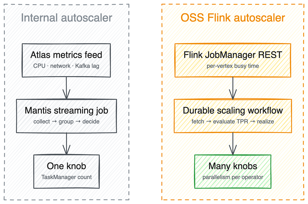
Our first answer, built around 2019, was an autoscaler shaped like a stream-processing job. It ran on Mantis, consuming a live feed of cluster-level metrics from Atlas, our telemetry platform, including CPU, network, Kafka lag, input-rate, and consume-rate signals for every job. The scaler combined lag-derived catch-up time, CPU/network utilization thresholds, observed performance history, and regression over recent input rate to decide when to scale up or whether a smaller cluster could handle the lookahead window. Because the autoscaler operates independently of the Flink platform, it remains unaffected by issues within Flink itself. Building it as a streaming job also made it easy to scale. Each autoscaler node handled the metrics for a subset of Flink jobs, and we never had to write custom sharding or coordination logic to keep up with a growing Flink fleet. It reliably cut resource usage by 25–45% across thousands of managed pipelines. Check our previous talk at Flink Forward 2020.

But watching from outside has a ceiling. The system reasoned about a whole cluster through coarse container metrics, and it scaled a single knob, the total TaskManager count, so every operator in a job moved together. That fit the simple, single-operator pipelines it was built for, but not the multi-operator, stateful DAGs that teams were increasingly bringing to us for Ads, recommendations, and games. Those were exactly the jobs it could not reason about, and supporting each new case meant more custom logic rather than any general capability.

The autoscaler is only as good as the metrics served by external systems beneath it. Those metrics could miss real trouble: a job could be completely busy without any of it showing up as CPU utilization, leaving the job stuck in a degraded state the scaler had no way to see. Recently a networking migration quietly changed how some traffic was reported, and a subset of the Atlas metrics the scaler relied on stopped capturing everything accurately. The gap stayed invisible until it surfaced in production much later.

It was time to reconsider build versus buy.

The second autoscaler: reasoning from inside

When we started, the Flink community had no mature autoscaler to offer. By the time we re-evaluated, it did: the Apache Flink Autoscaler. Instead of watching containers from outside, it reasons from inside the job.

Figure 1: Architecture of the two Flink autoscalers

Its key idea is to estimate each operator’s true processing rate (TPR): the throughput it could sustain if it were fully busy. Flink reports, per subtask, the fraction of each second spent doing actual work, separate from time spent backpressured or idle. Dividing observed throughput by that busy fraction extrapolates capacity to full utilization: an operator handling 700 records/sec while busy 70% of the time has a TPR of 700 / 0.7 = 1,000 records/sec. Starting from the sources, the autoscaler walks the job graph and uses each operator’s TPR, its input/output ratios, and a target utilization to compute the parallelism every vertex needs so that no operator becomes the bottleneck, rather than resizing the whole cluster as a unit.

Figure 2: Flink job DAG: current → desired parallelism per vertex, based on busyness

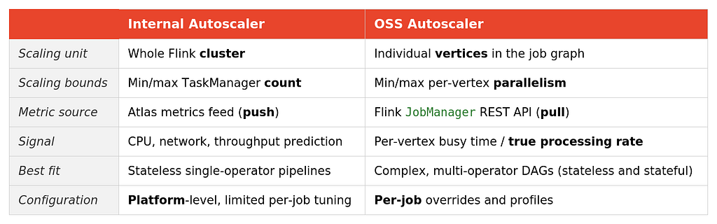
The two approaches make a different contract, summarized below.

Table 1: Comparison of the two Flink autoscalers

The decisive difference for us is the last two rows: the OSS autoscaler can scale exactly the stateful, multi-operator jobs our homegrown system could not, and it lets each job carry its own configuration — stabilization periods, thresholds, and other scaling behavior tuned to the workload. That made it the natural fit for the custom jobs teams had been scaling by hand.

Making it work at Netflix scale

Adopting the algorithm was straightforward; the community had done the hard part. The work for us was running it reliably across our own jobs, and this is where our system differs most from the stock open-source deployment.

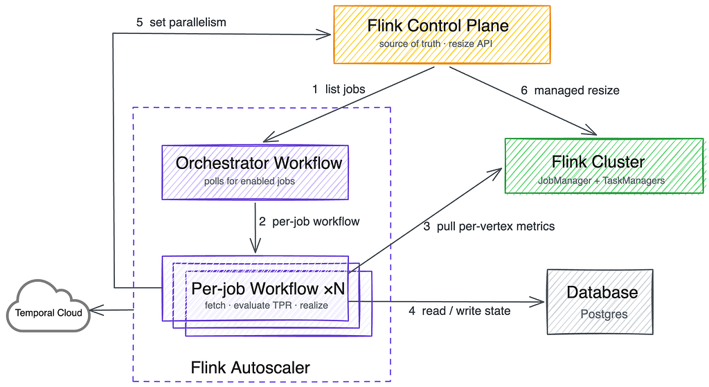
Firstly, the OSS autoscaler was originally architected to reside within the Kubernetes Operator for Flink, but our Flink platform runs on its own control plane, not that operator (see our previous talk at Current Conference 2024). The community later made a fantastic decision to keep the core logic as a standalone library. They refactored four generic interfaces that made it easy to plug directly into our internal ecosystem: a context carrying job metadata and REST API info, a state store, an event handler, and a realizer that applies scaling decisions.

That service is a Spring Boot application whose orchestration runs on Temporal, the durable workflow engine. An orchestrator workflow polls our Flink control plane about once a minute for the jobs with autoscaling enabled, and starts one long-running workflow per job. Each per-job workflow pulls that job’s per-vertex metrics from its Flink JobManager, runs the OSS evaluation algorithm, and, when a scaling decision results, hands it to a realizer that actuates the change through our Flink control plane.

Figure 3: The OSS-based Flink Autoscaler architecture with Temporal workflows

The workflow-per-job design was a direct response to pain. We first ran evaluations in a single batch loop over the whole set of jobs, and it was fragile: one slow or misbehaving job could stall metric collection and scaling for every job behind it. Giving each job its own durable workflow isolated that blast radius, so a single problematic job now fails and retries on its own, and the runtime scales out as we onboard more jobs.

Secondly, three engineering gaps stood between “works in community” and “works at Netflix scale”:

  • Metric collection at high parallelism. On big jobs, pulling metrics from the JobManager became a bottleneck, and part of the cause was in Flink’s runtime. To address that, we changed the JobManager to cache transient metric names and clean them up once instead of rescanning on every fetch, and we added server-side filtering so the autoscaler asks only for the metrics it needs. This let the autoscaler work on jobs up to 3,000 Flink subtasks, where it had previously struggled above roughly 1,000. Those are in our internal fork of Flink release, while some are contributed upstream such as FLINK-36172.
  • Preserving forward chaining. Two separate vertices joined by a forward connection must run at the same parallelism, because records are handed over in memory on a fixed local channel. Scale one of them alone and Flink does not fail; it silently converts that edge into a network shuffle. Our fork detects forward-connected subgraphs and scales each as a unit.
  • Respecting sink limits. Some sinks have finite write capacity, so we added detection for async-sink backpressure (also a fork change) to keep the autoscaler from scaling a job up into a sink that cannot absorb more.

Before it actuates anything, the realizer runs a set of safety checks. For example, it refuses to scale a job down in a region being evacuated during a company-wide region failover. It also verifies there is enough disk for the new cluster to hold the job’s checkpoint state, and it adds a small standby buffer for larger clusters.

The road to one autoscaler

Last year, the OSS-based autoscaler achieved general availability for custom jobs at Netflix, yielding promising initial outcomes. For instance, our client telemetry and logging team achieved a 58% reduction in its annualized Flink compute expenditures, saving approximately $1.1 million annually. This efficiency is driven by three key factors. First, whereas static provisioning must always account for peak loads, autoscaling dynamically adapts to daily cycles, capturing the drop in traffic during nights and weekends compared to weekday peaks. Second, rather than relying on teams to manually optimize resources following performance improvements or post-holiday slowdowns, the autoscaler continually adjusts capacity. Finally, adopting uniform container dimensions enables superior bin-packing and more granular scaling increments.

Additionally, scaling down too eagerly is its own trap. Cut too deep and CPU saturates, lag spikes, and the system cannot react instantly because its metric window and stabilization period have to rebuild after each restart. We now run a target utilization of 0.45, below the community default of 0.7, deliberately trading a little efficiency for stability. Fewer and calmer rescales are worth the marginal cost for large stateful jobs.

While our scaler provides fine-grained signals and vertex-level decision units for stateful DAGs, fast rescaling still heavily depends on Flink Core’s state restoration performance. Today, the biggest remaining cost in scaling a stateful job isn’t the scaler’s logic — it’s the restart and state recovery process itself. Flink 2 addresses this through its disaggregated state architecture, keeping state in external storage rather than on local disk, which can sharply reduce how much a rescale or recovery depends on total state size. Having started supporting Flink 2.2 at Netflix, we plan on experimenting with this new state backend to see if it can help eliminate state recovery bottlenecks when scaling large stateful jobs.

Looking ahead, we aim to migrate all internal scaler use cases onto the new one based on OSS autoscaler to simplify our operational surface area.

Key Takeaways

Along the way, three lessons that generalize beyond Flink:

  • Metric choice matters more than algorithm sophistication. Our most useful debugging was rarely about the scaling math; it was about which signal to trust most. Understand your metrics before you tune your algorithm.
  • Set sensible defaults, but leave room to tune. Our managed jobs are similar enough that one good default covers most of them untouched, which is the point of a platform. But forcing a single configuration on every job punishes the ones that do not fit, so we pair defaults with per-job overrides and deliberately hide the knobs that need deep expertise. Most teams should never have to think about the autoscaler.
  • Adopt, then extend. We built in-house because in 2019 nothing mature fit our platform. When a strong community project appeared, the right move was neither to defend our investment forever nor to rip it out overnight, but to adopt it for new workloads, contribute fixes back, and plan a deliberate migration.

Thanks to the Flink and Data Mesh teams for the control-plane changes this work depended on, to the Temporal team and our early pilot teams, and to the Apache Flink autoscaler maintainers whose foundation we built on. Special thanks to Andy Zhang, Calvin Cheung, Daniel Trager, Guil Pires, Mark Cho, Matthew Kornitsky, Nikhil Sulegaon, Sujay Jain, and Tom Lee.


A Tale of Two Flink Autoscalers was originally published in Netflix TechBlog on Medium, where people are continuing the conversation by highlighting and responding to this story.

show more
How and Why Netflix Built a Real-Time Distributed Graph: Part 3 — Querying the graph with gRPC…
Feed: Netflix TechBlog - Medium (https://netflixtechblog.com/feed)
Published: 2026-08-07 16:01:02 | Created: 2026-08-07 16:15:55

How and Why Netflix Built a Real-Time Distributed Graph: Part 3 — Querying the graph with gRPC execution API

Authors: Nilesh Mishra and Ajit Koti

This is the third entry of a multi-part blog series describing how we built a Real-Time Distributed Graph (RDG). In Part 1, we discussed the motivation for creating the RDG and the architecture of the data processing pipeline that populates it. In Part 2, we discussed how we designed the storage layer to handle billions of nodes and edges while maintaining single-digit-millisecond latency. In Part 3, we will explore how we designed a fast, flexible serving layer to efficiently query the graph.

Introduction

In Part 1 of this series, we described why Netflix needed a Real-Time Distributed Graph (RDG) and how we used Apache Flink to build an ingestion and processing pipeline that turns streaming events into graph primitives. In Part 2, we explored how we designed a storage layer capable of handling billions of nodes and edges while still delivering single-digit-millisecond latency.

In this post, we focus on the next challenge: querying the graph efficiently to power real-time insights for our internal partners. All of the work on ingestion and storage only matters if we can actually ask complex questions and get answers back quickly. As we optimized for lower latency, we found that the serving layer posed its own set of challenges, distinct from those of ingestion and storage. How do we turn a constantly evolving, billion-edge graph into sub-100ms responses across a wide variety of workloads? This is the problem we tackle in this post.

The Real World Needs

As we integrated the RDG into Netflix’s ecosystem, we realized that “querying the graph” is not a one-size-fits-all operation. We needed to handle a wide range of access patterns: from high-volume security lookups to deep, exploratory personalization traces.

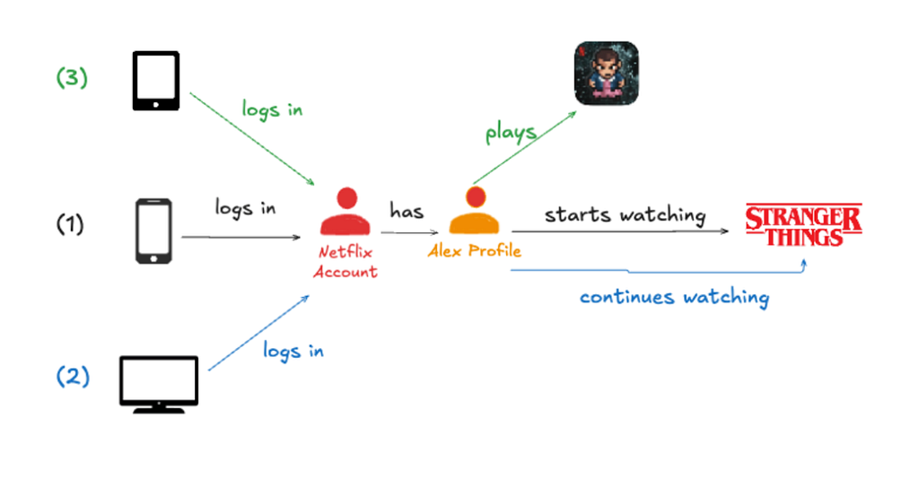
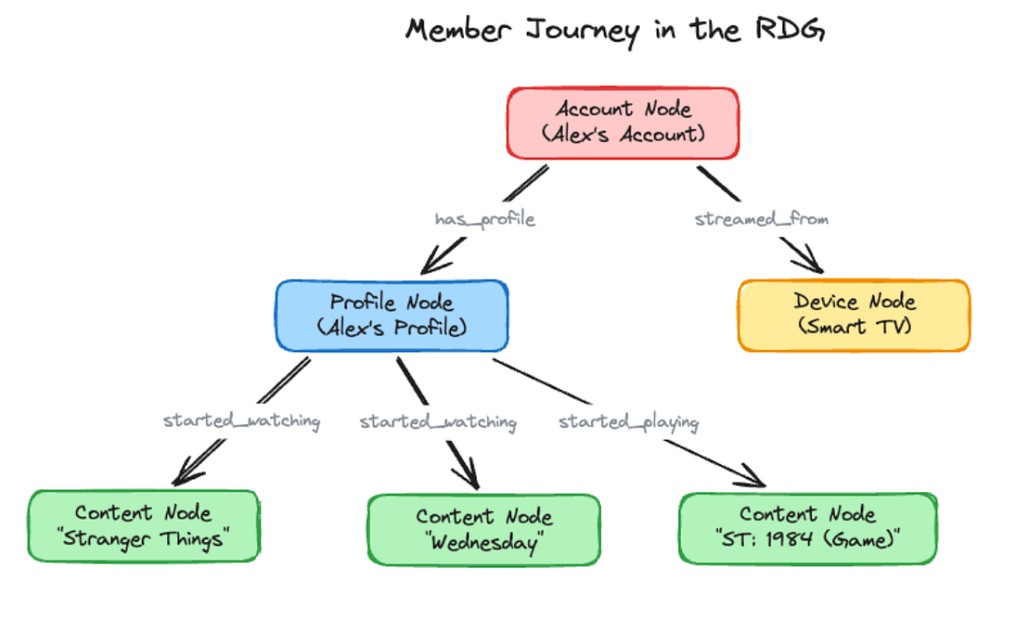
Let’s revisit our example from Part 1 and expand on it slightly. In the earlier posts, we focused on accounts, devices and content. In practice, the graph is richer: each account has multiple profiles.

A member journey often looks like this:

  1. Alex logs in to their Netflix profile on a smartphone and starts watching Stranger Things.
  2. They later switch to a smart TV in the living room to continue the episode.
  3. The next morning, they use a tablet to play the game Stranger Things: 1984.

In the RDG, this journey creates the following graph structure:

Graph queries vary along two axes: how wide they fan out at each hop, and how deep they chain across hops. To see this range, let’s look at two scenarios from opposite ends:

1. Shallow and wide: “Which devices has this account used?”

Consider a “shallow, wide” query: “Which devices has this account used to stream in the last 30 days?”

Using the graph structure above, this translates to:

  • Starting Point: A specific Account Node.
  • Hop 1 Edge Traversed: The streamed_from edge.
  • Hop 1 Destination: Device Nodes.

While this is only a “single hop,” it presents a significant scaling challenge. For a highly active account, the fan-out can be massive. The query layer must fetch hundreds of streamed_from edges, apply temporal filters on each edge’s last_watch_timestamp property to capture only those within the last 30 days, and aggregate the results, all while maintaining sub-100ms latency.

2. Deep & Narrow: What has this profile watched?

Consider a scenario where personalization teams need to understand a member’s viewing journey. They might ask: “For Account X, show me the Stranger Things viewing history across all profiles: which profiles watched it, what they watched, and when”.

This path unfolds as follows:

  • Starting Point: A specific Account Node.
  • Hop 1 Edge Traversed: has_profile
  • Hop 1 Destination: Profile Nodes
  • Hop 2 Edge Traversed: started_watching (filtered for title_name = “Stranger Things”)
  • Hop 2 Destination: Content Nodes

The core challenge in this scenario is sequential dependency: we cannot fetch a profile’s viewing history until Hop 1 has identified which profiles exist. In a distributed environment, the client has to wait for Hop 1 to finish before sending Hop 2. If each hop takes 10ms of network time, that’s 20ms of overhead before we’ve processed a single byte. To hit our sub-100ms goal, we needed a way to package this multi-step logic into a single request.

This example is a 2-hop traversal, but queries can chain 3–4 hops across different entity types, and the latency penalty of sequential execution only grows with depth.

Balancing Depth and Breadth

These two scenarios pull the system in opposite directions. Shallow-wide queries stress I/O throughput: can we handle massive fan-out without slowing down? Deep-narrow queries stress execution efficiency: can we chain multiple hops without the network overhead adding up? Supporting both on the same system is what shaped the design that follows.

Design Constraints and Key Choices

The two scenarios above sit at opposite ends of the spectrum, but they are not unusual. In practice, the RDG serves tens of thousands of queries per second, each potentially different, all needing sub-100ms responses while the underlying graph continues to grow. Scale, latency, query diversity, and the need for extensibility pulled the design in different directions at once, and every choice came with a trade-off we had to live with.

Why breadth-first, not depth-first? The most intuitive way to traverse a graph is depth-first: pick a path, follow it to the end, backtrack, try another path. But in a distributed system where every hop is a network call, depth-first can lead to high latency. If Account X has 5 profiles and each profile has watched hundreds of titles, depth-first would trace all of one profile’s watched titles before moving to the next, missing the opportunity to batch lookups across profiles. Breadth-first flips this by working one level at a time across all nodes, rather than one path at a time through each node. We fetch all profiles for the account at once, then fetch the started_watching edges for all profiles, and finally fetch content details for all matching titles. Three rounds of parallel calls instead of sequential chains. With breadth-first, there is a clear trade-off in memory, because we hold each level of the graph in memory at once, so the cost scales with how wide a level fans out rather than how deep the query goes. We keep this comfortable by bounding each hop with the per-edge-type limits described in Step 5 below, so even a high fan-out level stays a manageable frontier. We’ll walk through how this works, level by level, in Step 3 below.

Why async-first, not thread-per-request? Latency in the RDG is dominated by I/O, reading from the storage layer, calling enrichment services, and waiting on caches. A traditional thread-per-request model would pin a thread to each in-flight query, and most of the time, the thread would be idle, waiting for a network response. With thousands of concurrent queries, we’d need thousands of threads, most of which would be doing nothing. Instead, we decided to build the entire execution pipeline around asynchronous composition. A small set of dedicated thread pools (16–24 threads total) handles thousands of concurrent requests because no thread ever blocks on I/O. While a storage call is in flight, the thread continues with other work and picks up the result when it arrives. This is the foundational design decision on which everything else rests. We’ll see this in action in Step 4 below, where we cover parallel execution.

Why cache selectively, not everything? Not all data in the graph changes at the same rate. Some properties, such as account plan type and content metadata, are relatively stable: they change on the order of hours or days. Edges like who watched what and when change constantly. For stable data that many queries touch, we use a distributed cache (EVCache) with TTLs tuned to data volatility. Getting the caching strategy right took iteration. We started by caching aggressively and measured the impact: tracking hit rates, monitoring stale-data incidents, and adjusting TTLs based on how quickly different node types actually changed in production. The result: 70–80% hit rates on node lookups, achieved by narrowing the cache to nodes that are both frequently accessed and slow to change, while skipping data that would expire before the TTL ran out. Step 6 below covers how this works in practice.

Why opt-in enrichments, not automatic? Clients know what they need. A query checking account relationships doesn’t care about title artwork; a personalization service building a viewing timeline does. Rather than fetching metadata from external services by default and penalizing every query, we make enrichments opt-in: clients specify exactly which external data they want per request. Also, enrichment is fail-open: if a service is slow or unavailable, we return the graph data without it.

Why eventual consistency, not strong? Most of our queries ask “What has this member done recently?”, not “What happened in the last millisecond?” By defaulting to eventual consistency, we read from the nearest replica and avoid coordination overhead. While the RDG is used to power in-the-moment experiences, it is not set up as the source of truth for the data it holds.

Architecture Overview

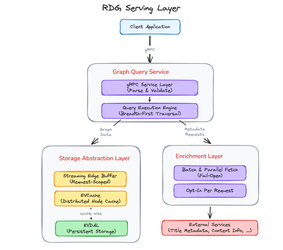
The above choices lead to the following three-layer architecture:

The Graph Query Service is the entry point. It accepts gRPC requests, validates the traversal specification, and hands it to the query execution engine. The execution engine orchestrates breadth-first traversal: expanding one level at a time, applying filters and limits at each hop, and composing all I/O asynchronously.

The Storage Abstraction Layer sits between the execution engine and the underlying KVDAL storage. It provides a clean interface for node lookups and edge retrieval, handles streaming for large adjacency lists, and manages node caching (EVCache).

The Enrichment Layer fetches additional metadata from external Netflix services on demand. It batches requests, runs them in parallel with graph data assembly, and degrades gracefully when an enrichment source is unavailable.

When a client sends a query, the request flows through these layers in sequence: the Query Service parses the request into an execution plan, the execution engine walks the graph level by level through the Storage Abstraction Layer, and if enrichments are requested, the Enrichment Layer fetches and merges external data before the response is serialized back to the client.

Now, with that mental model in place, let’s follow a query through this system and see how these choices play out in practice.

Executing Queries Efficiently: Following a Query’s Journey

To see how the RDG query layer works in practice, let’s follow a single query end-to-end and focus on one question: how do we make every step fast?

We’ll reuse the deep-narrow example from above:

For Account X, show me the Stranger Things viewing history across all profiles: which profiles watched it, what they watched, and when.

In graph terms, this becomes a 2‑hop traversal:

  1. Account X → has_profile → Profiles
  2. Profiles → started_watching → Content (filtered for “Stranger Things”)

We’ll walk through how this query moves through the layers we described above:

  1. Reading and interpreting the request
  2. Reading from storage efficiently
  3. Executing traversal with breadth‑first levels
  4. Running many operations in parallel, but safely
  5. Filtering smartly to keep only what matters
  6. Making repeat queries faster with caching

By the end, we’ll see how a 2-hop query like our Stranger Things example, with streaming, filtering, and parallel execution, can complete in under 100ms.

Step 1: Reading the Request: Deciding What the Query Really Wants

Every query starts as a gRPC request. Before we touch storage or walk a single edge, the engine needs to understand what the caller actually wants.

For our running example below:

For Account X, show me the Stranger Things viewing history across all profiles

The engine creates a traversal plan with a set of levers: how many hops, how many edges per hop, how much history to consider, and whether to favor recent activity.

We resolve these upfront by merging a hierarchy of filters and limits, from application-level defaults down to per-edge-type overrides, into a concrete execution plan. By the time we read from storage, every hop has clear rules. We’ll see how this hierarchy works in detail in Step 5, but the key insight is simple: interpreting the request up front prevents over-fetching from the downstream storage layer.

Step 2: Reading from Storage: Direct Lookups and Streaming Fan‑Out

Once we’ve parsed the request and decided what the query should do, the next step is to actually touch the graph. For our running example:

For Account X, show me the Stranger Things viewing history across all profiles…

The first concrete question the engine has to answer is very simple:

Which profiles does Account X have?

Under the covers, that really means: how do we find all relevant edges for Account X without scanning the entire graph every time?

Finding Edges Fast with Adjacency Lists

If we stored every edge in one massive table, the naive approach would be to scan for rows where source = Account X. Even with indexing, doing that across billions of edges for every request would be slow.

Instead, we organize edges as adjacency lists. For each node, we keep a compact list of “who it’s connected to” by edge type. For Account X, a simplified view might look like:

Account_X: has_profile → [Profile_Alex, Profile_Kids, …,]

Now “get all profiles for Account X” is no longer a global search; it’s a direct lookup into Account X’s stored adjacency. The storage layer can usually pull that list back in a few milliseconds because it’s reading a small, well‑indexed slice of data instead of hunting through everything.

For our query, the first hop is quick: Account X has just two profiles. The engine fetches those edges with has_profile and moves on. For more information on Storage, refer to our previous post.

When One Node Has A Lot of Neighbors

The first hop was small, but the second is where things get interesting. Each profile can have a large number of started_watchingedges. Loading the entire adjacency list at once would spike latency and memory usage.

To avoid this, we treat adjacency lists as streams rather than blobs.

When the engine requests Profile_Alex’s started_watching edges, the storage layer streams them in batches of 100. As each batch arrives, we apply filters (e.g., “last 30 days”) and decide whether to continue.

If we’ve collected enough edges to satisfy the query’s limits ( max_edge_cnt, lookback window, etc.), we stop reading. Otherwise, we pull the next batch.

In our Stranger Things example:

  • Storage streams the started_watching adjacency for Profile_Alex.
  • There are about 500 edges total: months of viewing history
  • As each batch arrives, we filter for Stranger Things and drop anything older than 30 days.
  • After a few batches, we’ve found what we need: a handful of Stranger Things sessions.
  • We never materialize more data than needed. Filtering happens at the source.

Why This Matters Later

These two choices, the adjacency‑list lookups and streaming fan‑out, enable everything that follows:

  • Small fan‑outs (like Account → Profiles) yield predictable, low‑millisecond lookups.
  • Large fan‑outs (like Profile → Content) stay efficient by reading only what’s needed.
  • Traversal logic treats “neighbors of this node” as a cheap, bounded operation.

By Step 3, we’re working with concise frontiers like “Profile_Alex and Profile_Kids,” ready for the next hop into their viewing histories.

Step 3: Traversal Execution: Walking the Graph Level by Level

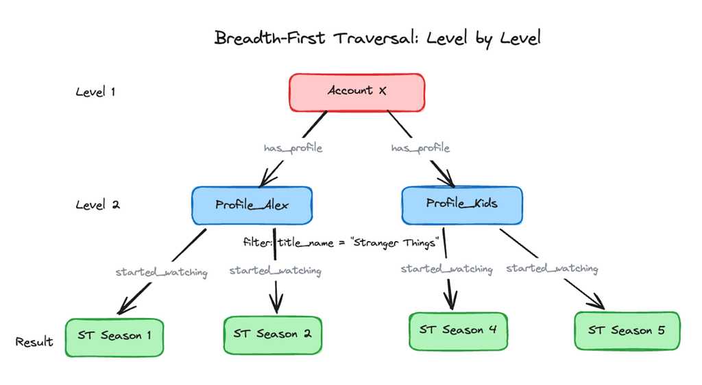
We’ve completed the first hop. From Account X, we pulled the has_profile edges and found two profiles: Profile_Alex and Profile_Kids.

But we’re not done. The query was:

For Account X, show me the Stranger Things viewing history across all profiles: which profiles watched it, what they watched, and when

So we still need to fetch each profile’s history and filter it down to Stranger Things sessions. As we covered in our design choices, we use breadth-first traversal: expanding all nodes at the current level in parallel before moving to the next.

Querying, Level by Level

Let’s walk through the Stranger Things query level by level.

Level 1: Account → Profiles

Starting at Account X, the engine pulls has_profile edges, discovering two profiles:

  • Profile_Alex, Profile_Kids

These become the frontier for Level 2, a single small lookup that takes a few milliseconds.

Level 2: Profiles → Content (Stranger Things)

From those two profiles, we fetch started_watchingedges and filter for Stranger Things. Instead of exhausting Profile_Alex’s entire viewing history before touching Profile_Kids, we treat this as one logical step:

  • For each profile, fetch started_watching edges in parallel.
  • Filter for title_name = “Stranger Things” as edges stream in.
  • Each profile might have hundreds of content edges, but filtering at the source keeps the result set small.

We discover that Profile_Alex watched Season 1 and Season 2, while Profile_Kids watched Season 4. Level 2 turns “2 profiles” into “a handful of Stranger Things sessions” in roughly one storage round trip.

The traversal completes: two levels, two frontiers.

Why This Matters for Latency

We parallelize within each phase, then regroup. This provides:

  1. Predictable resource usage: known requests per level
  2. Maximum parallelism: all frontier nodes processed together
  3. Far fewer round trips: one per level, not per path

For a 2-hop query: two rounds of parallel lookups instead of hundreds of sequential ones. That’s why our Stranger Things query completes in under 100ms.

Step 4: Parallel Execution: Doing Many Things at Once, Safely

Breadth-first traversal enables parallel work at each level, which is the key to low latency.

At Level 2 of our Stranger Things query, we fetch started_watching edges for each profile. With two profiles, this is trivial, but in production queries fan out across many profiles, each with hundreds of edges to stream and filter. So do we process them sequentially or in parallel? Sequential means waiting for each profile before starting the next, and the delays stack up. Parallel finishes in the time of the single slowest profile, but hundreds of queries doing this at once could overwhelm storage with unbounded concurrency.

The goal: parallel speed without unbounded chaos.

A Kitchen, Not a Single Queue

We structured the query engine like a professional kitchen, with specialized stations for appetizers, mains, and desserts, each with its own capacity. If one station is slammed, the others keep flowing. In practice, that means dedicated thread pools for different work types: fetching nodes, reading adjacency lists, and performing enrichments. When the Stranger Things query reaches Level 2, calls route to the adjacency-list pool, where 8 workers stream and filter each profile’s edges in parallel.

Knowing When to Back Off

Thread pools give us local control, but we also need a global view of total capacity, so we use adaptive concurrency limiting. When things are healthy, we raise the limit gradually (100 in-flight, then 101, 102, and so on); when timeouts or errors spike, we back off by a larger step (say, 100 down to 70). Combined with per-pool limits, the engine constantly tunes parallelism, fanning out within each level while staying inside safe storage and network limits.

Fetching Extra Metadata Along the Way

If the client opted into enrichments (say, maturity ratings for the matched content), the Enrichment Layer fetches them in parallel on its own thread pool and merges them into the response. Enrichment is fail-open: a slow or unavailable source never blocks the query, and we just return the graph data without it.

​​Step 5: Smart Filtering: Keeping Only What Matters

We’ve traversed from Account X to profiles, then to their viewing histories. But raw edges aren’t what our partners need. They care about recent, relevant activity, not every started_watching edge accumulated over the years. This is where filtering decides which parts of the story make the final cut.

From “All Activity” to “The Last 30 Days”

Go back to the original question:

For Account X, show me the Stranger Things viewing history across all profiles: which profiles watched it, what they watched, and when.

The phrase “viewing history” is deceptively simple. Under the hood, it means we need to:

  • Ignore older viewing activity, even if it exists in the graph
  • Avoid pulling more edges than we actually need
  • Let different teams choose their version of “recent enough.”

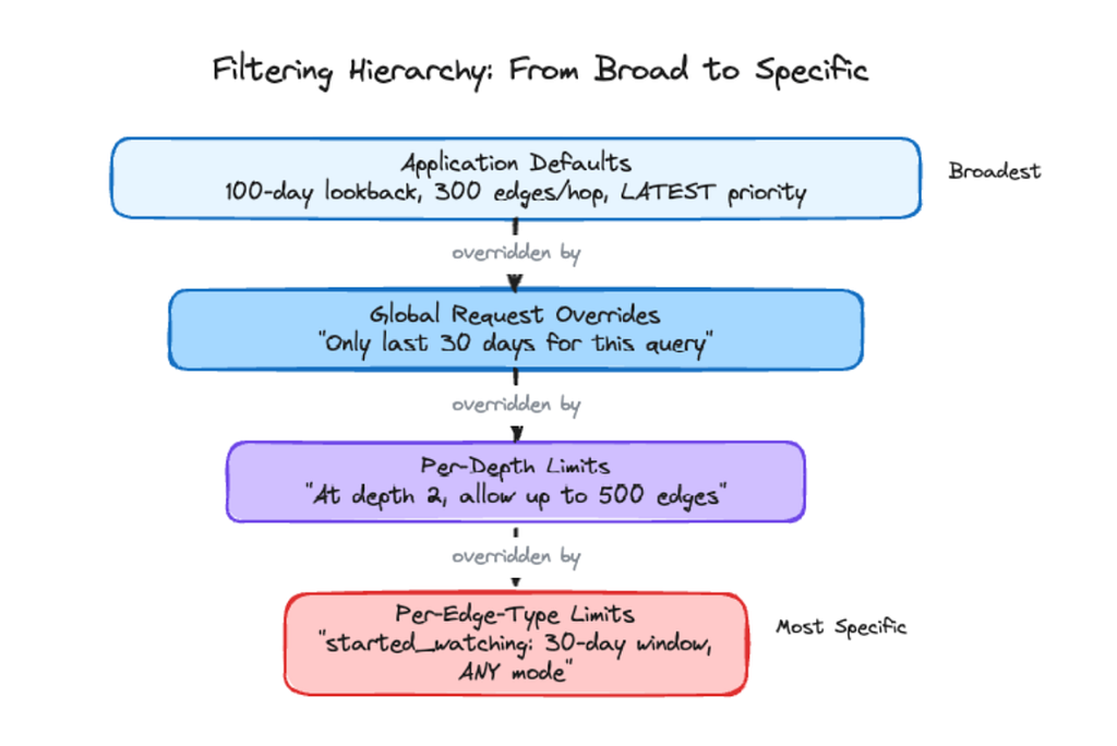
We handle this with a filtering hierarchy. The system starts with conservative defaults (e.g., 100-day lookback, 300 edges per hop), and requests can override them globally, per-hop, or down to specific edge types. In our query, the 100-day default applies broadly, but the caller sets 30 days for started_watching edges, and the narrower rule wins. Older sessions are discarded. The same engine can just as easily provide a tight recent window on one edge type and full history on another, all in a single query.

Choosing Which Edges to Keep: LATEST vs ANY

Sometimes there are still more edges than we want to return after time filtering. If Profile_Alex watched the same episode several times last month, pausing and resuming, we don’t want to send all those edges back. So we offer two selection modes.

LATEST sorts edges by timestamp and keeps the newest ones up to the limit, ideal for “what has this profile watched recently?” where teams want the current state, not every play event. ANY grabs whichever edges it encounters first, no sorting, which is faster and fine for “has this profile ever watched Stranger Things?” where timing doesn’t matter. Teams default to LATEST and switch specific edge types to ANY when “any proof” is enough.

Bringing It Back to Our Story

So what happens for our running query?

We start with all the started_watching edges for each profile. The time filter narrows this to 30 days. Edge-count limits prevent response flooding. LATEST mode selects the most recent viewing session per title. The result: a concise answer distilled from a verbose history:

  • Profiles that watched Stranger Things in the last month.
  • Which seasons and episodes they watched.
  • The most recent session for each, tying it all together.

This filtering turns raw history into a focused answer.

Step 6: Making It Even Faster: Caching the Things We Keep Seeing

By now, we’ve walked the full path of our query: we’ve traversed from account to profiles, filtered viewing history by time, and focused on Stranger Things sessions.

Despite our optimizations, each storage call still costs a network round-trip. When the same nodes appear across thousands of queries per minute, those redundant calls add up: both in infrastructure cost and in tail latency at scale.

The key question: what can we avoid repeating?

The Things That Don’t Change Every Second

Look back at the entities in our Stranger Things journey:

  • The Account node (plan type, region, etc.)
  • The Profile nodes (“Alex”, “Kids”, whether it’s a kids profile)
  • The Content nodes (Stranger Things seasons and episodes)

These rarely change. Profiles don’t flip between “kids” and “non-kids” every minute. Title metadata is stable.

To improve efficiency, we keep a distributed cache of hot nodes (accounts, profiles, content) that are likely to reappear. When the same entity appears again, we answer “What is this node?” from memory, skipping storage.

Result: for high-traffic entities, we eliminate storage calls and noticeably reduce infrastructure cost and tail latency at scale.

A Quick Replay of Our Query With Caching Turned On

The first time the Stranger Things query runs for Account X, the cache is cold, so we pay the full cost: we fetch the account and its profiles, then the started_watching edges and matching content nodes, caching each node as we go. Minutes later, a different query arrives:

Show me everything Account X’s profiles have watched in the last 7 days, and flag anything rated TV-MA on the kids profile.

This time, many of those nodes are already in the distributed cache. Storage still handles the adjacency lists and edges, but node lookups are lighter and latency drops. At scale, that reuse gives us comfortable headroom for traffic spikes.

Not Everything Deserves a Spot in Cache

We can’t cache everything. The RDG prunes old activity after a set retention window, so caching a node that’s about to be deleted is wasteful.

To avoid polluting the cache, we consider:

  1. The node’s last activity timestamp
  2. The graph’s retention period (e.g., 100 days)
  3. The cache TTL (e.g., 30 days)

If a node was last active 99 days ago, it expires from the graph in a day, so a 30-day TTL makes no sense, and we skip it. We reserve cache space for active nodes like Account X. This “smart TTL” policy keeps the cache focused on live stories rather than archival ones, so repeat queries for the same part of the graph return faster.

Caching is integrated into the journey, not an afterthought. The engine reuses knowledge from previous queries, so repeated traversals over the same part of the graph keep getting cheaper

The Payoff

The serving layer sits in front of 8 billion nodes and 150 billion edges, serving mixed workloads, all of which need to feel interactive. Single-hop queries return at a P50 of 15–30ms with P99 under 100ms. Even 3-hop traversals, the kind that chain across accounts, profiles, and content, come back at P99 between 100–150ms. Breadth-first execution and parallelism within each level keep these numbers stable even as fan-out grows.

The async-first design is what enables the throughput. Thousands of concurrent requests flow through just 16–24 threads spread across dedicated pools because no thread ever blocks on I/O. When load spikes, our concurrency limiter lets work queue briefly: slowly increasing capacity when things are healthy, backing off aggressively when they’re not

Caching has the most visible impact on day-to-day efficiency. Popular entities like accounts, profiles, and content achieve 70–80% cache hit rates, resulting in roughly 3–4x fewer storage calls on common query paths. Smart TTLs keep the cache focused on active data, avoiding wasted memory on nodes that are near the end of their graph retention window.

These properties, together, make multi-hop graph queries over billions of entities feel, at query time, much closer to in-memory lookups than to remote calls.

What We Learned Along the Way

The biggest surprise wasn’t any single optimization: it was how much async composition changed the economics of our system. We expected it to help latency; we didn’t expect it to slash infrastructure cost. A serving layer that would have needed hundreds of threads per instance runs comfortably on 16–24, because no thread ever blocks on I/O. The tradeoff is debuggability: async stack traces are hard to read, and exceptions can get lost in future chains. We compensated with per-stage metrics, measuring each request at validation, storage, enrichment, and end-to-end, so when something is slow, we know exactly which stage to blame.

Caching took longer to get right than expected. Our first instinct was to cache everything in EVCache and let TTLs handle freshness, but that wastes memory on nodes about to expire from the graph anyway. The breakthrough was matching TTLs to data volatility: stable node properties get long TTLs, while nodes near the end of their retention window aren’t cached at all. The 70–80% hit rate we see today came from being selective, not aggressive.

The filtering hierarchy was born out of frustration. Early on, every new use case meant a code change: one team wanted a 7-day lookback, another 90 days, a third different limits at different depths. Instead of bespoke logic per team, we built a layered override system: application defaults, global overrides, per-depth limits, and per-edge-type limits. It took real effort, but it eliminated an entire class of feature requests and teams now tune their own queries without touching our code.

Closing: Principles for Distributed Systems

The lessons above are specific to the RDG, but the underlying principles apply to any distributed system built around I/O-heavy, fan-out workloads.

  • Think in terms of frontiers, not features. Design your APIs so callers describe what frontier to explore, then let the system decide how to walk it efficiently.
  • Filter early, not late. Every byte you fetch but don’t need is wasted I/O. Push filters and limits as close to the storage layer as possible: discard irrelevant data at each stage rather than fetching everything and trimming at the end.
  • Parallelize deliberately, not by default. Unbounded concurrency feels fast until it overwhelms the systems you depend on. Set explicit limits, monitor them, and adjust dynamically: treat concurrency as a dial, not a switch.
  • Treat caching as a first‑class design choice, not an afterthought. Decide what is worth remembering, for how long, and what should be allowed to fade out of memory. Match TTLs to data volatility, and don’t cache what’s about to expire.

Thanks for reading Part 3 of the RDG blog series. For us, getting these details right is what turns a constantly changing, billion-edge graph into something that, at query time, feels like a responsive, in-memory data structure.


How and Why Netflix Built a Real-Time Distributed Graph: Part 3 — Querying the graph with gRPC… was originally published in Netflix TechBlog on Medium, where people are continuing the conversation by highlighting and responding to this story.

show more
Modeling Device Capabilities for Analytics
Feed: Netflix TechBlog - Medium (https://netflixtechblog.com/feed)
Published: 2026-07-31 16:01:02 | Created: 2026-07-31 16:04:56

by Aarti Laddha, Richard Diaz-Cool, Rishika Idnani, Venkatesh Selveraj

Netflix supports a vast and evolving set of features and content types, ranging from 4K streaming and immersive audio to live streaming and cloud gaming, across a diverse ecosystem of devices. However, not all devices are created equal. Hardware limitations such as available RAM, CPU cores, display capabilities, or platform support mean that some features cannot be supported on certain device models. To ensure the best possible user experience, we rely on a deep understanding of device capabilities. We have invested in building a comprehensive device capability data model and integrating feature flags from internal systems, paving the way for smarter, more granular feature management across our global device landscape. This approach helps us identify bottlenecks in feature penetration and accelerates the pace of innovation.

We have designed our data storage and modeling strategies to efficiently support analytics at scale. We use a cumulative table to process information about the device’s capabilities. This table is structured to efficiently capture the latest state of each device and its associated capabilities (like Screen resolutions, Video Profiles Supported, Surround Sound, RAM size etc) making it ideal for analytics and reporting use cases.

{
"Screen Height": ["720"],
"Screen Width": ["1280"],
"Video Profiles":
[
"playready",
"hevc",
],
}

For aggregate analytics, we leverage a histogram table that captures active device counts over the past 28 days, broken down by device model and software version. This table also records the number of devices supporting specific capabilities, enabling detailed distribution analysis. One use case for this histogram data is to analyze the distribution of external display capabilities attached to streaming sticks. For example, the histogram below shows that out of total X number of devices, all supported the HD profile (playready), while only 20% devices supported the UHD profile (hevc).

{
"Video Profiles": {
"playready": 100%, # HD profile
"hevc": 20% # UHD profile
}
}

We have built analytical products that leverage these datasets to provide a comprehensive view of feature reach such as 4K Ultra HD, Netflix Spatial Audio, Cloud Gaming and the latest UI. By relying on data-driven insights, we can make informed decisions about which features to enable on specific devices, ensuring both performance and reliability.


Modeling Device Capabilities for Analytics was originally published in Netflix TechBlog on Medium, where people are continuing the conversation by highlighting and responding to this story.

show more
GenRec: Towards LLM-Native Recommendation at Netflix
Feed: Netflix TechBlog - Medium (https://netflixtechblog.com/feed)
Published: 2026-07-30 20:10:15 | Created: 2026-07-31 01:12:58

Authors: Ying Li, Arjun Rao, Shradha Sehgal

Introduction

Recommendations sit at the heart of the Netflix experience. Our current production models rely on thousands of hand‑crafted features over users, items, and interactions, along with specialized architectures for sequence modeling, feature interactions, and multi‑task objectives. This stack has evolved over many years to support diverse content types (movies, series, games, live, podcasts) and product surfaces, but its complexity makes it costly to onboard new use cases: adding a content type or surface can require significant feature engineering, architecture change, infrastructure work, and experimentation.

At the same time, large language models (LLMs) are changing how we think about recommendation, as shown by recent work such as PLUM, GLIDE, and OneRec-Think. Their broad world knowledge and strong language understanding make it possible to represent user histories and item metadata directly as text, capture rich relationships in a shared semantic space, and steer recommendations via natural‑language prompts. However, off‑the‑shelf LLMs are still far from production‑ready recommenders: they often over‑recommend globally popular content, hallucinate out‑of‑catalog items, ignore business constraints, and provide only limited personalization.

To address this, we built GenRec, an LLM‑backed recommendation ranker that post‑trains an internal foundation LLM on Netflix‑specific data and objectives. GenRec shows that an LLM‑based ranker can match or exceed a mature production system while relying on far fewer labeled examples and input signals.

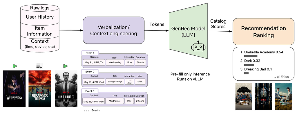
Figure 1: GenRec pipeline. Raw logs of user history, item metadata, and context are transformed via context engineering into natural-language prompts and fed into the GenRec, which runs on vLLM in prefill-only mode and outputs scores for each catalog item, yielding a recommendation ranking.

At a high level, GenRec:

  • Verbalizes user histories, item metadata, and context as text.
  • Post‑trains a Netflix‑adapted foundation LLM for ranking.
  • Adds a catalog‑aware scoring head over Netflix titles.
  • Uses reward signals to align with long‑term member value and business goals.
  • Runs in prefill‑only mode on Netflix’s LLM serving stack for cost efficiency.

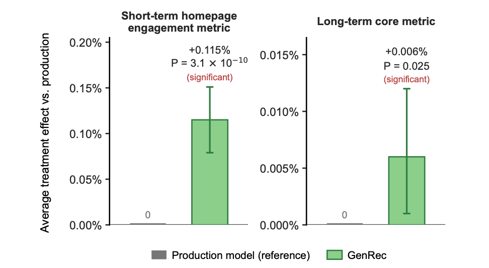
In a large‑scale A/B test against a well‑tuned production ranker, GenRec achieves statistically significant improvements in both short‑term and long‑term online metrics, while using only a small fraction of the Phase‑2 labeled data and input signals. It reduces our reliance on hand‑engineered features and shifts the focus from feature engineering to context engineering. In this blog post, we will describe how GenRec works, how it performs, and why we believe it points toward a more LLM‑centric future for recommendation at Netflix.

Problem Setting

We focus on a full‑catalog ranking task (or top‑K ranking when a candidate set is provided).

Given a user 𝑢, their interaction history 𝐻, and the current context 𝜏 (device, surface, locale, time, etc.), GenRec scores each item and produces a personalized ranking that can directly power recommendations or serve as input for downstream personalization systems.

Formally, we map a request (u,τ,t,H) — user, context, time, and history — to a ranking 𝜋 over the catalog C, where π(i) is the position assigned to item i. We optimize π for expected long‑term member utility (a proxy for satisfaction and retention), not just short‑term engagements.

From Foundation LLM to Recommendation Ranker

GenRec follows a two‑phase training framework (Figure 2):

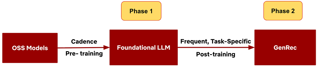
Figure 2: Two Phase Framework. Phase 1 trains a foundational LLM on Netflix data for user and content understanding, and Phase 2 post-trains on ranking-specific data and objectives.

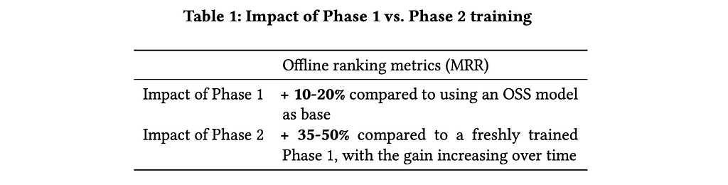
Phase 1 — Netflix-Adapted Foundation LLM.

We start from an open‑source LLM and adapt it on proprietary Netflix corpora, so it learns foundational capabilities such as

  • Netflix content understanding
  • Member behavior and preference patterns
  • General language understanding and generation.

Phase 1 is updated relatively infrequently and serves as a shared, Netflix‑aware backbone for many applications.

Phase 2 — GenRec.

We then turn this foundation model into a high‑quality ranking model by post‑training on ranking‑specific data and objectives. Phase 2:

  • Focuses on ranking quality and steering
  • Incorporates multiple reward signals via reward‑weighted losses
  • Is refreshed more frequently to track new content and evolving tastes
  • Is explicitly optimized under serving cost constraints.

Training Data as Conversations

Netflix members generate hundreds of billions of interaction events spanning many surfaces (views, plays, durations, thumbs up/down, add to list, abandons, etc.). We convert this log data into single‑turn or multi‑turn “conversations” between a user and a recommender. Each turn contains:

  • User message: verbalized context, profile, history, item metadata, and task (e.g., recommend what the user will watch or thumb next).
  • Assistant message: the member’s actual engagement (e.g., which titles were played, for how long, what feedback they provided).

During Phase‑2 training, the LLM learns how assistant messages depend on user messages. This allows us to express rich recommendation signals as text, jointly supporting both the language-modeling (LM) and ranking objectives.

At inference time, we feed in the verbalized context and apply a catalog‑aware scoring head to rank items; we do not decode assistant messages. The conversational format is primarily used during training to support the LM objective and preserve strong language understanding over the verbalized text.

Verbalization and Context Engineering

Traditional recommenders operate on dense features and embeddings. GenRec takes a different approach: it verbalizes rich user histories and context as natural language, encoding raw interaction signals directly in the LLM’s semantic space. In doing so, it relies on the model to discover higher‑level patterns — such as item relationships and evolving user interests — rather than on manual feature engineering.

Naively verbalizing every interaction in a user’s history can quickly exceed the token budget and be too expensive at Netflix scale. The context window becomes our new “feature budget”, so we apply context engineering:

  • Retain in full: high‑signal engagements (e.g., long plays, thumbs‑up) with richer details
  • Omit: low‑signal events (e.g., very short plays or quick hovers)
  • Summarize or compress: repetitive behaviors (e.g., binge‑watching )
  • Elaborate selectively: important or cold‑start items (e.g., new releases)

Within a fixed token budget, we prioritize recent, high‑signal history and compress or drop older history. We also structure the prompt to maximize shared prefixes for better prefix caching. The goal is a compact, high‑information prompt that preserves ranking quality without prohibitive costs.

Objectives: Ranking, Language, and Rewards

The overall GenRec model is trained with a multi‑objective loss that combines a recommendation ranking objective, language modeling objectives, and alignment via reward‑weighted training.

1. Catalog‑Aware Ranking Objective

The primary task is a ranking objective that teaches the model to score items by engagement quality. We label positives using high‑value engagements (e.g., sufficiently long plays, strong explicit feedback), with thresholds and denoising logic, and train the model — via a cross‑entropy loss over the catalog or candidate set — to assign higher scores to these positives given a verbalized context.

2. Language Modeling Objective

We also retain a language modeling (LM) objective over the verbalized inputs and outputs. This helps preserve the model’s general language understanding, improves its ability to interpret rich natural‑language histories and item metadata, and keeps the door open for text‑generation use cases such as recommendation explanations.

3. Reward‑Weighted Loss for Alignment

Beyond raw ranking accuracy, GenRec must (1) respect business requirements — for example, balancing movies, series, games, live, and podcasts — and (2) optimize long‑term member satisfaction rather than just immediate clicks or plays.

Training only on raw interaction sequences can lead to undesirable behaviors, such as over‑favoring binge‑watching or over‑focusing on a single content type. To address this, we weight the ranking loss using signals from separate reward models. Each training example receives a scalar weight derived from two types of signals:

  • Long‑term satisfaction proxies: estimate how much a short‑term engagement contributes to long‑term outcomes, such as return behavior, catalog exploration, or sustained engagement.
  • Behavior rebalancing: adjust behaviors across content types and launch stages (for example, games vs. movies, new releases vs. evergreen titles) to better align with business goals.

The example’s ranking loss is then scaled by this weight: high‑value engagements receive larger weights, and low‑value ones are down‑weighted. This reward‑weighted approach is simpler and more cost-efficient than full reinforcement learning, yet provides effective alignment in practice. We have seen additional gains from RL‑style methods (e.g., GRPO), but leave them to future work due to their higher cost.

Model Architecture and Serving

Backbone and Scoring Head

GenRec’s architecture closely follows our foundational LLM: a decoder‑only Transformer trained with next‑token‑prediction style objectives, augmented with a catalog‑aware ranking head that scores only Netflix in-catalog items. The scoring pipeline works as follows:

  1. Verbalization: A verbalizer V serializes user history H, context 𝜏 , and relevant item metadata into a single text sequence x.
  2. Pooled representation: The LLM processes x, and we extract a pooled hidden state h that summarizes the user’s current preferences and context.
  3. Catalog‑aware scoring: Each catalog item i has a learned embedding eᵢ. A scoring head ϕ combines h and eᵢ (e.g., via dot product or small MLP) to produce a score s. Applying a softmax over scores yields a probability distribution which we convert into a ranking π.

All parameters — the backbone, scoring head, and item embeddings — are trained jointly. For very large catalogs, we can use sampled softmax or candidate sets for efficient training and inference. This architecture constrains recommendations to the Netflix catalog while supporting efficient scoring over large candidate sets.

Serving and Cost Optimization

GenRec is served on Netflix’s internal LLM stack using vLLM. At Netflix scale, serving cost is driven primarily by 1) Model size; 2) Context length; 3) Inference mode (prefill vs. autoregressive decoding). We control cost through three strategies:

  • Smaller / distilled models: We train GenRec on smaller or distilled foundation models, often with larger or more targeted datasets, to capture most of the quality of larger models at lower serving cost.
  • Aggressive context compaction: Using the context engineering described earlier, we minimize tokens while preserving ranking quality.
  • Prefill‑only inference: Autoregressive decoding over large candidate sets would be prohibitively expensive. Instead, we run in prefill‑only mode: the model consumes the prompt once and scores the entire candidate set in a single forward pass, with no token‑by‑token decoding.

Together, these choices make it feasible to serve GenRec on high‑volume workloads within compute budgets.

Offline and Online Experiments

We evaluated GenRec against a mature production ranker that has been tuned over many years. The baseline model relies on thousands of engineered dense and embedding features, as well as custom architectures for modeling feature interactions and sequences. We assessed performance using both offline evaluation metrics and a large‑scale online A/B test.

GenRec vs Production Baseline

Offline, GenRec outperformed the production ranker on ranking metrics despite using far fewer input signals and labeled examples. With roughly 40× fewer Phase‑2 labeled training examples, GenRec achieved about +1.6% improvement in Mean Reciprocal Rank (MRR). As we increased Phase‑2 training data and enriched the input signals, GenRec’s offline metrics continued to improve.

Online, we ran a large A/B test on batch‑compute recommendation surfaces, covering ~10% of Netflix traffic over ~4 weeks. In this low‑data, low‑signal configuration, GenRec delivered statistically significant gains over the production baseline on both short‑term and long‑term online metrics (Figure 3).

These results indicate that a properly post‑trained and aligned LLM‑backed ranker can be a strong alternative to traditional recommendation models, with substantial headroom as we further scale data and input signals.

Figure 3: Online metrics of GenRec vs. production model. GenRec achieves statistically significant improvements on both short-term and long-term online metrics.

Data, Model, and Phase Contributions

We ran ablations to understand where GenRec’s gains come from.

Data and Model Scaling

  • Data scaling: For both ~1B and ~10B parameter backbones, offline MRR improves as we increase Phase‑2 post‑training data. Larger models reach higher absolute MRR but follow a similar scaling curve (see Figure 4).
  • Model scaling: Under a fixed training budget, we post‑trained GenRec variants from ~1B to ~10B parameters. Within this budget, larger backbones consistently achieved higher offline MRR than smaller ones.
Figure 4: GenRec Phase-2 data scaling for the∼10B model.

Phase-1 vs. OSS, Phase-2 vs. Phase-1

  • Phase-1 vs. OSS: Using the Phase‑1 Netflix‑adapted foundation LLM as the base model improves offline ranking metrics by roughly 10–20% compared to starting directly from an off‑the‑shelf LLM.
  • Phase-2 vs. Phase-1: Phase‑2 post‑training adds another 35–50% gain in offline ranking metrics when evaluated near the Phase‑1 training cutoff (i.e. when Phase‑1 model is the freshest). As time passes and Phase‑1 becomes stale with new content and shifting tastes, the relative benefit of Phase 2 grows to about 80% after 2 weeks.

Data efficiency vs. production ranker

  • Starting from a strong Phase‑1 model, GenRec matches or exceeds the production ranker using 10–40× fewer Phase‑2 labeled examples, depending on configuration. This marginal data efficiency is especially valuable because Phase 2 is refreshed far more frequently than Phase 1.

Context Length Optimization

Context length drives both quality and cost: longer verbalizations expose more behavior and context but increase training and serving cost. To study this trade‑off, we varied context length and verbosity and optimized them in three steps:

  1. Clean and compress events: drop low‑signal engagements and compress repetitive behavior to form a cleaned sequence of events.
  2. Find the “elbow point”: vary how many historical events we include and plot MRR vs. number of events to identify an elbow beyond which additional context yields diminishing returns (see Figure 5).
  3. Optimize verbosity: for the retained events, test different levels of details and simplified wordings, measuring MRR each time.

In our experiments, we can reduce the context tokens to roughly one-third of the original budget with negligible degradation in offline ranking metrics. Since serving cost is approximately proportional to context length, we observed a similar reduction in serving cost.

Figure 5: Offline ranking metric (MRR) vs. number of user engagement events included in the prompt. The dashed line marks the elbow point: increasing the number of events beyond this yields diminishing returns.

Towards LLM‑Native Recommendation

GenRec is more than “swapping in a Transformer” for an existing ranker. It hints at a broader shift toward LLM‑native recommendation at Netflix. A few notable changes:

From Feature Engineering to Context Engineering

Traditional RecSys stacks revolve around large feature sets and heavy feature infrastructure. LLM‑centric systems instead revolve around constructing rich textual contexts from raw logs, metadata, and tools. The “prompt” becomes the new feature vector.

Modeling effort shifts from designing features to deciding which signals to include, how far back in time to go, how to compress or summarize history within a token budget. Our experiments on verbalization compaction illustrate this shift: careful context design can preserve quality while dramatically reducing serving cost.

From Customized Architectures to Foundation Backbones

Historically, each recommendation task often had its own custom architecture (two‑tower models, DLRM‑style networks, bespoke attention blocks). In an LLM‑centric world, many tasks share a common foundation backbone, with differentiation coming from data and verbalization strategies, post‑training objectives and rewards, and inference optimization.

GenRec leverages the same backbone as our foundation LLM rather than introducing a new architecture built from scratch. This makes it easier to share learnings across applications, and opens the door to natural‑language steering for future experiences.

Scaling Laws as Design Guides

Traditional RecSys can hit diminishing returns due to sparse IDs, heavy engineering objectives, and task‑specific architectures. With an LLM‑backed backbone, recommendation inherits clearer data and model scaling behavior: within cost limits, more data and larger models consistently improve quality. This brings RecSys design closer to the broader LLM paradigm, where scaling laws help guide model and data investment.

From RecSys Infra to LLM Infra

LLM‑backed recommenders push us toward LLM‑style infrastructure: GPU‑accelerated, vLLM/Triton‑based, with careful batching and caching. Over time, recommendation serving infra starts to look more like general LLM infra than classic RecSys stacks built around MLPs or factorization models.

Conclusions

We have presented GenRec, an LLM‑backed recommendation ranker at Netflix that adapts an internal foundation LLM for large‑scale personalization. By verbalizing user histories, context, and item metadata, adding a catalog‑aware ranking head, using reward‑weighted objectives aligned to long‑term satisfaction and business goals, and serving efficiently on our LLM infrastructure, we obtain a model that improves on a strong production ranker while using far fewer Phase‑2 labels and input signals.

GenRec is an early but promising step toward a more LLM‑centric recommendation stack at Netflix. Our results suggest that, with careful attention to cost, infrastructure, and alignment, LLM‑backed recommenders can play a central role in large‑scale personalization.

Acknowledgments

GenRec is the result of close collaboration among multiple teams and organizations across Netflix. The contributors to this work (in alphabetical order):

AI for members: Arjun Rao, Ashish Rastogi, Baolin Li, Fernando Amat Gil, Grace Huang, Justin Basilico, Kamelia Aryafar, Linas Baltrunas, Moumita Bhattacharya, Ogheneovo Dibie, Rein Houthooft, Shradha Sehgal, Sejoon Oh, Sergi Perez, Sourabh Medapati, Thea Wang, Yaochen Zhu, Yesu Feng, Ying Li, Yun Li, Yucheng Shi, Yunan Hu

AI platform and serving: Abhishek Agrawal, Adam Singer, Binh Tang, Daneo Zhang, Derek Olejnik, Ed Maddox, Erik Osheim, Lingyi Liu, Liping Peng, Meghana Chilukuri, Nicolas Hortiguera, Shaojing Li, ZQ Zhang

Product: Ilke Kaya, Michelle Kislak, Scarlet Chen, Si Cheng


GenRec: Towards LLM-Native Recommendation at Netflix was originally published in Netflix TechBlog on Medium, where people are continuing the conversation by highlighting and responding to this story.

show more
Thinking Fast & Slow for a Personalized Notification System
Feed: Netflix TechBlog - Medium (https://netflixtechblog.com/feed)
Published: 2026-06-19 23:53:16 | Created: 2026-07-23 05:14:38

by Matthew Wood, Ishan Gupta, Kevin Mercurio, Devon Bryant, and Claire Dorman

In his seminal book “Thinking, Fast and Slow,” Daniel Kahneman describes two systems that drive human cognition: System 1, which operates automatically and quickly with little effort, and System 2, which allocates attention to more challenging mental activities requiring deliberate focus. This dual-process theory has profound implications not just for understanding human behavior, but for designing intelligent systems that must balance immediate responsiveness with strategic foresight. Similar “plan vs. act” decompositions show up in other domains too — for example, robotics and autonomous driving often separate a slower planning layer (setting goals and constraints over longer horizons) from faster control and execution loops, and modern LLM agents frequently pair deliberate planning with rapid, step-by-step tool use and reaction.

At Netflix, our messaging platform faces a similar challenge every day. We send hundreds of millions of personalized notifications — push messages, emails, and in-app alerts — to help members discover content they’ll love. This creates a central tension: optimizing each notification for near-term engagement can conflict with what is best for the member over the long term. Higher message frequency can increase fatigue and opt-out risk, while lower frequency can reduce awareness of relevant titles and features the member would value.

This blog post introduces our framework for personalized notifications — a hierarchical system where a “slow” policy makes strategic, personalized decisions about a member’s weekly messaging plan (e.g., the intended frequency per channel and the resulting pacing over the week), while a “fast” policy handles the tactical, real-time decisions about which specific message to send when a send opportunity occurs. Together, they balance near-term engagement with longer-term member experience.

The Problem:

Before introducing our new framework, it is helpful to ground the discussion in a representative baseline for a personalized notification system. In our previous production system, we used a causal model to make send decisions by predicting the causal effect of a single message over a short time horizon. While this approach is effective as a baseline, it suffers from two fundamental limitations:

Short-Term Reward Horizons

The single-message outcome model is trained to optimize short-horizon metrics, such as immediate user actions occurring shortly after a notification is sent. While this is excellent for driving near-term engagement, it misses the cumulative, long-term effects of a messaging strategy. A message that drives an interaction today might also contribute to notification fatigue, reducing responsiveness in the weeks to follow. Because critical indicators of member satisfaction — like sustained viewing habits or gradual opt-out risk — only surface over extended timeframes, a short-term model will always miss the bigger picture.

Coupled Ranking and Pacing Decisions

When a single system evaluates daily incrementality to decide both whether to send something and, if so, which item to send, an individual member’s weekly message frequency becomes a by-product of those daily decisions rather than an explicit control variable. In our previous single-policy system, frequency was controlled implicitly through a relevance threshold on the model score calibrated to achieve a target aggregate send rate. While effective for managing overall frequency, this mechanism limited the system’s ability to personalize frequency based on individual engagement patterns. Moreover, because send eligibility and message selection were coupled in the same decision rule, adjusting the threshold to control frequency also changed the distribution and quality of selected messages, and vice versa.

To solve these challenges, we needed a system that could separate longer-term strategy from shorter-term decisions. What if we could determine an optimal, personalized message plan for each member, and then focus on selecting the most relevant content within those bounds? In the following sections, we detail how we realized this vision by decoupling our notification engine into a hierarchical ‘System 1’ and ‘System 2’ framework.

The Proposed Method: A Hierarchical Slow-Fast Architecture

The Slow policy’s primary role is to define a personalized pacing of messages over a defined time horizon. The decisions made by slow policy are consumed by the Fast Policy whose role is to maximize immediate relevance and select the optimal message for the member at any given moment.

To illustrate the Slow Policy in practice: For example, if optimized at a weekly cadence, the policy evaluates a member’s long-term engagement patterns to select a “Pacing Plan Action.” To keep the action space manageable yet expressive, we discretize the decision space into a set of actions that independently specify push and email frequencies. This provides approximately O(100) distinct combinations of cross-channel pacing strategies.

The Utility Function

The Slow policy selects actions by maximizing a personalized utility function. This function explicitly trades off positive engagement signals against the long-term “cost” of messaging.

U(member, action) = Σ wₖ·Reward_k(member,action) — Cost(action)

To capture a holistic view of member health, this utility is composed of:

  • Positive Signals: Capturing the likelihood that a member will find value in and engage with the platform.
  • Negative Signals: Capturing the likelihood of member fatigue or a propensity to opt out of a messaging channel.

Ideally, negative signals alone would naturally penalize over-messaging. In practice, however, explicit negative feedback is extremely sparse. Without an additional constraint, the predicted ‘cost’ of an incremental message appears negligible, causing the model to gravitate toward maximum frequency.

To address this, we introduce a universal message cost that is added to the personalized negative‑feedback prediction for every send. This additional cost term keeps the reward function concave and well‑behaved, preventing degenerate “always send” policies. The message cost parameter is empirically tuned using a combination of online experiments and offline evaluation metrics.

Pacing Strategy

The two-stage design naturally allows for optimizing both the average frequency as well as pacing of messages over time. The simplest pacing strategy is uniform random: we translate the frequency target into a per-opportunity send probability and, at each eligible opportunity, effectively flip a weighted coin to decide whether to send. This produces an organically randomized pattern whose expected send rate matches the target.

While uniform pacing provides a clean and robust baseline, the framework readily extends to richer, non-uniform pacing profiles (for example, day-of-week patterns, conditioning on user activity, or launch-aligned bursts) whenever product or user-experience considerations call for more structured temporal distributions.

Policy-to-Policy Communication

The true power of this hierarchy lies in decoupling. By splitting into “Slow” and “Fast” policies, we allow each to focus on what it does best.

To bridge these two worlds asynchronously, decisions are events and state is managed through a low-latency feature store:

  • The Planner (Slow): The Slow policy calculates a member’s ideal pacing plan. It writes this strategic intent to a feature store
  • The Executor (Fast): Every day, when a notification opportunity arises, the Fast Policy simply pulls that stored “plan” as a feature. It then executes the tactical send decision within those strategic guardrails.

This architecture provides two critical advantages:

  1. “Stickiness”: It ensures a member receives a consistent experience. The Slow policy will be executed once at a defined cadence; the plan is stored and honored.
  2. Independent Evolution: We can retrain, optimize, or A/B test our weekly pacing strategies (the “Slow” layer) without ever touching the real-time ranking logic (the “Fast” layer).
Figure 1: Schematic of the two-layer message personalization system composed of a slow planning policy (top) and a fast execution policy (bottom). A feature store serves as the communication bridge between the two policies.

Key Results & Takeaways

The transition to a hierarchical architecture resulted in one of our largest production metric lifts to date. We observed several key breakthroughs:

  • Empowering the “Casual Viewer”: Gains were most significant among members who watch less frequently — a critical cohort where timely, high-relevance awareness of new content is vital.
  • The Power of Decoupling: Separating frequency planning from message selection was as transformative as the modeling itself. This new architecture unlocks incredible flexibility, allowing us to iterate on content ranking models and pacing strategies as two independent, clean variables.
  • Respecting the Horizon: The impact of messaging is rarely an isolated event; its effects build up cumulatively based on ongoing interactions between our system and the member. By isolating pacing into a dedicated strategic layer, we now have the mechanism to explicitly manage long-term fatigue and opt-out risk.

Acknowledgments

We could not have delivered this project without the help of our outstanding colleagues, and we sincerely thank them for their contributions.

Feature Store Team: Aaron Lewis, Tom Switzer, Abby Whittier, Ray Zhang
Product: Fiona Li
AI for Member Systems (supporting contributor): Sergi Perez


Thinking Fast & Slow for a Personalized Notification System was originally published in Netflix TechBlog on Medium, where people are continuing the conversation by highlighting and responding to this story.

show more
The Evolution of Cassandra Data Movement at Netflix
Feed: Netflix TechBlog - Medium (https://netflixtechblog.com/feed)
Published: 2026-06-19 23:53:30 | Created: 2026-07-23 05:14:38

By Guil Pires, Jennifer Prince, Jose Camacho, Ken Kurzweil, Phanindra Chunduru

Background

In a previous post, we introduced Data Bridge, a unified management plane for batch Data Movement at Netflix. Historically, several bespoke Data Movement connectors were developed across different engineering organizations to fulfill their specific requirements. Over the last few years, the Data Movement team has started centralizing these offerings through an abstraction that provides a catalog of connectors, along with simple UI and APIs to initiate Data Movement jobs.

One such case is the Cassandra to Iceberg connector. Apache Cassandra powers mission critical applications at Netflix, including Member, Billing, Recommendations, Subscriptions and many more. These use cases heavily leverage Data Movement to Apache Iceberg for many analytics and operational tasks, and central to this movement was a connector for Cassandra to Iceberg built in-house named Casspactor. As many Cassandra based Data Abstractions emerged, such as Key Value, Time Series and Graph — the need for larger and more complex Data Movement with transformations became more critical to the business.

Data movements are fundamentally fulfilled by leveraging the existing Cassandra backup infrastructure. Regularly scheduled backups are performed directly on the Apache Cassandra nodes, via a sidecar process managing the upload of all necessary SSTables and associated Metadata files directly into Amazon S3. When a Data Movement job is initiated, the job constructs the specific backup structure it needs by referencing the S3 based metadata, allowing it to precisely locate the SSTable files. The engine then downloads these files, performs the required mutation compaction and processing, and finally writes the fully transformed, compacted data directly into the target Apache Iceberg tables.

Image 1: Cassandra Cluster Backups to S3

Casspactor: The Engine We Outgrew

Casspactor processed roughly 1,200 data movements per day, transferring approximately 3 PB of data from Apache Cassandra into Apache Iceberg tables. It served some of the most critical workloads at Netflix. For years, it worked. Then, two compounding challenges made it clear we needed a fundamentally different architecture.

Fragile Metadata Dependencies

Before Casspactor could move a single record, it needed to answer a deceptively simple question: which backup exists, is it complete, and what does it contain?

Casspactor assembled this answer from multiple independent systems:

Image 2: Casspactor’s Composite View of a Backup

Each system had its own failure modes, update cadences, and accuracy guarantees. Casspactor’s view of the world was a composite, and composites diverge from reality.

Metadata fell out of sync with actual backups, causing Casspactor to read stale or incorrect data silently. Routine maintenance on the Cassandra Clusters triggered uncoordinated snapshots, and because Casspactor required all nodes in a region to snapshot at the same clock second, a single node replacement could break data movement for an entire region.

The fix was hiding in plain sight. The answer to “which backup exists and is it complete?” already lived in the backup storage layer (Amazon S3) itself. By reading metadata directly from the backup files, we could replace the entire dependency chain with a single source of truth.

Every Connector Inherited Casspactor’s Limitations

Cassandra at Netflix does not just store raw tables. It backs higher level data abstractions, such as Key Value, Time Series, and others, each with its own data model, access patterns, and semantics. When any of these abstractions needed to move data to Iceberg, they all funneled through Casspactor.

Every abstraction inherited Casspactor’s constraints:

  • Skewed partition failures: Casspactor could not handle tables with large partitions, a common pattern in Key Value and Time Series workloads. Jobs crashed with out-of-memory errors on some of Netflix’s largest datasets.
  • No data model awareness: Casspactor moved raw Cassandra tables as is. Connectors for Key Value and other abstractions had to bolt on post processing to reconstruct their data models from the raw output — extra cost, extra complexity, and an extra surface for failures.
  • Intermediate table bloat: Casspactor wrote to an intermediate Iceberg table before producing the final output. The Key Value connector added another intermediate table and a snapshots table. Connectors for abstractions on top of Key Value added even more. This compounded into significant storage cost overhead.
  • Inability to Time Travel: by relying on multiple services to compose a backup unit, Casspactor was unable to restore prior backups in the event of cluster Topology or Keyspace schema changes.
  • Monolithic design: Casspactor was built as a single connector, not as an engine. There was no way to build a family of purpose built connectors on a shared foundation.

We needed something fundamentally different: an engine that reads directly from backups in S3, produces standard Spark DataFrames, and lets each data abstraction build its own connector with full awareness of its data model. One foundation, many connectors.

The New Stack: A Layered Architecture

The new architecture, built upon the foundation of Apache Cassandra Analytics and the in-house Move Data framework, represents a fundamental shift toward a layered, purpose-built stack designed for reuse and maintainability. This new engine was conceived with clear separation of concerns, moving away from Casspactor’s monolithic design. The architecture is intentionally layered with the foundation being a core S3 reading capability: the Cassandra Analytics Wrapper, which is built on top of the Open Source Cassandra Analytics with Netflix’s internal backup representation and an S3 Client.

This layer handles the raw data retrieval from backups, translating it into standard Spark DataFrames. Sitting atop this foundation is a “Connector Factory” model, via both Java UDFs and transforms which allows individual data abstractions (Key Value, Time Series, others) to build highly optimized, data model aware connectors that process the generic Spark DataFrames, avoiding the need for complex, expensive, and failure-prone post-processing steps. This layered approach ensures that improvements to the core reading engine benefit all connectors, while the connectors themselves are focused solely on data transformation.

Image 3: The new Connector layered stack
  • Handles Skewed Partitions: By moving the mutation compaction and processing to the Executor level within Spark, the new engine can efficiently handle tables with highly skewed or wide partitions, a major pain point for Casspactor. Crucially, this processing occurs without excessive data shuffling, preventing out-of-memory errors and enabling reliable movement of Netflix’s largest datasets.
  • Operates at Spark DataFrames (No Intermediary Tables): The new architecture directly generates standard Spark DataFrames from the Cassandra backups. This eliminates the need for Casspactor’s costly, multi-stage intermediate Iceberg tables, which led to storage bloat and operational complexity. This native DataFrame operation enables the “Connector Factory” by providing a universal, easily consumable interface for building diverse, model specific connectors.
  • Jobs Auto Size: The engine integrates intelligent auto-sizing capabilities, allowing jobs to dynamically adjust resource consumption based on the source table’s characteristics. This removes the burden of manual tuning from engineering teams, ensuring optimal performance and cost efficiency without sacrificing reliability.
  • Reduced Dependencies: By reading metadata directly from the backup files stored in S3, the new stack removes the fragile, multi-service dependency chain that plagued Casspactor. S3 becomes the single, authoritative source of truth for backup existence and completeness, vastly improving data movement reliability and consistency.
  • Time Travel: A critical feature of the new stack is the ability to process the schema, cluster topology, and data as a cohesive unit at a specific point in time. This capability provides robust time travel functionality, essential for auditing, debugging, disaster recovery and reproducing past data states.
  • Performance: Collectively, these architectural improvements, including native DataFrame processing, optimized partition handling, and streamlined metadata retrieval have resulted in notable performance gains, reducing overall data movement execution runtime and cost compared to the legacy Casspactor system.
  • Cost: by eliminating intermediary Iceberg tables and efficient SSTable compaction on Executors, the new stack needs a significantly smaller storage and compute footprint leading to significant cost savings in the order of USD millions.

The Journey Towards a Safe Migration

The successful validation of the new stack was the critical first step, but it only marked the beginning of the most challenging phase: the migration. Large scale data migrations are inherently complex, high-risk undertakings that can be time consuming and often result in customer frustration and service disruption. To navigate the high stakes of decommissioning a mission-critical system like Casspactor and seamlessly replacing it, we needed a strategy that prioritized reliability and transparency above all else.

The migration was fundamentally enabled by a Like-for-Like strategy, which served as the cornerstone of our Platform Engineering philosophy, abstracting complexity. The core tenet was to maintain absolute consistency across the user-facing interface, the output contract, and the final data artifact. This meant ensuring that the data movement parameters defined via the Data Bridge abstraction remained unchanged, and, critically, the schema, metadata, and data within the destination Iceberg tables were identical to the legacy output. By preserving these external contracts, we eliminated the need for complex, time-consuming coordination with dozens of internal teams who relied on these data pipelines. This approach transformed the migration from a distributed, high-risk, multi-team effort into an internal platform implementation detail, allowing us to achieve a transparent, zero-impact transition and accelerate the retirement of the legacy system without requiring any code changes or validation from downstream users.

To navigate this migration, we developed a strategy anchored by three core pillars that serve as a blueprint for successful, large-scale data migrations:

  1. Validation: Establishing and maintaining absolute confidence in data consistency through rigorous, ongoing validation.
  2. Visibility: Instrumenting every part of the system to provide a clear, real-time understanding of migration progress and system health.
  3. Safety: Ensuring user impact is minimized or eliminated, despite the inevitable system failures, by leveraging abstractions and robust fallbacks.

The next section will provide a detailed exploration of these key pillars.

Pillar 1: Validation

Trust is earned, and in data migration, it is earned one row at a time. The first pillar is the most critical: providing a measurable guarantee to users and partners that the data produced by the new system is an exact, row-by-row replica of the data produced by the old one.

Our foundational tactic was deploying the new Move Data connector in a “shadow” testing that ran in parallel with the production Casspactor jobs. This allowed us to validate the new system with real-world, production workloads without any customer impact.

Image 4: Shadow job structure leveraged for data validation
  • Let C be the set of rows in the legacy Casspactor output (Iceberg table).
  • Let M be the set of rows in the new Move Data output (Iceberg table).

The test for trust: prove that C = M. This required continuously checking for two conditions:

  1. Rows in C but not in M (C-M): The new system missed data.
  2. Rows in M but not in C (M-C): The new system introduced phantom or erroneous data.

Any result where the cardinality of these difference sets (the number of differing rows) was greater than zero triggered an immediate, high-priority investigation. The target was 100% similarity.

Uncovering and Resolving Disparities

The shadow mode quickly became a powerful forensic tool, exposing “unknown unknowns”, subtle discrepancies that were not bugs in the new system but rather differences in behavior between the new and old systems. Resolving these was the core work of building trust. For each problem we initiated an investigation log where we captured the details, logs, queries that allowed us to diagnose. Based on the assessment the issues were categorized so that similar differences on other datasets were later resolved affecting many of the shadow pipelines.

Maintaining an investigation log was critical to organize the outstanding issues and effectively communicate to stakeholders the progress and confidence of the new connector so that we effectively measure the appropriate level of “confidence” to initiate the migration.

We observed differences in how connectors leverage reference timestamps for Time-to-Live, Consistency Levels, backup selection, and various internal business logic. This continuous, data-driven cycle of discovery and resolution was the mechanism by which we built confidence in the new architecture.

Pillar 2: Visibility

Trust is built in the background, but an active migration requires real-time insight: Visibility. The second pillar involves instrumenting the system to provide an unambiguous, clear understanding of operational health and migration progress.

We extended our instrumentation to the overall migration workflow and its dependencies:

  • Dashboards: We created centralized dashboards to track migration status, visualizing the total number of data movements migrated versus those remaining. The dashboards tracked execution status, average runtime, and cost comparisons between the two connectors.
  • Dependency Tracking: Since the new system relied on a new set of APIs to fetch backup metadata, we implemented detailed metrics for failures to keep track of the APIs or dependencies failed.
  • Alerting: Proactive alerts were set up for job failures (Move Data or Casspactor), failures on Move Data that triggered a fallback to Casspactor or any data discrepancy being detected.

This comprehensive instrumentation allowed the team to be proactive, fix issues as they emerged during the migration, and gain the necessary confidence to accelerate the migration timeline.

Pillar 3: Safety

Even with perfect data correctness and enhanced visibility, the third pillar, Safety is required for a zero-impact migration. The challenge is ensuring that when a system inevitably fails, the user experience is uninterrupted. Our strategy centered on decoupling the user’s workflow from the underlying connector implementation.

Leveraging Abstraction: The Decider Pattern

To achieve a transparent swap, we leveraged the Maestro workflow orchestration platform to implement the Decider pattern:

  1. Data Movement Abstraction: From a user’s perspective, their Data Movement job definition remained the same.
  2. The Decider Step: Internally the workflow responsible to execute the job was modified to include a Decider step. This step took the data movement parameters (source cluster, table name, destination) and invoked a control plane: Connector Controller.
  3. Connector Controller as the Registry: The control plane served as the dynamic registry. Based on the migration cohort and the data movement attributes, it determined and reported the appropriate connector to use either Casspactor (legacy) or Move Data (new).

This abstraction gave our team complete control. We could upgrade or rollback any connector for any data movement instantly by simply updating a configuration in the controller, with zero modification required to the thousands of downstream customer workflows. Crucially, this abstraction guaranteed the critical safety net: a conditional step in the Maestro workflow logic ensured that if the Move Data step fails, it would immediately execute the Casspactor step.

This pattern would increase the chances that the user’s data movement completes successfully, even if the new connector encountered a bug or transient failure during the initial rollout phases. User impact was completely eliminated; they might see a slightly longer runtime in the event of a failure and fallback, but they would never see a migration failure or suffer from stale data.

Image 5: The Decider Pattern Implementation via Maestro

Beyond the workflow, the new system architecture itself was inherently more resilient. By building the new data movement connector on Cassandra Analytics and reading backups directly from S3, we removed fragile dependencies on deprecated internal services.

Conclusion

The migration from Casspactor to the new, layered architecture built on Cassandra Analytics and the Move Data connector was more than a typical “tech debt” project; it was a fundamental shift in our approach to data movement reliability and scalability at Netflix.

The legacy system, while serving us well for years, was ultimately constrained by monolithic design, fragile metadata dependencies, and an inability to handle the complexity of modern data abstractions. The new stack resolves these issues by delivering a robust, cost-efficient, and inherently more resilient solution that reads directly from S3, handles wide partitions gracefully, and eliminates costly intermediate tables.

Our blueprint for the migration, anchored by the three pillars of Validation, Visibility, and Safety, ensured a transparent and high-confidence transition. Through rigorous shadow testing and a data-driven audit framework, we achieved the desired data consistency. Enhanced dashboards and alerting provided the real-time operational insight necessary to manage risk. Most critically, the implementation of the Decider pattern within our workflow abstraction minimized the impact for all downstream users.

This successful migration validates a core philosophy: by abstracting complexity at the platform level, we can perform large system migrations without burdening our product engineering partners. The new foundation is now ready to support the next generation of Netflix’s data abstractions.

Looking ahead

This foundational work on the Cassandra Data Movement stack has done more than just replace a legacy system: it has become an accelerator for innovation across the entire Data Movement organization. By providing a reliable, performant engine that standardizes data retrieval into Spark DataFrames, we’ve enabled the rapid development of new, highly optimized connectors. This new “Connector Factory” approach has already delivered a dedicated Key-Value to Iceberg and Time Series connectors, both of which are fully aware of their respective data models, eliminating costly post-processing. This architecture is also paving the way for ambitious new initiatives, including the development of a solution for bulk loading data into Cassandra itself, effectively completing the data movement cycle, and enabling safer fleetwide connector rollout with canaries inspired by the Decider Pattern.

We are incredibly grateful for the extensive collaboration among the Data Movement, Data Bridge, Online Data Stores, Membership, Billing, Subscriber and Ads platform teams at Netflix; this work simply couldn’t have been accomplished without their partnership!


The Evolution of Cassandra Data Movement at Netflix was originally published in Netflix TechBlog on Medium, where people are continuing the conversation by highlighting and responding to this story.

show more
Predicting Risk in Content Launches: How Data-Driven Insights can Transform Launch Planning
Feed: Netflix TechBlog - Medium (https://netflixtechblog.com/feed)
Published: 2026-06-19 23:53:47 | Created: 2026-07-23 05:14:38

by Emily Gill

Each year, we bring the Analytics Engineering community together for an Analytics Summit — a multi-day internal conference to share analytical deliverables across Netflix, discuss analytic practice, and build relationships within the community. This post is one of several topics presented at the Summit highlighting the breadth and impact of Analytics work across different areas of the business.

Understanding Risk in Content Launches

Every title you see on Netflix goes through several key phases: Development, Pre-Production, Production/Principal Photography, Post-Production, and finally, Launch Preparation, all leading up to the Title Launch. Once Principal Photography wraps, the focus shifts in Post-Production from content creation to quality assurance and visual effects (if needed).

At the end of Post Production, Netflix receives the final audio and video files — often delivered as an IMF (Interoperable Master Format) — which triggers a flurry of Launch Preparation activities, focused on tasks such as the development of artwork and trailers, creation of subtitles, maturity ratings & quality control, that happen within a tight window and rely on having the finalized media assets in hand.

Some of this work can be kicked off earlier using a non-final version of the media called the Locked Cut, but since it’s not the absolute final deliverable, this presents a tradeoff: should our teams who prepare content for service wait for the more finalized IMF to begin their work, or start sooner with the unfinal Locked Cut? Waiting for the IMF risks a compressed timeline if it arrives late, while starting with the Locked Cut means teams may need to do additional conformance work if there are significant changes between the Locked Cut and the final IMF.

Identifying Gaps in Schedule Accuracy

To help navigate the decision of when to start launch preparation, our teams rely on estimated delivery dates for both the Locked Cut and IMF media assets, which are manually provided by content partners in production schedules. However, these schedules often have gaps in coverage and lack accuracy for both asset types (see Figure 1).

Figure 1. At an asset-level we generally see that scheduled date accuracy and coverage are lower at horizons further from asset delivery. As we approach delivery (moving towards the right on this plot) schedules become more accurate (errors decrease) adn coverage improves.

This isn’t unexpected — productions are dynamic, facing frequent changes, scheduling conflicts, and unforeseen obstacles that can shift timelines without warning. As a result, there’s a clear opportunity to leverage the wealth of production data we collect to predict the risk of schedule slips. By developing a predictive model, we aim to both fill in ETA gaps (providing asset delivery estimates when none exist) and improve the accuracy of existing ETAs compared to traditional manual schedules.

Correlation between Schedule Accuracy and Launch Misses

Our analysis reveals a strong correlation between scheduled inaccuracies and launch misses — instances where a title experiences delays. To quantify schedule inaccuracy, we created a metric called Accumulated Error Days (AED), which measures the cumulative deviation between estimated (scheduled or predicted) delivery dates and actual delivery dates over time. AED is calculated retrospectively as the area between the scheduled (grey line) or predicted (blue line) delivery dates and the actual delivery date (green line).

When we compare titles with at least one launch miss to those without, we find that mean AED is significantly higher in the group with launch misses. Notably, this effect is even more pronounced when we focus on the period closer to delivery — indicating that high AED (i.e., inaccurate schedules) in the final stretch before launch is especially correlated with launch misses, more so than AED accumulated over a longer timeline. These findings further motivate our efforts to improve schedule accuracy and reduce AED by leveraging rich production data and predictive modeling.

Modeling Time-to-Delivery

Our predictive models are designed as boosted tree regression models that predict the “days until” either media asset delivery for in-progress productions.

To power these models, we leverage a range of upstream data sources including production-level signals of progress, title metadata, and seasonal signals. We are able to predict the days until media asset delivery using daily update snapshots, allowing us to generate up-to-date predictions that reflect the latest state of each in-progress production. This means that we have each feature and what its value was as of each day of a production. Modeling with this snapshotted data enables us to generate up-to-date predictions as new information becomes available, build a flexible model that works across all production phases, and seamlessly incorporate dynamic features that evolve over time (Figure 2).

Figure 2. Hypothetical illustration of the evolving nature of production-related signals used in our models. Some signals are present throughout but dynamic, others are present at single moments in time during specific production phases. By capturing data in a snapshotted form, we’re able to build a flexible phase-agnostic model that leverages many different types of progress signals. This figure is illustrative only and does not depict actual Netflix financial or production data.

Evaluating Our Approach

Building a Comprehensive Metrics Suite

When evaluating the performance of the predictive models, we look across a suite of metrics to try to understand where and when predicted dates outperform scheduled dates. Among these are mean and median absolute error, relative to actual delivery, to understand the accuracy of our estimated dates. We also consider bias metrics, such as mean and median error, to understand if we are consistently over- or under-predicting the actual delivery. We calculate the standard deviation of our errors to understand if there are large shifts in the bulk of the distribution of errors. For the tails of our error distributions, we calculate the percentage of our absolute errors that are greater than x days to delivery.

For scheduled dates, we calculate coverage across various horizons to delivery. This is a value prop of the model; we’ve built the model in such a way that we can always provide a predicted date and recoup any coverage gaps that exist from scheduled dates alone.

Benchmarking Against Manual Scheduling

In a backtest, we observed significant improvements across all of our metrics and across most horizons from delivery. As an example, see Figure 3 which plots global mean absolute error (MAE) and shows large reductions in errors (greater accuracy) in predicted IMF and Locked dates as compared to scheduled dates. Additionally, we see large reductions in outliers from scheduled to predicted dates as well.

Figure 3. This plot compares accuracy (measured as Mean Absolute Error) between predicted and scheduled dates. The horizontal axis plots time prior to delivery, which decreases from left to right until you reach the moment of delivery at the bottom right. For this particular asset, the predicted delivery dates on average are much more accurate than manually scheduled delivery dates throughout the full horizon to delivery.

Since our teams use these dates over a period of time and not at a single point in time, there is an additional benefit that we’re describing as an Earlier Accuracy Signal. By leveraging predictive dates, our teams benefit from a level of accuracy that they would otherwise have to wait x amount of time for if using scheduled dates. As an example, 6 months out from Locked Cut delivery the predicted dates are better than scheduled dates on 76% of titles and have a level of accuracy (6.1 wks MAE) that scheduled dates don’t reach until 11 weeks later.

Circling back to AED, which we mentioned earlier is correlated to launch misses, we find that in our backtested titles globally, and across most buying orgs and content types (i.e., series versus standalones), predicted IMF and Locked Cut dates reduce AED from scheduled dates when calculated across the 6 months leading up to delivery. We see similar patterns when we repeat this for shorter horizons to delivery as well.

Streamlining Workflows with Improved Scheduling

A key advantage of this predictive model is that estimated delivery dates are already integral to our stakeholders’ workflows — meaning we can introduce predictive dates without overhauling existing processes. However, this creates a new challenge: with both scheduled and predicted dates available, teams need to determine which is more reliable. While predictive dates are often more accurate on average, there are situations where scheduled dates perform better. To address this, we’ve built serving logic that defaults to scheduled dates in buying orgs where the model underperforms. Elsewhere, teams can view both dates side by side in dashboards, allowing them to apply their own judgment. Additionally, our predictive models leverage features that are tied to scheduled dates, which has emphasized the need and impact of ensuring our upstream teams continue to input and update scheduled dates even in the presence of our predictions. We’re piloting these predictive signals in multiple ways, tailoring the approach to fit the diverse needs and tools of our various launch prep functions.


Predicting Risk in Content Launches: How Data-Driven Insights can Transform Launch Planning was originally published in Netflix TechBlog on Medium, where people are continuing the conversation by highlighting and responding to this story.

show more
Data Projects: Managing Data Assets at Netflix Scale
Feed: Netflix TechBlog - Medium (https://netflixtechblog.com/feed)
Published: 2026-06-19 23:54:00 | Created: 2026-07-23 05:14:38

By Amer Hesson, Marcelo Mayworm, James Mulcahy, and Brittany Truong

The Problem: Managing Assets at Netflix Scale

Netflix’s Data Platform is vast. We have millions of tables in our data warehouse and tens of thousands of scheduled workloads running across our orchestration systems. Behind each of these assets sits an engineer, a team, or an initiative — and behind each of those sits a set of decisions about who can access what, and how those workloads execute day after day.

For years, the tools we used to manage access and identity for these assets operated at the granularity of the individual asset. Every table had its own Access Control List (ACL). Every workflow ran under the identity of the engineer who authored it. In a workforce that is fluid, where people change teams, change roles, and occasionally leave the company, this fine-grained model broke down in two persistent, painful ways.

Problem 1: Permissions that can’t keep up with organizational changes

Imagine you’re on a team that owns a few hundred tables. Your org restructures, a neighboring team merges into yours, and you inherit another few hundred. Now you have to find every ACL on every table, figure out who should still have access, and update them one by one. Multiply that by every reorg across every team across the company. The result? Two failure modes:

  1. The support team gets flooded. A significant and outsized share of support threads were requests to update table permissions en masse in response to org changes. While self-service tooling and best practices are in place to manage this, adherence is inconsistent. Data Projects addresses this by promoting the solution from optional tooling to a foundational part of the data platform.
  2. Access gets granted far too broadly. Rather than maintain fine-grained ACLs, teams would often open up table access to the whole company. This defeated the purpose of having ACLs in the first place.

Problem 2: Workloads tied to human identities

Scheduled and asynchronous workloads — Maestro workflows, data movement jobs, Spark pipelines — need an identity to run as. Historically, that was a human: whoever authored the workflow.

Human identities are not durable. People change teams, get new responsibilities, and leave the company. When they do, their permissions change, and the workflows running under their identity start to fail. The only fix was to swap in a colleague’s identity, which inevitably had different permissions, kicking off a “permissions whack-a-mole” as each fix surfaced the next missing grant. And then, eventually, that colleague would also move on, and the cycle would repeat.

Enter Data Projects

We introduced Data Projects to tackle both problems head-on. At its core, a Data Project is two things:

  1. A container to manage and view a set of related assets in aggregate: tables, workflows, and other data assets grouped under a single logical umbrella.
  2. A synthetic, durable, and assumable identity: one that asynchronous and scheduled workloads can execute under, independent of any human’s lifecycle.

You can think of it as hoisting the granularity of management up from the individual asset to a meaningful container: the project. Instead of managing permissions on 500 tables, you manage them on one project that contains those 500 tables.

While the initial focus has been access and identity, the abstraction has applications well beyond those concerns. That broader potential is part of what makes it worth investing in.

Figure 1a. Individual assets, each managed in isolation, with per-asset access controls and per-person ownership.
Figure 1b. These assets are logically grouped into projects for easier management.

Grants and Roles

Each Data Project has a set of grants managed by the owning team. Different identity types can be added as grants: users, groups, applications, and continuous integration (CI) jobs. Each grant has a role that determines what the grantee can do within the project. For example, a Contributor has read/write access to the project’s assets, while a Viewer has read-only access. These roles roll up neatly — instead of rewriting hundreds of ACLs when someone joins or leaves a team, you update a single project grant.

The Identity Umbrella: Netflix and IAM

Every Data Project is provisioned with a Netflix application identity, and optionally an AWS IAM role. This is the “identity umbrella” that makes workloads durable:

  • The project’s Netflix identity is what executes the project’s async workloads (e.g. Maestro workflows). It belongs to the project, not to any person.
  • The project’s IAM role supports specialized use cases in AWS like Spark jobs on Amazon EMR. Crucially, the IAM role can be exchanged for the project’s Netflix identity in a cryptographically secure way.

Members with privileged roles can also assume the project’s Netflix identity. This is enormously useful for testing and troubleshooting from a development context like a laptop or a notebook — you get to run commands as the project, exactly as the scheduled workload would.

Gravity

One of the more elegant properties of Data Projects is what we call gravity. When a workload running under a project’s identity creates a new asset — say a Maestro workflow creates three tables — those assets are automatically added to the project as contained assets. The project becomes the center of mass for everything produced under its identity. You get organization for free as a side effect of how the platform already works, eliminating future challenges of discovering relevant assets and gaining access to them.

Securing Data Workflows with Data Projects

Maestro is Netflix’s primary workflow orchestrator for batch analytics, covering scheduled ETL pipelines, data movement jobs, ML training, and much more. Because workflows can run on schedules without the original user present, Maestro is designated a Trusted Workload Manager (TWM), formally authorized to mint fresh identity tokens on behalf of the workloads it manages.

That identity matters everywhere. A single workflow execution may be checked against table ACLs in the Secure Data Warehouse, authorization policies for Netflix resources, and IAM policies for AWS — all in a single run. If the identity is fragile, the whole workflow is fragile.

The Problem with User-Tied Identity

The standard pattern was to run workflows under an On-Behalf-Of (OBO) credential — for example, maestro OBO alice@netflix.com. This gave the workflow the union of Maestro’s and the human’s permissions, but in doing so it also bound the workflow’s permissions to that person’s. When they changed teams or left Netflix, the workflow broke. A colleague might take over ownership, but they rarely had the same access as the previous owner, so the workflow would stay broken for days while permissions were sorted out. At Netflix’s scale, with tens of thousands of scheduled workloads, many of them business-critical, this was unsustainable.

Data Projects: Durable Identity

Data Projects solves this by replacing user-tied identity with a durable, team-owned Netflix application identity: one that doesn’t change teams, go on vacation, or leave the company. Each project groups related workflows, tables, secrets, and other assets under a single consistent identity, and Maestro validates the caller’s access to the project before executing any workflow under it.

The downstream improvements are as follows:

  • Tables created during execution are automatically associated with the project’s identity through gravity, inheriting its access controls without additional configuration.
  • Secrets are scoped to project policies, so ownership transfers no longer strand credentials.
  • Access is managed once at the project level, replacing fragmented per-user grants across every asset the workflow touches.

The result is a workflow identity model that is stable, auditable, and built to survive the organizational changes inevitable at any company operating at this scale.

Success Stories

Many Data Projects have already grown to contain tens of thousands of assets in production. A couple examples are highlighted below:

  • Streaming Quality of Experience: A core observability pipeline tracking quality of experience (QoE) metrics whose continuity used to depend on whichever engineer happened to own the underlying workflows. Now it runs under the project’s identity, stable regardless of team membership changes.
  • Member Analytics: Analytical models and ETL workflows for member data products. A concentrated set of business-critical analytics whose access is managed at the project level rather than across hundreds of individual tables and workflows.

More broadly, we’ve seen Data Projects adopted as the organizing principle for entire analytics domains. Where teams previously maintained their own access policies, ad-hoc grant lists, and tribal knowledge about “who should have access to what,” the project is now the single answer.

Using Data Projects

Onboarding workflows onto Data Projects is a matter of:

  1. Creating a project for the logical grouping of assets (or using an existing suitable one).
  2. Granting the right people and groups the appropriate roles.
  3. Configuring the workflow to run with the project’s identity.

Thanks to gravity, new assets produced by project workflows land in the project automatically. Migrating existing workflows can be a challenge as it requires setting up the Data Project with the appropriate permissions before changing its execution identity. We are actively working on infrastructure to track the access patterns of existing workflows so that we can recommend precise permission updates for the destination project. Our goal is to make the Data Project the de facto option for executing any kind of asynchronous workload.

What’s Next

Data Projects started as an Analytics Platform initiative, a response to specific pains in the data warehouse, but the underlying ideas are not unique to data. We see a potential future where Projects (not just Data Projects) are a first-class platform concept spanning data assets, software assets (GitHub repositories, Spinnaker applications, Docker images), and even studio assets (production content, pipelines, and transformations).

We’re also investing in:

  • Rightsizing: we’re integrating a layer on top of our authorization policies that automatically rightsizes permissions based on actual usage patterns, proactively eliminating unnecessary access and preventing “permission creep”.
  • Hoisting beyond access and identity: the project is a natural unit for surfacing other concerns at the aggregate level — cost attribution, health indicators, and more.
  • Ad-hoc use case integrations: extending project identities beyond scheduled workloads to cover interactive, on-demand actions like running a query through the Data Portal.
  • Activity logs and audits: a unified timeline of grant changes, asset changes, and workflow versions at the project level.

Conclusion

Data Projects is an answer to a simple observation: at Netflix’s scale, the unit of identity and access management can’t be the individual asset or the individual human. It has to be something larger, something durable, something that matches the way teams actually think about the work they own.

A project is that unit. And as we continue to generalize the concept beyond the data warehouse, we expect it to become one of the foundational primitives of how engineering at Netflix is organized, not just how data is organized.

Acknowledgments

We would like to express our gratitude to the following individuals for their contributions to this effort: Ryan Bordo, Doug Clark, Luke Fernandez, Sarrah Figueroa, Ankit Gupta, Brian Hoying, Ye Ji, Abhishek Kapatkar, Anmol Khurana, Matheus Leão, Hechao Li, Raymond Liu, Alice Naghshineh, David Noor, Anjali Norwood, Javier Garcia Palacios, Kunaal Parekh, Brandon Quan, Andrew Seier, Jason Seo, and Ethan Zhang.

If you are interested in helping us solve these types of problems and helping entertain the world, please take a look at some of our open positions on the Netflix jobs page.


Data Projects: Managing Data Assets at Netflix Scale was originally published in Netflix TechBlog on Medium, where people are continuing the conversation by highlighting and responding to this story.

show more
The Data Canary: How Netflix Validates Catalog Metadata
Feed: Netflix TechBlog - Medium (https://netflixtechblog.com/feed)
Published: 2026-06-19 23:54:17 | Created: 2026-07-23 05:14:38

By Celina Amados

At Netflix, our catalog metadata is crucial to our member experience, and a single corrupted data state can impact millions of viewers immediately. To protect streaming reliability, we built an automated data canary system that validates data transformations using production traffic. This canary detects issues in under 10 minutes, and blocks bad data from reaching our members.

Intro

Catalog metadata is what makes Netflix functional. It defines what titles exist, where they’re available, whether they can be played, and more. This data gets transformed and distributed across our vast infrastructure near-continuously, powering everything that helps members find what they want to watch. Accurate catalog data delivers moments of joy. Corrupted catalog data breaks streaming.

What Went Wrong

A production incident revealed a critical gap in our resilience strategy. No code had been deployed. No configuration had changed. But, a manual mitigation action taken during a previous incident had inadvertently corrupted a data feed, rendering it empty for a subset of titles.

The impact was immediate: missing metadata prevented manifest generation, causing failures in our catalog service and playback issues.

Engineers were alerted immediately, but identifying the root cause took time. After intense triaging, responders pinpointed the corrupted data feed and pinned services back to a known-good state, restoring playback.

The problem? Our sophisticated code canary deployments had caught nothing. No code had changed — the data had.

This incident exposed a fundamental gap in our resiliency capabilities: we can validate code deployments, but we had no equivalent for our high-velocity data pipelines. Our catalog metadata, consisting of titles, artwork, availability, and more, was continuously transformed from multiple upstream sources and published at a regular cadence. Each upstream source had its own validation, but these checks didn’t catch corruption in the final transformed output.

We needed to treat data deployments with the same rigor as code deployments.

The Challenge: Validating Data at Short Intervals

Our catalog metadata service operates as a high-velocity data pipeline: it processes multiple input feeds, transforms them, and publishes the final catalog state that gets distributed across our infrastructure.

This creates unique validation challenges that our traditional canary analysis tools aren’t designed to handle:

Time Constraints: Our existing canary analysis tools require 30–60 minutes to reach statistical confidence. We had a much shorter window between data cycles; we needed to detect issues, make a decision, and block publishing all within a single cycle.

Emergent Issues: While each upstream data source has independent validation, problems often only manifest in the final transformed state. We needed to validate the actual output that clients would consume, not just the inputs, as close to the clients as possible.

Production Traffic is Essential: We initially considered shadow traffic, but quickly realized it was insufficient. Shadow traffic can only replay requests to our catalog metadata service; it can’t simulate the entire playback lifecycle across multiple services and domains. To detect real customer impact, we needed real production traffic.

Limit Blast Radius: Despite using production traffic for validation, we couldn’t allow customers to experience widespread issues during the validation process. Any regression needed to be detected and contained immediately.

Our Solution: The Data Canary Orchestrator Pattern

After evaluating several architectural approaches, we developed a solution built around three key innovations:

1. Dedicated Orchestrator Pattern

We created a dedicated cluster for the purposes of canarying new catalog metadata that separates concerns, avoids self-testing, and provides a pattern for extensibility. Here’s how it works:

Orchestrator Instance: A dedicated orchestrator instance of our catalog metadata service coordinates the data canary flow. When a new catalog version is published to the canary environment, the orchestrator validates that both baseline and canary clusters are healthy and version-synchronized, then triggers a chaos experiment.

Permanent Baseline & Canary Clusters: Two dedicated service clusters run continuously in our canary region. The baseline cluster always serves the latest production catalog version, while the canary cluster receives new versions for validation.

Generic Integration Point: Upon chaos experiment completion, the orchestrator reports results back to the transformer service via a REST endpoint. This generic interface means new data sources can implement their own orchestrator patterns without requiring transformer code changes.

This pattern can now be adopted by other teams at Netflix for validating different data sources, which is exactly the kind of extensibility we designed for.

Data Canary workflow

2. Utilizing and Extending our Chaos Platform

Meeting the 10-minute constraint required not only leaning on our chaos platform, but also extending it to meet our needs:

Custom Threshold Tuning: We worked with our Resilience team to customize experiment thresholds for our use case. Standard chaos experiment thresholds were too conservative for our time constraints.

Multi-Tenant Testing: Our catalog service supports multiple client types with different traffic patterns and downstream dependencies. We ran separate experiments for major client types and discovered that running traffic through the tenant that handles playback requests consistently identified failures fastest.

Sticky Canaries: To isolate experiment traffic, sticky canaries use session affinity to guarantee that once a user’s traffic is routed to the baseline or canary clusters, it stays there for the duration of the experiment window. This prevents cross-contamination from concurrent chaos experiments, ensuring a clean apples-to-apples comparison between data versions.

Behavioral Metrics Over Technical Metrics: We focused on Starts Per Second (SPS), or actual customer playback attempts, as our primary signal. SPS proved more reliable than latency or error rates for detecting catalog corruption because it directly measures customer impact, and data errors may not always manifest as application errors to our catalog metadata service.

Immediate Abort on Regression: Instead of collecting data for post-hoc analysis, we stream metrics in real-time and abort experiments the moment we detect regression. This trades some statistical confidence for speed, but our tight thresholds and clear signal make this not only acceptable, but necessary.

3. Production-Hardened Edge Case Handling

Building a system that runs in production every 10 minutes taught us that the devil is in the details:

In-Flight Experiments During Redeployment: When the orchestrator restarts, it must detect and continue polling any ongoing experiments, as we can’t abandon a validation cycle mid-flight.

Leader Election: During orchestrator deployments, multiple instances might be running simultaneously. We implemented safeguards to ensure only one experiment is triggered per version announcement.

Version Synchronization: In a multi-tenant service where different clients consume data at different cadences, we track version state to ensure baseline and canary clusters are properly aligned before triggering experiments.

Validating the Validator: Controlled Failure Injection

To prove the system worked, we needed to break things on purpose. We ran a series of controlled experiments where we deliberately corrupted catalog data — denylisting high-profile titles and simulating real data corruption scenarios — to validate that the canary could detect issues and block publication.

These experiments were coordinated as proactive incidents during business hours, with product operations teams on standby. We routed approximately 0.2% of global traffic through the validation flow, minimizing blast radius while still generating meaningful signal.

Key Results:

  • Detection Speed: Issues identified in 2.5–4 minutes depending on client type
  • Clear Signal: 10x error differential between canary and baseline
  • Automatic Blocking: Publishing workflow blocked as designed when regressions detected

The experiments validated our end-to-end workflow and revealed important operational insights: different client traffic patterns detect failures at different speeds, and threshold tuning requires careful refinement based on the magnitude of impact we want this system to detect. Most importantly, they proved that even with a 10-minute validation window, far shorter than traditional 30–60 minute canary analysis, we had sufficient signal to catch high-impact catalog corruption.

Bringing Code Validation Principles to Data

This effort wasn’t just about building a validation system, it was about recognizing that data deployments deserve the same rigor as code deployments. Just because something isn’t a binary doesn’t mean it can’t break production. The patterns we landed on aren’t specific to catalog metadata, and can be applied to systems with high-velocity data pipelines more broadly.

If you’re working with data that changes frequently and impacts customers directly, ask yourself:

  • What’s your MTTD for data corruption?
  • Can you validate with production traffic safely?
  • How would you detect emergent issues in transformed data?
  • What behavioral metric most closely indicates customer impact in your domain?

Today, the failure mode that caused the aforementioned incident would be caught and mitigated in under 10 minutes. We all know outages aren’t a question of if, but when. The next time you find yourself faced with bad data, how fast will you be able to respond?

Acknowledgments

This work was a collaborative effort across multiple teams at Netflix. Special thanks to Jongyoon Lee, David Su, and Zubeen Lalani of the Catalog Foundations & Distribution team for their contributions to the design, and to Ales Plsek of the Resilience team for their support in customizing our chaos platform for our unique use case.


The Data Canary: How Netflix Validates Catalog Metadata was originally published in Netflix TechBlog on Medium, where people are continuing the conversation by highlighting and responding to this story.

show more
How Netflix Simplified Batch Compute with Kueue
Feed: Netflix TechBlog - Medium (https://netflixtechblog.com/feed)
Published: 2026-06-22 21:35:01 | Created: 2026-07-23 05:14:38

By Alvin Bao, Alex Petrov, Jennifer Lai, Aidan Sherr, and Samartha Chandrashekar

As a part of the journey to transition Netflix’s compute infrastructure to be more Kubernetes-native, we have leaned into incorporating components from the Kubernetes ecosystem into our container platform Titus. One example of this is our use of Kueue, a cloud-native job queueing system for batch workloads, which has largely replaced the custom queuing and scheduling logic in our homegrown managed batch solution Compute Managed Batch (CMB). In this post, we’ll give an overview of what motivated the migration, how we migrated millions of batch jobs to use Kueue, and what Kueue allows us to offer as a Compute platform.

Brief Overview of CMB and Titus

CMB is a managed batch solution that allows users and applications to execute and manage workloads that run to completion. Using a tenant hierarchy, workloads are managed and queued with ordered execution through priorities, and capacity is managed on a per-tenant basis. Workloads that are submitted to CMB are then run on Titus. The features of Titus relevant to CMB are workload federation across multiple cells (Kubernetes clusters) and federated capacity reservations. This means CMB can talk to a single Titus endpoint to get/submit workloads and update capacity reservations without having to worry about the underlying cell/cluster topology.

CMB Tenant Hierarchy

Tenants provide a grouping mechanism for jobs submitted on behalf of certain organizations, platforms, or applications. Users can create and organize tenants however best suits their organization or use case. For example, an organization may use a single tenant across several applications or a complex hierarchical structure that matches its team and application ownership structure.

Tenants are associated with a capacity configuration. The capacity configuration defines the amount of compute capacity available to the tenant and provides certain guarantees around isolation from other tenants. The capacity configuration contains weight (used for fair sharing) and resource dimensions.

There are two types of tenants in CMB:

  1. Internal Tenants — meant to facilitate the creation of a tree of tenants. Internal tenants’ children can be both internal and leaf tenants. Internal tenants themselves do not accept work and thus do not have associated queues.
  2. Leaf Tenants — can accept work and have queues associated with them. Leaf tenants cannot have any children.

With regards to capacity configuration, tenants can use 2 types of capacity:

Reserved Capacity

For internal tenants, if a user specifies reserved capacity, it is fair-shared across the subtree and usable by the leaf tenants under that internal tenant.

For leaf tenants, if a user specifies reserved capacity, it partitions capacity within the hierarchy so that other tenants cannot reserve the same resources. Those reserved resources are not shared with any other tenant, ensuring throughput for a given leaf tenant.

Shared Capacity

The Compute team maintains a global pool of shared capacity that any tenant can burst into, in addition to its reserved capacity. Reservations are not required to use CMB, so a tenant can run out of shared capacity entirely. The pool is fair-shared across tenants, but in CMB, this applied only at admission: CMB had no preemption, so once a job was admitted, it ran to completion regardless of shifts in fair-share demand.

Kueue changes the semantics for both types of capacity, which the fair sharing and preemption section covers.

Here is an example of what a tenant hierarchy looks like:

CMB User/Application Workload Submission Flow

CMB User/Application Tenant Management Flow

Why Kueue?

CMB was created in 2018, before or alongside many of the open-source batch compute offerings available today. Over the years, as the Kubernetes ecosystem has evolved, many of the features that CMB offered or strived to offer have been included in these open source projects e.g., fair sharing, hierarchical tenants, capacity management, priority queuing. In addition, it became increasingly cumbersome to develop new features such as preemption when CMB was so far removed from the underlying Kubernetes cluster.

The team took a look at what it would take to modernize our batch abstraction and settled on Kueue for the following reasons:

  1. Unlike other options such as YuniKorn or Volcano, Kueue does not replace pod scheduling by the kube-scheduler, allowing integration with existing Titus scheduling profiles. Replacing Titus scheduler profiles can fragment job placement, potentially harming efficiency.
  2. Adoption momentum and pace of innovation.
  3. Kueue supports multi-tenant quota management over heterogeneous hardware.
  4. Kueue can operate on primitives such as v1.Pod and batch/v1.Job, and also supports higher-level abstractions such as RayJob / RayCluster for future extensibility.
  5. Kueue has native features that the team would have liked to implement in CMB, such as preemption, all-or-nothing scheduling, topology aware scheduling.

Migrating to Kueue

This initiative of migrating CMB workloads to Kueue became known as Netflix Batch. The key tenets of our migration were the following:

  1. Migration should require zero lift for CMB end users and be completely transparent to them
  2. No regressions in container launch rate and overall max throughput
  3. Replace CMB queuing and scheduling with Kueue

Netflix Batch User/Application Workload Submission Flow

The key difference between the old and new flows is that we defer queuing and scheduling to Kueue, which is enabled in each Kueue-enabled Titus cell. Titus federation routes the job to Kueue cells using our custom Kueue router.

Netflix Batch User/Application Tenant Management Flow

For us as operators, the migration was as simple as clicking a button on a tenant in our UI (as shown in the example above). This also allows us to easily rollback changes if there were issues.

Under the hood, this enrollment converts internal tenants to Cohorts and leaf tenants to a ClusterQueue + LocalQueue. The capacity configuration on a given tenant is converted into resource flavors and nominal quotas. The architecture for this looks as follows:

Lessons Learned

  1. Maintaining API parity with the existing system (vs exposing a new API surface) and migrating the underlying components as a first step derisked the project by unstacking bets while also ensuring we didn’t disrupt the customer experience.
  2. Don’t wait until the end to migrate the most complex use case. We decided early on to migrate our largest and most complex customer first. This allowed us to build confidence that we could later migrate other customers to Netflix Batch without issues, and resulted in the production migration lasting only 4 weeks.
  3. We had to run Kueue with much higher QPS, Burst, and groupKindConcurrency than the default configuration to meet our throughput needs. This was derisked early on by running load tests in a development environment that mimics Titus.

Current State of Kueue at Netflix

Kueue is fully rolled out in production, with it managing millions of batch workloads. In the future, we’re looking at options to enroll more of Titus batch workloads into this more managed experience. We have also productionized more fair sharing and preemptions to address better utilization of reserved capacity. In addition, our learnings are being leveraged by other internal teams, including those building Kubernetes-native training infrastructure, to inform their job scheduling and queuing configurations.

Fair Sharing and Preemption

With Kueue, Preemption-based Fair Sharing allows Netflix Batch to maintain reservation semantics while lending resources to other tenants when those reservations are not in use. In addition, preemption allows Netflix Batch to preempt lower-priority workloads for higher-priority workloads. For our customers, this means that tenants can use more idle capacity from reservations, submit more jobs without the risk of starvation, and have quicker turnaround times for business-critical workloads.

An example preemption configuration on a ClusterQueue that we would be using is as follows:

apiVersion: kueue.x-k8s.io/v1beta2
kind: ClusterQueue
metadata:
name: "team-a-cq"
spec:
preemption:
reclaimWithinCohort: Any
withinClusterQueue: LowerPriority

With these features deployed, Compute has seen a significant increase in average resource utilization.

Acknowledgement

This work would not have been possible without the great work of the entire Compute team at Netflix.


How Netflix Simplified Batch Compute with Kueue was originally published in Netflix TechBlog on Medium, where people are continuing the conversation by highlighting and responding to this story.

show more
Toward More Controllable AI Video Editing: An Early Research Exploration at Netflix
Feed: Netflix TechBlog - Medium (https://netflixtechblog.com/feed)
Published: 2026-06-23 00:31:01 | Created: 2026-07-23 05:14:38

By Zhuoning Yuan, Ta-Ying Cheng, Benjamin Klein, Bahareh Azarnoush

Introduction

At Netflix, we build technology to help storytellers bring their creative visions to life and to help members discover the stories they love.

To connect stories with diverse audiences around the world, we produce promotional assets, including trailers, teasers, and social short‑form videos, that build on and elevate the original footage. Through close collaboration with the teams crafting these assets, we identified a recurring gap in current tools. Transforming raw footage into a polished final asset often requires complex edits like seamlessly adding new visual elements, patching or replacing backgrounds, or removing unwanted objects without breaking the scene’s physical continuity. These tasks typically demand hours of specialized manual editing work. While recent generative video editing models show promise, they often struggle to preserve the integrity of the source footage. Many methods regenerate every pixel to make an edit, which can fail to isolate changes and inadvertently alter elements that should remain untouched. To execute these tasks effectively, artists need tools that empower them to dictate exactly what changes and how it changes.

Our research goal is to make this process easier for artists. We’re deliberate about where and how AI is applied, ensuring that the technology always serves the creative intent. That principle drives our recent work: exploring the benefits of generative AI in ways that protect and expand creative choice, and keeping artists in precise control of their final vision. Recent advancements in AI video editing have demonstrated impressive capabilities in streamlining complex manual editing workflows, but key challenges remain before they can reliably support professional use:

  • Unintended edits: When editing a specific element in a video clip, many methods regenerate the entire video, which can inadvertently alter identity, performance, and other elements like objects, backgrounds, or critical scene details.
Left: input video. Right: output from Ditto using the prompt “change the background to a winding coastal highway in California,” which completely changes the scene.
  • Unnatural physics: When removing objects, many methods focus only on erasing the target while ignoring the scene’s physical continuity. This can lead to inconsistent motion and implausible interactions, making the results look unnatural.
Left: the green mask denotes the target to be removed. Right: output from Gen-Omnimatte where the target was removed, but the physical continuity of the scene was ignored — the pool float shouldn’t move if there’s no interaction with it.

Today, we’re sharing two research explorations that aim to address these challenges. We believe this work can help advance the field in a way that’s both meaningful and responsible:

  • Vera: a layered video diffusion model. Vera generates only what needs to change as separate edit layers while leaving the rest of the video untouched, preserving the identities, performances, and other details from the source footage exactly as filmed.
  • VOID: a video inpainting model for video object and interaction deletion. VOID performs physically plausible inpainting in complex scenes: it doesn’t just remove an object, but also reconstructs the scene as if the object was never there.

Along with this blog post, we’re also publicly releasing the research papers that detail the algorithmic innovations behind Vera and VOID. We hope these publications will enable other researchers to experiment with these ideas, build upon our findings, and further advance the field.

Vera: A Layered Video Diffusion Model

Existing video editing models regenerate the entire clip, coupling the intended edit with regions that should remain unchanged. This increases the risk of altering details of the original footage. To tackle this challenge, we introduce Vera, a novel layered video diffusion framework for content-preserving video editing.

Teaser for Vera (disclaimer: This is a research prototype, not an official product).

Inference Pipeline

Given a source video and a text editing instruction, Vera jointly generates an edit layer and an alpha matte. These layers are then seamlessly composed with the original footage to produce the final edited result. By design, Vera supports complex tasks such as object addition and background change, while ensuring that the pixels outside the edited regions from the source video remain perfectly intact.

Inference pipeline for Vera: object addition and background replacement.

Training Data

One of the main challenges in developing Vera was the lack of suitable training data. Since no public dataset provides the high-quality layered data we need (clean input, alpha matte, edit layer, composite video), we built our own. Using a combination of existing open-source videos and human annotation, we constructed a layered video dataset with a total of 486k frames at 832×480 resolution. We organized it into three subsets of increasing complexity:

  • Synthetic Composites: Clips with high-quality foreground alpha mattes are composited over diverse, automatically generated backgrounds. This subset provides strong and reliable supervision for alpha matting in object addition and background change tasks.
  • Realistic Single-Object Videos: Real-world clips are processed through segmentation, matting, background inpainting/generation, and human quality filtering. This subset increases scene diversity and camera motion, improving composition quality across both tasks.
  • Realistic Multi-Object Videos with Effects: This extends the previous subset by isolating individual objects with curated alpha mattes, including their associated effects such as shadows and reflections. This subset improves compositing and editing in more complex, dynamic scenes.

Model Architecture

Beyond data, model design is another key challenge. The three target outputs Vera generates — an edit layer (decoupled creative edits), an alpha matte layer (a grayscale mask that depends on the edit content and scene interactions such as occlusions), and a composite layer (natural footage) — have substantially different distributions. In practice, using a single shared architecture to reconcile these differences proved data-inefficient. To address this, Vera uses a MoT (Mixture-of-Transformers) design. Instead of a single DiT, we use three separate DiTs, one for each output:

  • Each DiT maintains its own QKV projections and FFN weights, but we concatenate the output tokens from all three branches and then pass it to joint self-attention. This enables cross-layer interaction while allowing each branch to specialize.
  • All three DiTs are initialized from the same pretrained T2V base model. We add two additional patch-embedding layers for the input video and an optional mask video. Source-video tokens are added to the composite tokens, while mask tokens are added to the noisy alpha tokens.
  • All layers share the same RoPE (Rotary Positional Encoding). We also add zero-initialized learnable embeddings to the alpha and composite tokens to help the model distinguish between layers.
Architecture of Vera compared to other methods. We train two Vera variants: 1.3B and 14B parameters.

Evaluations and Results

To evaluate Vera, we curated a benchmark of test video-prompt pairs: 72 for object addition and 69 for background change, using open-source videos. The test set spans a range of difficulty, including slow and fast motions, various camera motions, single and multiple objects, and both simple and complex scenes. We evaluated the performance across three complementary dimensions:

  • Content Preservation: Measures whether regions outside the targeted edit remain strictly unaltered, evaluated using pixel-level and perceptual similarity.
  • Instruction Compliance: Measures how faithfully the edited video executes the text prompt.
  • Video Quality: Assesses the temporal coherence and per-frame spatial quality of the final edited video.

In our results, both Vera-1.3B and Vera-14B significantly outperform existing baselines on content preservation, while maintaining similar video quality and instruction compliance performance compared to strongest baselines (please see the paper for full results).

Qualitative comparisons between Vera and baselines (please see more examples on Vera’s project website).

To complement automated metrics, we ran a human preference study comparing Vera against five baselines. We collaborated with 19 creative reviewers who evaluated 512 video trials in total. In each trial, reviewers were shown randomized side-by-side comparisons between the Vera model and a baseline model. The human consensus strongly aligned with our quantitative findings: Vera-1.3B was preferred over all baselines for content preservation and instruction compliance. Furthermore, reviewers rated Vera’s video quality as comparable to baselines on background change tasks, and noted a clear advantage for Vera on object addition tasks.

User study on test set: Vera-1.3B vs. five strong baselines.

VOID: Video Object and Interaction Deletion

Existing video object removal methods excel at inpainting content “behind” the object and correcting appearance-level artifacts such as shadows and reflections. However, when the removed object has more significant interactions — such as collisions with other objects — current models fail to correct them and produce implausible results. To address this, we present VOID, a video object removal framework designed to perform physically-plausible inpainting in these complex scenarios.

Teaser for VOID (disclaimer: This is a research prototype, not an official product).

A Two-Pass Inference Pipeline

Given an input video, the user clicks on an object to remove. A VLM-based reasoning pipeline then analyzes the scene to identify other regions that will be causally affected, e.g., objects that will fall, collide, or change trajectory. This physical reasoning is encoded into a quadmask to guide the diffusion model:

  • First Pass: VOID takes the video and the quadmasks as input and generates a physically plausible counterfactual video in which the object — and its interactions — are removed.
  • Second Pass: Smaller video diffusion models occasionally suffer from “object morphing” when generating moving objects. If VOID detects this failure mode, it triggers a second pass that re-runs inference using flow-warped noise derived from the first pass, stabilizing the object’s shape along its newly synthesized trajectory.
Overview of VOID’s two-pass inference pipeline.

Training Data

We built on top of the Kubric simulation engine and the HUMOTO human motion capture dataset to generate synthetic counterfactual video pairs along with their corresponding quadmasks. Specifically, the counterfactual videos are generated by re-simulating the exact scene from the original video, but with the target object(s) or human removed. This resimulation creates an alternate outcome based on strict laws of physics. For example, if a person holding a lamp is removed from the scene, the simulation ensures the lamp obeys gravity and falls to the ground. The quadmasks then capture the removed object (black), the affected regions (grey), their overlaps (dark grey), and the unchanged parts of the scene (white).

Overview of VOID data engine.

Model Training

During model training for VOID, we introduce two improvements over prior work: (i) quadmask conditioning, which explicitly identifies regions in each frame that may change after the object is removed, and (ii) a second-pass video appearance refiner that reduces artifacts such as unwanted object morphing. VOID is finally trained on the CogVideoX-Fun-V1.5–5b-InP backbone with Gen-Omnimatte’s checkpoint and fine-tuned for video inpainting with interaction-aware quadmask conditioning.

Evaluations and Results

Experiments across both synthetic and real data demonstrate that VOID preserves consistent scene dynamics far better than prior video object removal methods (please see the paper for full results). VOID successfully maintains object structure and produces plausible motion over time across a wide variety of real-world cases. By contrast, results from both open- and closed-source baselines consistently exhibit physically inaccurate artifacts. For instance, baselines generate water splashes without human impact (see top row of the figure below) or show spinning tops being disrupted without the presence of interacting hands.

Comparison of VOID with other strong baselines (please see more examples on VOID’s project website).

To complement our quantitative evaluation, we conducted a user study with 25 creative reviewers to measure the perceptual realism and physical plausibility of our counterfactual edits. Each participant was randomly assigned 5 out of 75 real-world scenarios, resulting in 125 total comparisons. For each video, participants viewed the original input alongside the outputs of VOID and six baselines (seven models total) in a randomized order. Participants were asked to select the video that best reflected how the scene should realistically appear after the object was removed, factoring in visual quality, temporal consistency, blending, the realism of scene evolution, and the absence of artifacts. VOID was selected 64.8% of the time, substantially outperforming all baseline models.

User study on real-world test examples: VOID vs. six baselines.

Looking Ahead

Applying AI in ways that serve both member and creator needs is core to our research philosophy, and these projects reflect that approach. While Vera and VOID show promising early results, reaching production-ready quality will require addressing several limitations we encountered. For example, Vera struggles with some complex effects such as lightning or smoke due to the limited training data, and in some cases, it fails to keep background motion fully consistent with the input camera movement. Despite the various generalization capabilities VOID exhibits, we still observe domain gaps. For instance, it cannot handle videos with unusual camera angles or shots captured very close to the target object, and it currently has constraints on supported video length and resolution.

These limitations motivate continued investment in this line of research. Vera and VOID are important early efforts toward making complex video editing more controllable and accessible for artists. For this work, we used publicly available datasets with additional annotation efforts for experiments, and we hope that sharing our research will encourage the broader community to build on these ideas and advance them further.


Toward More Controllable AI Video Editing: An Early Research Exploration at Netflix was originally published in Netflix TechBlog on Medium, where people are continuing the conversation by highlighting and responding to this story.

show more
GenPage: Towards End-to-End Generative Homepage Construction at Netflix
Feed: Netflix TechBlog - Medium (https://netflixtechblog.com/feed)
Published: 2026-06-29 13:01:02 | Created: 2026-07-23 05:14:38

Authors: Lequn Wang, Jiangwei Pan, and Linas Baltrunas

Figure 1. Autoregressive homepage generation. GenPage builds a Netflix homepage one row or entity at a time, each one conditioned on what’s already on the page and the user’s context.

Introduction

The Netflix homepage is the first thing users see when they open the app and the primary way they discover content to enjoy. Almost every part of it is personalized, including which rows appear, which entities show up within those rows, and how everything is arranged on the page.

Constructing that homepage is a genuinely hard problem. It is not simply producing one ranked list. The homepage is a structured, two-dimensional layout, made up of recommendation rows and the entities within them. Here, an entity can be a movie, show, game, live event, or other recommendable item. Each choice can affect the value of the others. Traditionally, it is built through a complex, multi-stage pipeline, with separate components for candidate generation and ranking at both the row and entity levels.

We saw an opportunity to rethink this design. Large language models have shown that a single generative model can perform diverse tasks just by generating a response to a prompt. Inspired by this prompt-response paradigm, we trained a single generative model to build the homepage by directly answering one question:

Given everything we know about this user and this request, what homepage should we generate to maximize user satisfaction?

We call this approach GenPage. It treats the user history and request context as the prompt, and autoregressively generates the entire homepage as the response (Figure 1). Unlike most generative recommenders, such as TIGER, HSTU, and OneRec, which generate flat ranked lists, GenPage generates the rows, entities, and layout together.

This shift is motivated by several goals:

  • End-to-end modeling. A single transformer model that constructs the page from raw input signals can replace a complex multi-stage recommender stack. This reduces the number of ML models to maintain, avoids misaligned objectives across stages, and eliminates much of the traditional feature engineering.
  • Whole-page optimization via reinforcement learning (RL). Autoregressive page generation makes it possible to optimize for page-level rewards with RL. This can capture interactions across rows and entities, such as diversity or the balance between rows with different stopping power. For example, a Continue Watching row near the top of the page may strongly satisfy a user’s immediate intent, but also reduce how much of the page they browse. Modeling these interactions at the page level lets us align the system more directly with user satisfaction than entity-level objectives alone.
  • Better scaling behavior. A generative transformer model gives us a clearer path to improving quality through more data, compute, and model capacity, without repeatedly redesigning the system.
  • Flexibility and extensibility. The prompt-response paradigm is flexible by design. By simplifying feature engineering and enabling whole-page optimization, GenPage makes it easier to support new product experiences, such as additional content types like live events, games, and podcasts; layouts beyond the current two-dimensional structure; personalized UI components; and per-entity artwork personalization, all with fewer architectural changes.

Bringing GenPage into production at Netflix also required solving challenges specific to industry-scale recommender systems. Because the homepage is generated in real time, serving latency is a primary engineering constraint. We also need to handle entity cold start in a constantly evolving catalog, keep the model fresh as user interests and cultural trends shift, and enforce complex product and business rules on the generated output.

Despite these challenges, GenPage has already had substantial production impact. In an online A/B test against a mature, highly optimized multi-stage production recommender, GenPage delivered statistically significant gains on the core user engagement metric we use for launch decisions, while reducing end-to-end serving latency by 20%.

Offline, two findings stood out. First, enriching the prompt helped more than scaling model capacity in our current regime. Second, RL post-training increased homepage diversity even though diversity was not part of the objective.

We expect this approach to generalize to many personalization settings. In this post, we focus on Netflix homepage construction as a concrete case study, sharing our design, trade-offs, and lessons learned.

Data

Moving from a traditional recommender to a generative transformer requires us to rethink how the data is represented. Similar to how an LLM turns text into tokens, GenPage represents both the user context and the generated homepage as one sequence of discrete tokens (Figure 2). This sequence includes the full structured homepage layout, with multiple rows and the entities inside them, so the model can generate the page holistically rather than scoring each row or entity in isolation.

Figure 2. Tokenization of Netflix homepage construction data. The context tokens function as the prompt, drawing from diverse data sources including user history, profile attributes, and request context, with example tokens shown for each source. The page tokens represent the generated response, encoding the structured layout of rows and entities.

Each training example represents a homepage impression and consists of three components:

  • Context: user engagement history, profile attributes, and request context.
  • Page: the recommended rows and entities shown on the homepage, in layout order.
  • Feedback: user interactions with that page, such as play, thumbs-up, or abandonment for entities on the page.

Only the context and page are tokenized as model inputs and outputs. Feedback is used to derive supervision signals via our internal reward system (see the Reward system section).

Instead of using an off-the-shelf text tokenizer, we build a domain-specific tokenizer for the homepage construction data. This is a proven approach in recommender systems and other specialized domains including computer vision, biology, and chemistry, where the raw data is not naturally represented as text. Compared with generic text tokenization, this gives us two key advantages:

  • Computational efficiency. Custom tokenization significantly reduces sequence length, lowering inference cost and latency. For example, representing the event “User watched Orange Is the New Black for 50 minutes 30 days ago.” would require 16 tokens with the GPT-5 tokenizer, whereas our scheme compresses it to 4 tokens: [Entity_ID], [Action_Type], [Action_Time_Bucket], and [Action_Duration_Bucket].
  • Product control. A direct mapping between tokens and product concepts, such as rows and entities, makes it easier to control what the model can generate. This is crucial for enforcing business rules on the final homepage.

Context tokens

Context tokens encode user engagement history, user profile, and request context.

We represent user history as a sequence of user actions. For each action, we extract key metadata, including the action type, entity ID, timestamp, and duration. These actions include both explicit signals, such as play, add to My List, and thumbs-up, and implicit signals, such as trailer views or visits to a details page.

User profile tokens capture attributes such as language and profile type. Request context tokens encode signals like time of day, day of week, and device.

Some data sources are too long to include directly as raw token sequences. A user’s full impression history, for example, would be prohibitively expensive to represent in full. In these cases, we use a summarized version. This is a pragmatic trade-off: while GenPage aims to operate on raw inputs as much as possible, handcrafted summaries still introduce a form of prompt engineering into the pipeline. Learning to compress these long data sources end to end is an important direction for future work.

To help the model distinguish between data sources, we insert special tokens that mark the start of each segment. Continuous signals, such as timestamps and durations, are bucketized into discrete ranges to keep the vocabulary finite.

Page tokens

Each entity, such as a show, movie, or game, and each row, such as Korean TV Shows, is represented as a single token. The homepage is serialized in layout order: left to right, then top to bottom. We update the entity and row vocabulary daily to incorporate newly added entities and rows. Entities that are still out of vocabulary at serving time are handled through semantic embedding fusion and fallback tokens, both described later.

In principle, the same paradigm can extend to any output that can be expressed as a linear token sequence. This includes layouts beyond the current two-dimensional structure, such as one-dimensional feeds or mixed layouts, as well as personalized UI components, such as the display size of each row, and per-entity outputs such as personalized artwork. We leave these extensions to future work.

Paginated recommendation

To make recommendations responsive to in-session user preferences, the homepage is often generated incrementally, a few rows at a time. Before each pagination request, we append the page tokens from previously generated rows to the prompt, along with the user’s latest engagements on those rows from Netflix’s real-time event-logging infrastructure. This allows the model to generate the next set of recommendations using both the user’s long-term preferences and their most recent in-session behavior.

Reward system

To quantify the long-term value of a recommendation, we rely on an internal reward system described in prior work. The reward system is tuned through online A/B testing to align with long-term user satisfaction and serves as the primary supervision signal for both supervised and reinforcement learning.

The reward system processes user feedback and assigns a scalar reward for every impressed entity on the homepage. For instance, a TV show binge-watched in one night reflects stronger user satisfaction and receives a higher reward than a movie watched for only 10 minutes. An impressed entity that the user abandons receives a negative reward.

We define the page-level reward as the sum of rewards across all impressed entities on the homepage.

Model architecture

GenPage uses a standard decoder-only transformer architecture, the same general architecture behind many modern LLMs. This choice keeps the model simple and flexible, while also letting us benefit from the broad ecosystem of tooling around transformer training and serving.

One architectural detail is that we untie the input embedding and output projection weights. This is useful because pretraining and post-training place different demands on the logits. Next-token prediction pretraining optimizes a softmax over the vocabulary, while weighted binary classification (WBC) post-training optimizes per-token sigmoid scores, as described below. Untying the weights gives the model more flexibility to adapt to both objectives.

Training recipe

Our training pipeline mirrors the LLM recipe: we first teach the model the “language” of the Netflix homepage through pretraining, then align its outputs with user satisfaction through post-training. For post-training, we explore two alternative approaches: weighted binary classification (WBC) and reinforcement learning (RL).

WBC is simpler to optimize and aligns directly with the entity-level objectives of our production ranking models. RL is harder to evaluate and optimize, but it is the key path to GenPage’s full vision of page-level optimization, with the flexibility to incorporate test-time reasoning and multi-token entity representations.

Pretraining via next-token prediction

We pretrain the model with a standard next-token prediction objective: given the context tokens and a prefix of page tokens, the model learns to predict the next page token. This stage focuses on representation learning, teaching the model the relationship between user contexts and successful homepages. Note that our context-page training examples resemble the prompt-response pairs used in LLM supervised fine-tuning (SFT) more than the raw text used in LLM pretraining. We nonetheless call this stage pretraining because we train the model from scratch rather than fine-tuning from an existing checkpoint.

Unlike LLMs, which often face a scarcity of high-quality labeled data, recommender systems have an abundance of user feedback. For pretraining, we use homepage impressions that received positive feedback when served in production, bootstrapping the model to generate pages similar to those produced by the existing production system.

However, pretraining mainly teaches GenPage to imitate the production system. It does not directly optimize the magnitude of the reward, and as GenPage becomes part of production, repeatedly training on pages generated by earlier versions of the model can risk model degeneration. To address these limitations, we explore two post-training approaches.

Post-training via weighted binary classification

One effective way to align the generative model with user satisfaction is weighted binary classification (WBC). At a high level, WBC turns generation into token-level value prediction: given the user context and the tokens generated so far, the model learns to estimate the value of generating each possible next row or entity token.

This objective is easier to optimize than page-level RL. By decomposing the homepage into per-token targets, WBC provides token-level credit assignment by construction, rather than requiring RL to infer how each generated decision contributed to the final page-level reward.

This training setup is enabled by our custom tokenization. Each page token corresponds directly to a specific entity or row, making it straightforward to assign a reward. For every impressed entity on the page, our reward system provides a scalar reward based on user feedback. For each impressed row, we derive a row-level reward by aggregating the rewards of the entities in that row.

From each reward, we derive a binary label from its sign, such as positive engagement versus abandonment, and a weight from its magnitude, such as binge-watching receiving a higher weight than a short play. We then optimize a weighted binary cross-entropy loss on the logit for the corresponding token. Under this setup, the logit for a token can be interpreted as the model’s value estimate for generating that token at that position.

Although the model is trained as a value predictor, it can still generate pages autoregressively. At each step, the model scores the candidate next tokens, greedily selects the token with the highest value, and appends it to the prefix. This process repeats token by token until the full homepage is generated.

Post-training via reinforcement learning

Our second post-training approach is reinforcement learning (RL). WBC is effective for optimizing entity-level metrics, but it does not directly optimize the homepage as a whole. RL treats page generation as a sequential decision-making problem, allowing the model to optimize a page-level reward while preserving the flexibility of autoregressive generation.

This opens the door to several important capabilities:

  • Whole-page optimization. RL directly optimizes an aggregate page-level reward, allowing the model to account for interactions across rows and entities, such as diversity, stopping power, and page-level business constraints.
  • Test-time reasoning. Analogous to its application in LLMs, RL can optimize reasoning capabilities for generative recommendation. Reasoning outputs can also be viewed as a form of automated feature engineering.
  • Multi-token entity support. In our current tokenization, each entity and row is represented as a single token, so rewards map cleanly to individual tokens. In more complex settings, however, an entity may require multiple tokens, such as [Show_ID] plus [Episode_#] for an episode, or a sequence of semantic ID tokens. In that case, WBC’s per-token labeling becomes ambiguous because a single entity-level reward must be distributed across multiple tokens. RL avoids this issue by optimizing the sequence-level return, making it a more natural fit for variable-length, multi-token entities.

Inspired by the RLHF recipe used to align large language models, we adopt a two-step approach. First, we train a reward model that predicts the page-level reward for a generated page. This reward model is distinct from the reward system described earlier. The reward system converts observed user feedback into a scalar reward for a page that was actually shown, whereas the reward model predicts the page-level reward for a generated page without showing it to the user. This prediction is what lets RL optimize against arbitrary candidate pages during training.

Training against a reward model avoids the high variance of off-policy correction on logged or predicted propensities, but introduces the risk of reward hacking. Since the reward model is trained on data generated from the production policy, it is most reliable on pages similar to those the production policy generates. We therefore use a KL penalty to keep the policy close to the pretrained checkpoint, which itself was trained to mimic the production policy. This keeps the pages within the reward model’s region of coverage and limits opportunities for reward hacking.

For the RL algorithm, we adopt Dr. GRPO, a variant of GRPO that mitigates biases in the training objective. To train the model within this framework, we need the following components:

  • Prompts: production user requests, represented by context tokens.
  • Policy and reference models: both are initialized from the pretrained checkpoint; the reference model anchors the KL penalty discussed above.
  • Reward model: a dedicated transformer-based reward model, also initialized from the pretrained checkpoint, predicts the page-level outcome reward, using the sum of entity-level rewards from our internal reward system as the supervision target. We also incorporate rule-based format rewards to guide the RL policy. For example, the page should resemble a list of rows, and business-critical rows or entities should not appear too low on the page.

Addressing production challenges

Cold start

New entities lack the rich interaction data needed to learn robust token embeddings. We address this through two complementary strategies:

  • Context injection. We inject metadata about new or time-sensitive entities (e.g., Live Now events) directly into the context tokens, providing the model with semantic and time-sensitive information.
  • Semantic embedding fusion. Rather than relying solely on entity ID embeddings learned from user interaction data, we represent each entity as a fusion of its ID embedding and a content-based embedding derived from semantic information such as synopses, cast, transcripts, genres, and video content. This fused embedding serves as the input embedding for the entity’s token in the transformer. During training, with small probability, we randomly replace an entity ID token with the generic fallback token (described below), so the model learns to make recommendations from the content-based embedding alone. This ensures that a new entity has a meaningful representation in the same latent space as established entities as soon as its content metadata is available — even before it has any interaction data.

Multi-cadence incremental training

At Netflix scale, daily retraining of a large transformer from scratch is prohibitively expensive, but recommendation models must remain fresh to capture shifting trends and new catalog additions. We address this with a multi-cadence incremental training strategy (Figure 3).

Figure 3. Multi-cadence incremental training. Periodic large-scale pretraining and post-training passes run on a broad historical window. Between them, daily incremental updates combine the latest day’s data with a sampled subset of past data to keep the model fresh while avoiding catastrophic forgetting.

Our training pipeline operates on a cyclic schedule with two distinct rhythms. At a tunable cadence, we conduct a large-scale pretraining and post-training pass on data from a broad historical window. Between these passes, each day we perform an incremental update by continuing post-training from the previous day’s checkpoint, using a mix of the latest day’s data and a sampled subset of past data. This helps the model stay current with new trends and catalog changes while preventing overfitting and catastrophic forgetting.

To manage the daily influx of new tokens (e.g., new entities, rows), we employ fallback tokens. New tokens are initialized using fallback tokens of their type (e.g., [Row_Fallback_Token] for new rows, [Entity_Fallback_Token] for new entities). During training, we randomly replace a small percentage of known tokens with fallback tokens, teaching the model to handle unknown tokens gracefully.

Enforcing business rules

A Netflix homepage must satisfy structural constraints (e.g., organized as a list of rows) as well as product logic such as deduplication, row pinning, and category consistency (e.g., entities in a Comedy row must be comedies). While training signals can encourage rule adherence, they cannot guarantee strict compliance.

We enforce these rules at inference time through constrained decoding. At each autoregressive generation step, we compute a mask of eligible tokens based on the applicable business rules and apply it to the output logits, allowing only rule-compliant tokens to be generated. This is greatly simplified by our custom tokenization: because each entity and row is a single token, business rules map directly to token-level masks, avoiding the multi-token bookkeeping that constrained decoding requires over a text vocabulary. For example, to pin a specific row (e.g., popular games) at a fixed position (e.g., row position 2), we simply mask out all other tokens at that position.

Hybrid row decoding

Autoregressive generation ensures that each newly generated token is conditioned on the full preceding context, but generating every entity token one at a time can be expensive. We leverage the structure of the homepage to balance inference efficiency with the amount of contextual information available to each generated token.

Within each row, the first few entities are especially important: they receive the most user attention and strongly shape the row’s perceived quality and theme. To reduce inference latency, we use a hybrid row decoding strategy. The model autoregressively generates only the first few entities in each row. Conditioned on this generated prefix, we obtain logits for all eligible entities in a single forward pass and select the top-scoring remaining entities, subject to the same inference-time business-rule constraints described above.

This approach preserves autoregressive conditioning where it matters most while avoiding the latency and cost of decoding long rows token by token.

Offline experiments

We ran a series of ablations on Netflix internal data to understand how different components of GenPage affect model quality. Because the system was developed iteratively, individual ablations span different training configurations and data snapshots, so we report only relative comparisons within each study. Unless otherwise noted, experiments use ~200M-parameter models and report results on a held-out evaluation set.

Does pretraining help?

We compare WBC post-training with and without a preceding next-token-prediction pretraining stage. Figure 4 shows that pretraining yields substantial improvements across all metrics.

Figure 4. Relative improvement from pretraining (versus WBC post-training without a pretraining stage), across loss reduction, row AUC lift, and entity AUC lift. Loss is the weighted binary cross-entropy; Row and Entity AUC are sample-weighted ROC-AUC over row and entity targets.

The gains may look small in absolute terms, but they are large in our production regime: setting aside the sample weighting, an Entity AUC lift from 0.91 to 0.92 means that for a randomly drawn positive-negative pair of impressed entities, the model’s misranking rate drops from 9% to 8% — a magnitude of improvement we rarely observe from a single change on a mature production system. Pretraining the model on the “language” of the Netflix homepage provides a strong initialization for post-training, mirroring the pretrain-then-post-train recipe behind modern LLMs.

How does performance scale with model size?

We sweep model size from ~120M to ~900M parameters (Figure 5) and report the next-token-prediction loss from pretraining and the WBC loss from post-training. Both losses decrease in a power-law-like fashion, mirroring the scaling trends seen in LLMs. This confirms that the generative approach scales favorably with model size, suggesting that recommendation quality can be further improved by scaling capacity.

Figure 5. Pretraining and WBC post-training losses as model size scales from 120M to 900M parameters. Both decrease in a power-law-like fashion, mirroring LLM scaling trends.

How does performance scale with information in the user context?

Over the course of development, we progressively enriched the prompt, both by adding new data sources to the context and by refining how each source is tokenized. With model size held fixed, the WBC post-training loss decreases substantially as the context is enriched (Figure 6).

Figure 6. WBC post-training loss as we progressively enrich the user context tokens. Loss is normalized to the first step (= 1.0).

The model-size sweep and the context-enrichment sweep span different axes and are not strictly comparable: the model-size study covers roughly an order of magnitude in parameters, while the context study spans the full trajectory of our prompt design. Even so, the gap between the two is striking. Scaling the model from 120M to 900M parameters reduces WBC loss by roughly 1.3%, whereas the cumulative effect of enriching the context is around 6.9%. In several cases, a single well-designed context addition delivers a larger improvement than the entire ~7.5× model-capacity scaling.

This suggests that, in our regime, enriching the prompt — both what we put in the context and how we tokenize it — yields a substantially larger improvement than scaling model capacity. Personalization quality appears to be bottlenecked first by the information and representation available to the model, and only then by capacity. We expect context enrichment to dominate until the context is saturated, at which point model capacity becomes the primary driver.

Does RL post-training optimize at the page level?

In offline evaluations (Figure 7), RL post-training consistently improves the page-level reward over the pretrained checkpoint, but this is largely confirmatory: the reward is computed using the same model the policy is optimizing against. More interestingly, although diversity is not part of the RL objective, homepage diversity — measured via pairwise embedding distance among entities on the page — also increases over the course of training. This suggests that the RL-trained policy is optimizing the page as a whole rather than myopically optimizing each token in isolation.

Figure 7. RL post-training dynamics. Reward and diversity are shown relative to the initial checkpoint (1.0). Reward rises as expected; diversity also rises, despite not being part of the RL objective.

Online evaluation

We conducted an online A/B test against the current production homepage recommender using GenPage. In this test, GenPage decoded over the existing production row and entity candidate sets, which help handle many business rules (such as eligibility).

Figure 8 shows the result: all variants delivered statistically significant improvements on the core user engagement metric we use for launch decisions (p < 0.001) against a mature, highly optimized multi-stage production baseline. The variants differed in their training-data configurations; that they all delivered comparable lifts suggests the gain is robust to these design choices rather than dependent on a particular configuration.

Figure 8. Daily core user engagement metric over a 14-day online A/B test. The figure shows the average treatment effect of several GenPage variants (differing in training-data configurations) against the production baseline. Shaded regions are 95% confidence intervals. All variants delivered statistically significant improvements over production.

Alongside the engagement wins, we observed unintended shifts in the distribution of impressed entity categories (e.g., new vs. established titles, TV shows vs. movies). These shifts are not necessarily negative, but they are not something we explicitly optimized for, and they warrant deeper investigation. We suspect these shifts reflect GenPage personalizing more precisely than the production stack — consistent with an increase in homepage impression efficiency, i.e., users engaging with what they saw using fewer impressions. This sharper personalization appears to surface production-inherited components (such as the reward system) that aren’t yet aligned with the new generative paradigm. We plan to characterize the drivers of these shifts and, where appropriate, tune these components so the resulting distributions better align with desired product behavior.

We also observed strong responsiveness to in-session signals: the latest in-session actions quickly influenced subsequent recommendations and faded back to long-term preferences after a day or two, confirming that the model effectively attends to action timestamps. This responsiveness emerges naturally from the generative formulation, without the extensive manual feature engineering used in our production stack.

Contrary to the common assumption that generative models are slower, GenPage reduced end-to-end serving latency by 20% relative to the baseline. By replacing multiple ranking stages and heavy feature computation with a single transformer operating on raw tokenized inputs, we eliminated substantial serving complexity and computational overhead. Custom tokenization and hybrid row decoding further reduced the number of decoding steps, and thus latency. The 20% reduction was achieved without exhausting the available optimizations; further reductions are possible, and this headroom can be reinvested in capacity or richer prompts.

Conclusion

We presented GenPage, an early step toward end-to-end generative Netflix homepage construction: representing user context as a tokenized prompt and generating the entire homepage autoregressively in real time. This collapses the traditional multi-stage recommender stack into a single transformer that can be optimized end-to-end.

In online A/B tests against a mature, highly optimized multi-stage production system, GenPage delivered statistically significant gains on the core user engagement metric we use for launch decisions, while reducing end-to-end serving latency by 20%. Achieving this required adapting the LLM training recipe — pretraining followed by WBC or RL post-training — together with a set of domain-specific techniques: custom tokenization for serving efficiency and product control, context injection and semantic embedding fusion for entity cold start, multi-cadence incremental training for model freshness, constrained decoding for business-rule enforcement, and hybrid row decoding for inference efficiency.

Two offline findings stand out. First, in our current regime, enriching the prompt yields a substantially larger improvement than scaling model capacity — a takeaway we expect to generalize to other industry-scale personalization settings, at least until the available context is fully exploited. Second, RL post-training increases homepage diversity even though diversity is not part of the objective — an indication that page-level optimization captures interactions across rows and entities.

Several pieces of the full vision are still in progress: long context still relies on handcrafted summarization, and broader LLM-style capabilities — language, multimodality, and reasoning — have not yet been incorporated. One promising direction here is a hybrid tokenization combining our domain-specific tokens with generic text tokens, retaining structured control while inheriting the strengths of general-purpose LLMs; conceptually, this introduces an additional recommendation modality into an LLM.

More broadly, we expect many advances from the LLM ecosystem to transfer naturally to this setting, and the boundary between an LLM and a recommender system may increasingly blur. Our results suggest this is a viable path toward simpler, more flexible recommender systems that align more directly with user satisfaction and can more readily support new product experiences.

Acknowledgments

Contributors to this work (in alphabetical order): Abhishek Agrawal, Ashish Rastogi, Baolin Li, Casey Stella, Dan Zheng, Daneo Zhang, Ding Tong, Donnie DeBoer, Fengdi Che, Fernando Amat Gil, Grace Huang, Inbar Naor, Ishita Verma, Jason Uh, Jimmy Patel, Justin Basilico, Lanxi Huang, Lingyi Liu, Liping Peng, Louis Wang, Michelle Kislak, Nathan Kallus, Nicolas Hortiguera, Paran Jain, Qusai Al-Rabadi, Rein Houthooft, Ryan Lee, Santino Ramos, Scarlet Chen, Shaojing Li, Sheallika Singh, Si Cheng, Wei Wang, Yesu Feng, and ZQ Zhang.


GenPage: Towards End-to-End Generative Homepage Construction at Netflix was originally published in Netflix TechBlog on Medium, where people are continuing the conversation by highlighting and responding to this story.

show more
Building Service Topology at Scale: Architecture, Challenges, and Lessons Learned
Feed: Netflix TechBlog - Medium (https://netflixtechblog.com/feed)
Published: 2026-07-13 22:44:11 | Created: 2026-07-23 05:14:38

By Parth Jain, Rakesh Sukumar, Yingwu Zhao, Renzo Sanchez-Silva & Nathan Fisher
A deep dive into the engineering challenges of building a real-time service dependency map at Netflix scale: from streaming architectures and distributed aggregation pipelines to time-travel queries and the methodology that made it work.

Introduction

In our first post, we introduced the problem: engineers at Netflix needed a unified, real-time view of service dependencies to troubleshoot faster, understand blast radius, and navigate our distributed architecture. We described our multi-source approach, combining eBPF network flows, IPC metrics, and distributed tracing into physically separate graph layers that can be queried independently or merged into a comprehensive view.

That post explained what we built and why. This post is about how, the engineering reality of building this system at Netflix scale.

Here’s the truth: the first version worked perfectly… in our local environment. Production was a different story. Kafka consumers fell behind. Instances ran out of memory. Some nodes received 100x the traffic of others. Garbage collection pauses consumed more CPU than actual business logic.

What you’ll learn in this post isn’t a success story, it’s a learning journey. We’ll walk through the architecture decisions that enabled scale, the production challenges that tested those decisions, the optimization methodology that guided us through, and the lessons that apply to any distributed system. Along the way, we’ll share the innovations that made it possible to process millions of flow records per second, reconstruct topology at any point in time, and provide sub-second query responses, all while maintaining near real-time freshness.

Architecture Deep-Dive: Building for Streaming and Scale

Streaming-First: Why Real-Time Matters

Traditional service topology systems use batch processing, aggregating data hourly or daily, then storing complete snapshots. This approach works at a modest scale but has a fundamental problem: by the time you see the data, it’s already old. During a production incident at 3am, an hour-old dependency map is archaeology, not observability.

Our key architectural decision was to build streaming-first. Instead of batch jobs that process historical data, we continuously ingest flow records from multi-region Kafka streams and IPC metrics as Server-Sent Events, process them through reactive pipelines with backpressure handling, and provide near real-time topology updates, typically within tens of minutes, compared to the hours-old or day-old data that batch processing approaches provide.

This wasn’t just about freshness, it was essential for our use cases. Live events can’t wait for the next hourly batch. Incident response needs current data. Change validation requires seeing immediate impact. The architecture had to support continuous updates while handling massive scale without falling behind.

How Backpressure Enables Real-Time Processing
The streaming approach created new challenges, but also required solving a fundamental problem: how do you process millions of flow records per second in real-time without losing data when downstream systems slow down?

Traditional approaches fall short at our scale:

  • Unbounded queues: Simple but dangerous. Keep buffering until you run out of memory, then the instance crashes.
  • Drop-based flow control: Discard data when buffers fill. Fast, but now your topology is incomplete, you’ve lost connection information.
  • Batch processing: Process everything, but hours later. By then, the incident is over (or worse, still happening with stale data).

We needed something different: the ability to slow down gracefully under load without losing data. This is where reactive streams with backpressure became essential.

Here’s how it works: when Stage 3 can’t write to the graph database fast enough, it signals Stage 2 to slow down. Stage 2 signals Stage 1. Stage 1 signals the Kafka consumer to pause. The data waits in Kafka until downstream capacity returns.

When a downstream stage can’t keep up, it signals upstream to slow down — backpressure flows in the opposite direction of the data

Backpressure propagates naturally through the entire system. When any stage becomes overwhelmed from traffic spikes, GC pauses, or external slowdowns, the pipeline automatically slows to a sustainable rate. No data is lost in most cases, no instances crash, the system degrades gracefully.

This is what enables “real-time” at our scale. During normal operation, we process with minimal latency. During load spikes or temporary slowdowns, we slow down rather than fall over. The data still gets processed, just a few seconds or minutes later instead of immediately. For topology updates, this trade-off is acceptable: slightly delayed real-time updates are vastly better than hour-old batch data or incomplete topology from dropped records.

The cost of this approach is complexity. Reactive streams are harder to reason about compared to traditional synchronous blocking models (we’ll discuss this more in the challenges section). But at Netflix scale, backpressure isn’t optional, it’s the mechanism that keeps the system running reliably under production load.

Multi-Layer Architecture: Physical Separation for Independent Optimization

As we covered in our first post, our multi-source approach uses three physically separate topology layers with different storage optimized for each:

  • Network Layer: eBPF flow logs in graph database partition, comprehensive coverage but lacks application context
  • IPC Layer: Application metrics in a different graph database isolated from the one for Network Layer, rich endpoint details but only instrumented services
  • Tracing Layer: Distributed traces in columnar storage (Parquet), actual request paths but sampled.(We cover the tracing layer and its integration in our next post).
Flow logs and IPC metrics travel through two independently-optimized pipelines into separate graph stores, unified behind a single API

Physical storage isolation enables independent optimization, each layer has different throughput, query patterns, and evolution timelines. At query time, we execute parallel queries across relevant storage systems and merge results, providing unified views with sub-second latency while maintaining flexibility to evolve each layer independently.

The Three-Stage Distributed Aggregation Pipeline

The heart of the network layer ingestion is a three-stage distributed pipeline. This architecture solves a fundamental challenge with network flow logs: they only show individual network hops, not the true application-level connections we need to build a useful topology.

The Core Problem: Network Intermediaries

In cloud environments, traffic between applications rarely flows directly, it traverses intermediate network components like load balancers, NAT gateways, API gateways, and proxies. Network flow logs show individual hops: App A → Load Balancer and Load Balancer → App B appear as separate flows. But what engineers need is the logical dependency: App A → App B. Without resolving these intermediaries, our topology would be cluttered with infrastructure components rather than showing the service-to-service relationships that matter for troubleshooting.

The three-stage pipeline solves this:

Diagram of the flow log pipeline showing a message stream flowing through Stage 1, Stage 2, and Stage 3 via SSE, with data enrichment feeding into Stage 3 before writing to the network graph store
The flow log pipeline in detail — three stages connected by SSE, with enrichment applied just before the final graph write

Stage 1: Initial Aggregation (FlowLog Ingestion Service)

Multi-Region Kafka (4 regions)
→ Filter invalid flow logs
→ 5-minute time-window batching
→ Create initial aggregators per window
→ Distribute via consistent hashing
→ Stream to Stage 2 via SSE

Stage 1 consumes flow logs from multi-region Kafka, filters invalid records, batches them into 5-minute time windows, and creates initial aggregator objects. At this stage, we’re still working with raw network hops, identifying which flows involve intermediaries but not yet resolving them. Aggregators stream to Stage 2 for resolution.

Stage 2: Network Intermediary Resolution Layer (Intermediate GraphEntity Ingestion Service)

Stage 1 Aggregators (via SSE streams)
→ Group flows by intermediary (load balancer, NAT gateway, proxy, etc.)
→ Identify pairs: (Source → Intermediary) + (Intermediary → Destination)
→ Resolve to direct edges: Source → Destination
→ Track which intermediaries were traversed
→ Aggregate metrics across both hops
→ Re-distribute via consistent hashing
→ Stream to Stage 3 via SSE

This is the key step. Stage 2 performs graph resolution:

  1. Collect flows by intermediary: Group aggregators where an intermediary is either source or destination, creating maps of flows going TO intermediaries (Source → Intermediary) and FROM intermediaries (Intermediary → Destination)
  2. Resolve direct edges: For each intermediary, join its incoming and outgoing flows to create direct application edges (App A → App B), combining metrics from both hops
  3. Result: Clean application-level topology showing App A → App B instead of App A → Load Balancer → App B

This resolution happens at aggregation time, not query time, with resolved edges flowing to Stage 3.

Why can’t we do this in a single stage? The fundamental issue is data locality. To resolve App A → Load Balancer → App B into App A → App B, we need both flows on the same instance to perform the join. But in Stage 1, flows are scattered across instances based on Kafka’s partitioning. Stage 2’s critical function is to redistribute aggregators by intermediary identifier, all flows involving “Load Balancer X” route to the same instance for resolution. This is the classic map-reduce pattern: Stage 1 maps, Stage 2 shuffles and reduces by intermediary, Stage 3 performs final aggregation.

Three-panel diagram showing how flow records for services A, B, C, D and load balancers LB1 and LB2 are scattered across instances in Stage 1, reshuffled and resolved into direct edges in Stage 2, and combined and persisted to the graph store in Stage 3.
A concrete example of why a single stage isn’t enough — Stage 1 scatters flows by partition, Stage 2 reshuffles by intermediary to resolve direct edges, and Stage 3 persists the final result.

Stage 3: Final Aggregation and Enrichment (GraphEntity Ingestion Service)

Stage 2 Aggregators (via SSE streams)Flow
→ Final aggregation across time windows
→ Enrich with external data (query key-value stores)
→ Convert to graph entities
→ Persist to graph database (throttled writes)

Stage 3 performs final aggregation of resolved edges, enriches graph nodes with external data sources (application health, ownership, metadata), converts aggregators to concrete graph entities (nodes and edges with all properties populated), and persists them to the distributed graph database with controlled throttling to respect storage system limits.

Why Three Stages, Not Two?

We initially used two stages: aggregate in Stage 1, resolve and persist in Stage 2. This worked in testing but failed at production scale, Stage 2 became overwhelmed by data concentration.

The problem: intermediary resolution requires collecting ALL flows involving an intermediary on the same instance. As a result, the instances handling flow logs for popular applications and their intermediaries became ‘hot nodes’ due to significant data concentration. Compounding this, data enrichment (querying external stores for health and metadata) meant the busiest instances were also doing the most I/O.

The solution: split responsibilities into three stages. Stage 2 focuses purely on resolution and redistributes. Stage 3 handles enrichment and persistence. Rather than routing all flows for a hot key to one owner, we redistribute in stages. Each flow is distributed, resolved, distributed again, and then persisted, which spreads the work across multiple instances and isolates compute-heavy resolution from I/O-heavy enrichment. Even when intermediaries see 100x typical traffic, no single instance becomes a bottleneck.

Why Server-Sent Events Instead of gRPC or Message Queues?

We initially used gRPC but it became a performance bottleneck, serialization overhead, connection pool management, and memory pressure for streaming responses consumed more CPU than business logic. Message queues added infrastructure complexity without benefit for our use case.

SSE proved ideal: lightweight HTTP-based protocol with minimal serialization, natural backpressure integration with reactive streams, and simpler connection model. The lesson: industry best practices like “use gRPC for service communication” don’t apply universally. For streaming large volumes of pre-aggregated data, lighter-weight alternatives may be more appropriate. Measure, don’t assume.

Why IPC Doesn’t Need Three Stages

Diagram of the IPC pipeline showing an IPC metrics stream flowing via SSE into a single aggregation stage, with data enrichment feeding into that stage, before writing to the IPC graph store.
The IPC pipeline mirrors the same pattern as the flow log pipeline, but needs only a single stage.

The IPC layer uses single-stage aggregation because: (1) IPC metrics are already at application level, no intermediaries to resolve, and (2) data is partitioned correctly from the start — each node receives all IPC metrics for its assigned applications via consistent hashing, eliminating the need for redistribution. This highlights a key principle: data partitioning strategy determines processing architecture. When data arrives with the right partitioning, you can aggregate directly; when it doesn’t (like network flows requiring intermediary resolution), you need shuffle/redistribution stages.

Dynamic Load Distribution: How Hashing Works with Auto-Scaling

How do we decide which instance receives which aggregator when our Auto Scaling Groups dynamically add or remove instances? Traditional approaches assume static clusters requiring explicit rebalancing, coordination services, or manual data movement when cluster size changes.

Our Approach: Dynamic Consistent Hashing

We use consistent hashing with dynamic instance discovery from our service registry. Each instance queries the registry to get the current list of healthy ASG instances, maintains them in sorted order (ensuring all instances have the same view), and uses this list for the hash function findOwnerInstance(aggregator.primaryKey). When ASG scales up or down, the hash function naturally redistributes aggregators based on the updated instance list, no explicit coordination needed.

The key insight: leverage existing infrastructure. Our service registry already tracks ASG membership for health checking. Using it as our source of truth gives us dynamic cluster membership for free. Consistent hashing provides stable partitioning (most aggregators stay on the same instance during membership changes), while the sorted list ensures consistency.

The Result

Load follows infrastructure automatically. During traffic spikes or live events, new instances immediately receive their share. During deployments, aggregators seamlessly shift to healthy instances. This pattern proved crucial for production stability, no manual intervention, no coordination protocol, just automatic rebalancing.

The V1 Journey: Major Challenges at Production Scale

Getting the initial version (V1) to production taught us that scale changes everything. What works in development breaks in production. Every assumption gets tested. And fixing one bottleneck reveals the next.

Challenge 1: Kafka Consumer Lag

The Problem: Our multi-region Kafka consumers started falling behind. Consumer lag grew from seconds to minutes, then hours. Flow logs were arriving faster than we could process them. If this continued, we’d never catch up, and our “real-time” topology would become increasingly stale.

Investigation: We instrumented Kafka consumer metrics heavily. Key findings:

  • Kafka had fewer partitions than optimal for our consumer group size
  • Each fetch operation retrieved relatively few records
  • Network socket buffers weren’t right-sized for our throughput
  • Cross-region read latency added overhead

Solutions Applied:

  1. Increased Kafka partitions: More partitions enabled more parallel consumers in our consumer group, distributing load across more instances.
  2. Tuned fetch parameters: Increased records per fetch operation, reducing the number of network round-trips. This trades off per-message latency (we fetch larger batches) for throughput (more records processed per second).
  3. Increased socket receive buffer size: Ensured network buffers never limited fetch operations. At our scale, default buffer sizes were too small.

Results: Throughput improved significantly, and lag reduced to acceptable levels, typically under a minute even during peak traffic.

Lesson: At scale, you can’t optimize in isolation. Fixing Kafka lag revealed the next bottleneck: our instances themselves couldn’t keep up with the higher ingest rate. The pipeline moved faster, which exposed downstream capacity problems.

Challenge 2: Hot Nodes and Data Amplification

The Problem: This was the most severe production issue we faced. Some instances in our Auto Scaling Group were receiving 100x more traffic than others. Memory usage spiked. Garbage collection pauses became frequent and long. More CPU time was spent in GC than in business logic. Eventually, hot instances would go DOWN, triggering cascading failures as their load redistributed to other instances.

Root Cause Investigation:
Flow logs for popular services dominate traffic volume. A service like our authentication layer or recommendation API is called by hundreds of other services, generating orders of magnitude more flow records than typical services.

Our initial architecture used consistent hashing to determine which instance owned aggregation for each destination service. All flow logs for a given destination are routed to the same instance, the “owner” for that destination. This design seemed reasonable: group related data for efficient aggregation.

But popular destinations created hot nodes. One instance might own authentication services, another might own a rarely-used backend service. The load distribution was wildly uneven, some instances handled 100x the flow records of others.

Worse, data amplification occurred during redistribution. Consider a service called by 100 upstream services across 10 instances. All 10 instances receive flow logs for that destination (because they all have local clients calling it). When they route aggregators to the owner instance, that instance receives 10 separate aggregators it must merge. The data volume multiplied during shuffling.

Diagram showing many instances each sending aggregators for the same destination into a single owner instance, illustrating how data volume multiplies at the point of convergence
When many instances route data for the same key to one owner, the volume multiplies right where it lands — the root cause of hot nodes.

We profiled extensively using async-profiler and heap dump analysis. The results were clear: hot instances spent most of their CPU on garbage collection, trying to manage the rapid allocation and deallocation of aggregator objects as flow logs poured in faster than they could be processed. Memory pressure led to GC thrashing, which consumed CPU, which slowed processing, which increased memory pressure, a vicious cycle.

Solution: The Three-Stage Pipeline’s Dual Benefits
The three-stage pipeline we described earlier, designed primarily for proxy resolution, turned out to be exactly what we needed to solve the hot nodes problem as well. Here’s why:

Stage 1 performs initial aggregation locally before any distribution. Instead of sending every flow log to a remote instance immediately, each instance performs online aggregation of raw flow logs into time-windowed aggregators (over 5-minute periods) directly in memory; this allows the raw flow to be discarded and garbage collected quickly, significantly reducing memory pressure, and ensures only the aggregation results are transferred across the network to downstream stages.

Stage 2 focuses on proxy resolution but also provides intermediate redistribution. Aggregators from Stage 1 distribute via consistent hashing to Stage 2 instances. Now we’re moving compressed aggregators, not individual flow logs. After resolution, Stage 2 redistributes resolved edges again to Stage 3, providing a second hashing operation that further spreads load.

Stage 3 receives resolved aggregators that have been compressed twice and distributed twice. Even for extremely popular services, load has been spread across enough distribution points that no single instance becomes overwhelmed.

The key insight: architectural decisions driven by one requirement (proxy resolution) often solve other problems (load distribution) as beneficial side effects. The three-stage pipeline with graduated redistribution achieves both goals, it resolves proxies to show clean application-level topology AND prevents hot nodes by spreading load across multiple distribution points.

Switching from gRPC to SSE
As described earlier, this challenge also revealed that gRPC wasn’t the right protocol for inter-stage communication at our scale. We replaced gRPC with Server-Sent Events, dramatically reducing resource consumption on both sender and receiver sides.

Results:

  • CPU usage became evenly distributed across instances, no more hot nodes with 10x the load of others
  • Network bandwidth usage dropped significantly due to better aggregation and lighter-weight protocol
  • Memory pressure decreased as we reduced the object allocation rate
  • The system scaled gracefully with Auto Scaling Group changes

Lesson: Technology choices must match your specific use case. gRPC is excellent for request-response RPC patterns. For streaming large volumes of aggregated data in a pipeline, lighter-weight alternatives can be more appropriate. Let measurements guide the decision, not industry hype or existing team expertise.

Challenge 3: Memory and Garbage Collection

The Problem: Even after fixing hot nodes, we still saw high heap usage, frequent garbage collection pauses, and instances occasionally going DOWN. GC logs showed pauses consuming significant CPU time, in some cases, more than our business logic.

Root Cause: Multiple factors contributed: objects accumulating in heap while waiting for 5-minute aggregation windows to complete, unnecessary conversions between different object types as data flowed through stages, and immutability overhead, following Scala best practices, we used immutable data structures for aggregators, but every update created new objects, overwhelming the garbage collector at millions of records per second.

Investigation: Heap dumps and GC logs revealed flow log objects retained beyond their useful lifetime, unnecessary intermediate conversion objects, and constant creation/disposal of immutable aggregator versions. Minor GCs occurred every few seconds, major GCs took hundreds of milliseconds, the JVM spent more time on garbage collection than business logic.

Solutions Applied:

  1. Faster processing: Process flow logs immediately, aggregate quickly, release references. Optimized Pekko stream stages to minimize object lifetime.
  2. Eliminate unnecessary conversions: Route aggregators directly between stages instead of converting to intermediate types.
  3. Mutable structures on hotpath: This was controversial, Scala best practices emphasize immutability. But at our scale, immutability created too many objects. We pragmatically chose mutable aggregators on the hotpath (immutability elsewhere), prioritizing performance over convention. Switching to mutable aggregators reduced heap allocation by over 50% and cut GC pause time significantly, though it required more careful code review.
  4. Tuned time windows: Balanced data freshness against memory pressure.

Results:

  • Heap usage decreased substantially
  • GC pauses reduced to acceptable levels (tens of milliseconds instead of hundreds)
  • CPU freed up for business logic instead of garbage collection
  • Instance stability improved, no more instances going DOWN due to memory issues

Lesson: “Best practices” are starting points, not absolute rules. At unique scale, you may need to diverge from conventions. But do it deliberately, with measurement justifying the decision, and with awareness of the trade-offs. Don’t abandon immutability everywhere, just where performance data proves it’s necessary.

Challenge 4: Reactive Streams Complexity

The Problem: Our Pekko Streams pipelines would stall unexpectedly. Backpressure propagation didn’t work as expected. We struggled to debug why certain streams would stop processing without obvious errors. The reactive programming mental model, with its emphasis on async boundaries, backpressure, and demand-driven processing, proved harder to master than anticipated.

What We Learned:
Reactive streams with backpressure are powerful tools for building systems that handle load spikes gracefully. When downstream consumers slow down (due to temporary load, GC pauses, or external system slowdowns), backpressure allows upstream producers to slow down rather than overflow buffers or drop data.

But this power comes with complexity:

  • Non-intuitive behavior: Traditional imperative code flows top-to-bottom. Reactive streams are demand-driven, downstream consumers pull from upstream producers. This inversion of control isn’t intuitive.
  • Async boundaries: The .async operator in Pekko Streams creates a boundary where processing moves to a different thread. This can improve parallelism but also introduces complexity around buffer sizing, demand signaling, and error propagation. We initially misunderstood when to use .async and ended up with over-parallelized streams that created more overhead than benefit.
  • Debugging difficulty: When a stream stalls, there’s no stack trace pointing to the problem. You must understand the internal mechanics, demand signals, buffer states, materializer state to diagnose issues.

Our Approach:

  1. Deep learning investment: We invested significant time in understanding reactive streams concepts deeply. Reading documentation, experimenting with small examples, and building team expertise.
  2. Simplified patterns: Where possible, we simplified our stream graphs. Complex branching and merging patterns are powerful but hard to debug. We preferred linear flows with clear stage boundaries.
  3. Better monitoring: We added metrics at stream boundaries, tracking buffer sizes, element throughput, backpressure events. Visibility into stream internals helped diagnose issues.
  4. Team education: We documented our learnings, shared patterns that worked, and built institutional knowledge about reactive streams.

Lesson: Powerful abstractions require investment. Don’t assume you understand a framework without validation. Build your mental model deliberately, test it with experiments, and be humble about your understanding. Reactive streams are worth mastering for systems that need to handle load gracefully, but expect a learning curve.

V2 Evolution: Continuous Refinement

V1 got us to production. The major architectural challenges like Kafka lag, hot nodes, memory pressure, were solved. But production at full scale revealed new optimization opportunities. V2 represents the continuous refinement that turns a working system into a production-ready system.

Challenge 5: Persistent Heap Pressure

The Problem: Despite V1 optimizations, we still observed higher-than-desired heap usage. GC metrics improved but weren’t optimal. Memory profiling showed room for improvement.

Root Cause: Deeper analysis revealed we were still doing unnecessary object conversions between stages. We’d convert aggregators to full graph entities (with all properties populated) before routing to the next stage, even though the next stage just needed the compressed aggregator state.

Solution: Architectural change to route aggregators directly through all stages, only converting to final graph entities at Stage 3 immediately before persistence. This eliminated two intermediate conversion steps and the associated object allocation.

Result: Heap usage dropped further, GC pauses became even less frequent, and memory headroom improved.

Challenge 6: Serialization Complexity

The Problem: Custom serialization logic for SSE messages caused occasional erratic errors that were hard to reproduce and debug. Different parts of the codebase used inconsistent serialization approaches.

Solution: Standardized on JSON encoding throughout the pipeline. While slightly less efficient than binary serialization, JSON’s human readability made debugging far easier, and the overhead was negligible compared to other operations. Consistency eliminated an entire class of bugs.

Result: Serialization-related errors disappeared. Debugging became easier because we could read SSE message contents directly.

Challenge 7: Stream Processing Inefficiencies

The Problem: Even after understanding reactive streams better, our Pekko configurations weren’t optimal. We had over-parallelized some stages and under-parallelized others. The .async boundaries weren’t placed optimally.

Solution: Through continued profiling and experimentation, we tuned parallelism parameters, adjusted buffer sizes, and refined async boundary placement. We added monitoring at stream boundaries to identify bottlenecks.

Result: Throughput improvements and more consistent processing latency.

Challenge 8: Uneven Graph Database Throughput

The Problem: Write distribution to our graph database wasn’t even. Some partitions received heavy write traffic while others sat idle. This caused throttling to kick in unevenly and limited overall write throughput.

Solution: Implemented batching of aggregators before writing to the graph database and improved distribution logic across partitions. Rather than writing each aggregator immediately, we batch them and write multiple entities in coordinated operations.

Result: More consistent write throughput and better utilization of database capacity.

Challenge 9: Data Enrichment at Aggregation Time

Beyond the core topology graph, we needed to enrich nodes with additional context. At Stage 3, before persisting graph entities, we integrate enrichment data from external sources, application health status, ownership information, and other metadata. Performing this enrichment at aggregation time rather than at query time avoids the performance overhead of post-query joins and ensures every topology node has full context when queried.

Pattern Recognition

Each V2 challenge followed the same pattern: production revealed an assumption, profiling identified the root cause, targeted fixes improved specific metrics. Measure, hypothesize, validate, iterate. This is how you build at scale, not by getting everything right upfront, but by continuous learning and improvement.

Time Travel: Continuous Topology Reconstruction

One of the most powerful capabilities we built enables querying historical topology: “What did the call graph look like when this incident happened?” This time-travel feature required solving an interesting architectural challenge, how to efficiently store and reconstruct topology across time.

The Problem

Engineers need to answer temporal questions: What did the topology look like during an incident? How have dependencies evolved? Traditional approaches, full snapshots or event sourcing — either have exponential storage costs or require slow log replay.

Our Approach: Time-Windowed Aggregators with Mutation Tracking

We combine three mechanisms:

1. Time-Windowed Aggregator Snapshots: Every aggregator stores startTs and endTs timestamps for its 5-minute window. These immutable aggregators persist in the graph database keyed by (entity_id, timestamp), providing checkpoint states every 5 minutes.

2. Property-Level Mutation Tracking: The graph database maintains mutation history at the property level, storing only changed properties with timestamps. This is much more efficient than full entity copies and provides sub-window precision beyond the 5-minute aggregation boundaries.

3. Query-Time Reconstruction: When querying historical topology, we query the mutation history API for the time range, retrieve all mutations, and reconstruct topology state by applying mutations in order.

This approach provides efficient storage (compressed aggregator states + sparse property mutations), fast retrieval (indexed mutation history, no log replay), and flexible analysis (arbitrary time ranges without pre-computing all possibilities).

Query-Time Re-Aggregation: We can further aggregate historical data at query time using the same aggregator classes from ingestion. This enables arbitrary groupby dimensions (availability tier, business domain, deployment cluster) that weren’t pre-computed, allowing exploratory analysis without exploding storage costs.

Lessons for Distributed Systems

While these challenges were specific to service topology, the lessons apply broadly to distributed systems at scale.

Scale Changes Everything

What works at 100 requests per second fails at 100,000 requests per second. The change isn’t linear, it’s qualitative. Approaches that are fine at modest scale hit fundamental walls at extreme scale.

Examples from our journey: immutable data structures create GC pressure at millions of allocations per second; single-stage aggregation fails catastrophically with power-law traffic distribution; standard gRPC becomes heavyweight for streaming aggregation at volume.

The lesson: be willing to break conventional wisdom when scale justifies it. But do it based on measurement, not speculation.

Optimize One Bottleneck at a Time

Distributed systems have cascading bottlenecks. Fix Kafka lag, and you discover hot node issues. Fix hot nodes, and you discover GC problems. Fix GC, and you discover serialization inefficiencies.

This isn’t failure, it’s the nature of complex systems. Each optimization raises throughput, which stresses the next weakest point. The approach: prioritize based on impact, fix the current bottleneck thoroughly with measurement confirming resolution, then move to the next one. Optimization at scale is continuous, not one-time.

Distribution Is Key to Scale

Single aggregation points are inevitable bottlenecks. Consistent hashing distributes load but doesn’t prevent concentration when data itself is unevenly distributed (power-law distributions like ours).

Our three-stage pipeline with graduated redistribution solved this. Load spreads across multiple distribution points at each stage. Even with highly skewed data, no single instance becomes overwhelmed. The general principle: use multi-stage processing with redistribution at each stage when dealing with skewed data at scale.

Current State and Impact

Service Topology operates in production today, processing flow logs, IPC metrics and traces from multiple regions and serving queries with sub-second latency. Teams across Netflix use it daily for incident investigation, blast radius analysis, dependency understanding, and production change management. The system has become essential infrastructure for maintaining reliability at scale.

Conclusion

Service Topology at Netflix represents a journey through building distributed systems at scale. We started with engineers struggling to understand dependencies across scattered tools. We built a multi-layer architecture using streaming aggregation, network intermediary resolution, and time-travel capabilities. And we learned that optimization at scale is continuous, measure, iterate, validate, repeat.

The challenges we faced, Kafka lag, hot nodes, memory pressure, required breaking conventional wisdom when data justified it. Each fix revealed the next bottleneck. But that iterative process, guided by constant measurement, is what makes systems work at extreme scale.

In our next post, we’ll explore the tracing layer integration, unified querying across heterogeneous storage, and how all three layers combine to provide comprehensive topology visibility.

Acknowledgements

Service Topology was built by Parth Jain, Rakesh Sukumar, Yingwu Zhao, Renzo Sanchez-Silva, and Nathan Fisher.

Special thanks to the many engineers across Netflix who made this possible — the Observability team who built the broader system, the graph database platform team who provided the storage foundation, and the Platform Modernization Engineering and Live teams who provided invaluable feedback and use cases throughout development.


Building Service Topology at Scale: Architecture, Challenges, and Lessons Learned was originally published in Netflix TechBlog on Medium, where people are continuing the conversation by highlighting and responding to this story.

show more
In-House LLM Serving at Netflix
Feed: Netflix TechBlog - Medium (https://netflixtechblog.com/feed)
Published: 2026-07-17 21:32:39 | Created: 2026-07-23 05:14:38

By AI Platform’s Model Runtime team and Inference team

Introduction

Most organizations consume LLMs through hosted APIs. Netflix went further — we run the full stack ourselves, from model deployment through inference, inside our existing production environment rather than a separate ML silo. Some of those decisions weren’t obvious, and a few revealed their trade-offs only under production load.

This post focuses on the choices where alternatives were seriously considered: engine selection, model packaging, API surface design, deployment strategy, and output constraints enforcement. The goal is to share not just what was built, but why — and what production revealed that the design phase didn’t anticipate.

Architecture Overview

Member-scale ML at Netflix is fronted by a unified JVM-based serving system that handles the end-to-end flow for downstream consumers: routing and A/B test logic, candidate generation, feature fetching, inference, post-processing, and logging at each stage. Both real-time and cached batch paths are supported. Figure 1 shows the two ways callers reach inference today: the gRPC path through this serving system and a direct HTTP path used by newer LLM-driven applications.

Where inference runs depends on the model. Small CPU models run in-process, avoiding remote-call overhead. Larger models need GPUs — the serving system handles pre- and post-processing locally but delegates inference to a remote service, Model Scoring Service (MSS). MSS is the shared inference backend, supporting XGBoost, TensorFlow, PyTorch, and LLMs behind a unified interface, with NVIDIA Triton Inference Server underneath managing model loading, batching, and GPU scheduling.

On top of Triton sits a Java control plane that handles deployment, versioning, health checking, autoscaling, and multi-region rollout. Model authors package their artifacts and configure the deployment; the control plane provisions GPU instances, configures Triton, and orchestrates zero-downtime upgrades.

Figure 1. Serving Architecture Overview

Design Decisions and Implementation

Four decisions shape this platform — engine, packaging, API surface, and rollout — presented in dependency order, since each one constrains the next.

vLLM as the Paved-Path Engine

The platform was originally built on TensorRT-LLM, a performant inference engine at the time and already integrated with Triton — the compute backend in use within MSS.

By summer 2025, two things had shifted: open-source engines had largely closed the performance gap with specialized stacks, and our workload mix had broadened to include embedding generation, prefill-only inference for ranking and retrieval, autoregressive decoding, and custom models with non-trivial per-step constraint logic. We re-benchmarked against this mix and selected vLLM as our paved-path engine on operational fit:

  • Loads custom model architectures without a multi-step compilation pipeline — faster iteration on non-standard models.
  • Extensibility hooks for custom decoding logic — necessary for the constrained-decoding work described later.
  • Debuggability — easier to inspect failures and intermediate state than with a compiled engine in earlier TensorRT-LLM.
  • Familiarity — many ML practitioners were already using vLLM in research, which cut the research-to-production handoff cost.

Integrating vLLM into Triton

With vLLM picked, the next decision was how to package models for it. Triton supports two ways, and the choice has significant implications for maintainability — specifically, how tightly model artifacts are coupled to frontend upgrades.

  • Python backend. The author defines explicit input/output tensor specs at packaging time. These specs are frozen in the artifact and must match what the third-party vendor’s frontend’s request builder expects, so every frontend upgrade that touches I/O specs requires a coordinated change to packaging code; otherwise, requests fail at runtime.
  • vLLM backend. The artifact is just a JSON config pointing to the model weights and tokenizer. Triton’s vLLM backend reads this config and generates I/O tensor specs dynamically at deployment time — the author never defines them. Models and frontend evolve independently.

The vLLM backend is the architecturally correct default. Two things bit us in production:

  • Triton/vLLM version mismatch. Triton’s vLLM backend is compiled against a specific vLLM API surface. When the two drift — for example, Triton 25.09 importing vllm.engine.metrics, a module removed in vLLM 0.11.2 — the backend fails to load entirely. The platform has to pin compatible versions when baking the service image, and prevent model authors from overriding the vLLM version at packaging time.
  • Custom model logic. The vLLM backend expects a standard HuggingFace-compatible model and handles the full inference lifecycle. Models needing custom preprocessing, postprocessing, or non-standard execution — ensemble pipelines, custom tokenization — must use the Python backend, which gives full control over execute(). This escape hatch will likely remain necessary for a subset of models.

Ecosystem-Compatible HTTP Frontend

With engine and packaging settled, the next question is how callers reach the system. A key design goal of our system was that LLM models should NOT be special snowflakes. Every model — XGBoost ensemble or large-scale LLMs — is scored via the same gRPC call, so we reuse the same client libraries, health checking, and deployment pipelines. Given that the OpenAI-compatible API interface has become the de facto interface for the LLM ecosystem — inference engines, orchestration frameworks, evaluation tools, and client libraries all speak it — so we expose the OpenAI-compatible API as an additional frontend alongside gRPC.

The payoff shows up in the experimentation-to-production path: graduating from a hosted model to a fine-tuned self-hosted one — for quality, latency, cost, or data privacy — is nearly seamless. Same API, minimal code changes.

Behind the API, the implementation reuses NVIDIA’s Triton OpenAI-compatible frontend. It starts an embedded Triton server, wraps it in a TritonLLMEngine that converts request schemas into Triton inference requests, and serves responses through FastAPI. KServe HTTP/gRPC frontends are enabled alongside, so the same Triton instance remains accessible to the Java control plane over gRPC. Adopting Triton’s frontend directly exposed one gap: response_format — accepted by the schema — was silently dropped before reaching vLLM, so that a caller requesting JSON output proceeded without guided decoding constraints and could receive malformed JSON with no error surfaced by the platform. We git-subtreed and patched the frontend to translate response_format into vLLM’s guided decoding parameters at request time.

Deployment Strategies

With API surface and engine in place, the question that remains is how new versions roll out without dropping requests. GPU deployments take longer to bring up than CPU services, and the I/O schema may change between model versions — adding a coordination problem on top. The platform offers two strategies:

  • Red-Black deploys a new version alongside the current one. Once the new instance passes health checks, traffic shifts in phases — the new version scales up while the old scales down at the same rate. If any step fails, the system triggers an atomic rollback. Red-Black is the right choice when the model interface is stable. Production revealed a coordination gap when a new version requires an I/O schema change (e.g., new tensor dimensions): the upstream consumer can’t update its config until the new model is fully live, so it inevitably sends “old” requests to a “new” deployment during the migration window, and those fail.
  • Versioned solves that gap by maintaining an independent deployment for every (modelId, modelVersion) pair. Multiple versions serve simultaneously, decoupling model deployment from consumer updates: the consumer waits for the new version to be fully ready before switching its config, while the old version keeps serving legacy traffic. The platform cleans up older deployments after inactivity but always preserves the latest. The trade-off is a temporary increase in GPU cost during the transition overlap.

We recommend embedding variable configurations (e.g., tensor shapes) directly into the inference model to make it version-agnostic, so it can use the cheaper Red-Black path. Versioned is reserved for the rare cases where a breaking interface change is unavoidable.

Operational Notes

Beyond those four decisions, two operational details are worth flagging — both hit production gaps the design phase didn’t anticipate.

Boot sequence

Bringing a vLLM-on-Triton instance up involves several coordinated steps before the gRPC port opens. Two are non-routine.

  • Model caching. Downloading large LLMs directly from S3 or Hugging Face at startup is slow enough to inflate cold-start latency past what schedulers tolerate. We materialize models on Amazon FSx at the time of model announcement, so warm starts hit a high-performance file system instead of object storage.
  • Embedded vs standalone Triton. When consumers need the OpenAI-compatible API, Triton runs as an embedded server inside the OpenAI-compatible frontend process; otherwise, it runs standalone. This is configured per-deployment at packaging time.

The rest of the boot sequence is mechanical: extracting the model package, installing custom vLLM plugins via Python entry_points, cleaning the Prometheus multiprocess directory, and gating the gRPC port until the engine is ready.

Unified metrics endpoint

The Prometheus cleanup above hints at a wider observability gap. vLLM writes metrics to PROMETHEUS_MULTIPROC_DIR as .db files; Triton reports server-level metrics through its own Prometheus endpoint. Neither is aware of the other, and Triton’s built-in bridge surfaces only 9 of 40+ vLLM metrics — missing critical ones like token throughput, KV cache utilization, and prefix cache hit rates.

We added a lightweight HTTP proxy that merges both into a single /metrics endpoint: it fetches Triton metrics via HTTP, reads vLLM metrics from disk using Prometheus’s MultiProcessCollector, and returns the combined output. Existing dashboards and alerts work without modification.

Deep-Dive: Constrained Decoding at Scale

Some Netflix production workloads rely heavily on fine-grained control over token generation. Rather than applying business logic after inference — paying for invalid generations, then retrying or repairing — we push constraints inside the decode loop, so the model generates outputs that are compliant by construction. We implement this via vLLM’s custom logits processor interface, modeling each constraint as a state machine that evolves with the generated token history and emits token-eligibility masks at each step. Each request gets its own configured processor, since different requests apply different rules.

Getting this to scale ran across two engine versions: we initially deployed on vLLM V0 (V1 had feature gaps), then migrated to V1 in Q4 2025 once it matured. The two subsections that follow are the before-and-after.

Why the first implementation didn’t scale

Our initial pure-Python implementation worked functionally but hit a scaling bottleneck. In vLLM V0, custom logits processors run per-request: the GPU produces logits for the whole batch, the CPU copies them across and waits for the transfer, and then constraint logic runs sequentially for each request — sequentially because the GIL prevents Python from parallelizing the per-request work. CPU time in logit processing therefore grows linearly with batch size, hitting tail latencies. End-to-end latency becomes CPU-bound even though the model’s forward pass is batched efficiently on GPU. It’s a bottleneck invisible in single-request benchmarks that only surfaces under realistic concurrency. Figure 2 makes the serial pattern visible.

Figure 2: Logits processor serial execution on CPU with vLLM V0

vLLM V1 enabled a batch-level design

The structural fix arrived in vLLM V1, which moved logits processing to batch level. We rewrote our custom processor to operate on batch-level data structures, computing masks across many requests together, and reimplemented the hot path in C++ with multi-threading to step around the GIL. The V1 API requires explicit tracking of batch membership changes via update_state(batch_update) — more complex than V0’s per-request interface, but necessary to maintain correct state in a dynamically evolving batch. Figure 3 shows logits processing time staying flat as batch size grows.

Figure 3: Batched logits processor execution on CPU with vLLM V1

Operational hardening

Now, performance was no longer the bottleneck. But stateful constraint logic in the decode loop introduced two issues the design phase didn’t anticipate:

  • Partial prefills. V1 performs chunked prefilling, so a request can be prefilled over multiple engine steps. BatchUpdate lacks the granularity to tell whether a request was fully or only partially prefilled, so we added internal tracking.
  • Preemption. Under memory pressure, vLLM may evict a partially completed request’s KV cache and reschedule it later with a different prompt and output token list. This breaks the state machine’s assumption that the output token list grows monotonically. We detect when the token history shrinks between decode steps, reset the state machine, and reinitialize from the new prompt.

Wrap up

We set out to build an LLM serving platform for broad production ML requirements — low latency, deep customization, and integration with existing infrastructure. The result is a system on vLLM and Triton, unified behind a consistent API, designed to give ML practitioners a fast path from experimentation to production.

The lessons were often in the details — version pinning, silent API gaps, packaging trade-offs — but addressing them has made the platform meaningfully more robust and the developer experience smoother. Next investments reflect where we expect friction:

  • System prompt compression to reduce prompt length without sacrificing quality.
  • Asynchronous scheduling of vLLM V1.
  • Vectorized logits processors that run as fused GPU kernels instead of CPU code.
  • Lower-precision model variants to decrease memory footprint and increase throughput.

We’ll continue working closely with the open-source community as this space evolves.

Contributions

This system is the result of close collaboration and contributions from many teams within the AI Platform org at Netflix. In particular, Liping Peng designed and developed the model packaging workflow and drove the integration of Triton and vLLM with MSS to enable a unified pathway for serving LLMs. Hakan Baba, Nicolas Hortiguera, and ZQ Zhang led GPU capacity planning, system performance tuning, application integration and observability, as well as A/B test readiness and operational excellence efforts for all production models. Santino Ramos enabled vLLM for production models and optimized constrained decoding performance. Binh Tang developed the initial version of custom model serving and benchmarked different LLM serving frameworks. Lanxi Huang and Daneo Zhang built the serving development tools to enable user self-service. Lingyi Liu drove the overall system architecture and core technical decisions. Abhishek Agrawal and Shaojing Li provide management leadership to ensure alignment, prioritization and execution.

Acknowledgements

This work heavily leverages open-source ML libraries, such as Triton, vLLM and PyTorch, etc. We’re especially grateful to the teams and contributors from the community. We also thank our partner teams in Netflix AI for Member Systems for their close collaborations and innovation on the modeling side.


In-House LLM Serving at Netflix was originally published in Netflix TechBlog on Medium, where people are continuing the conversation by highlighting and responding to this story.

show more
Page 1 of 1 (15 total items)