How we addressed the cold-start problem for Airbnb’s natural language search by jointly generating synthetic training data — queries and relevance labels — from de-identified booking and search signals.
Natural language search lets guests express intent in their own words, such as “romantic cabin near skiing” or “pet-friendly beach house that sleeps eight,” rather than navigating filters and categories. We needed to introduce this kind of search for Airbnb, and to have it work well from the start. However, this required training the model before we had actual user queries to train the model on, and a reasonable set of relevance labels (inferred from the queries) to map queries to matching listings. Without prior traffic, both must be synthesized from scratch. This is the cold-start problem for natural-language search.
Other organizations have faced similar challenges and have created methods to address them. However, prior approaches address the need for a body of queries and the need for relevance labels separately. Passage-based methods such as InPars [1] prompt a large language model (LLM) to generate queries conditioned on a single document, then rely on additional LLM judgments to assign relevance labels, introducing a second source of error. Promptagator [2] improves query diversity using few-shot examples, but is still limited by the gap between its generation distribution and real user behavior.
In this post, we describe Contrastive And Seed-guided Training for natural Language sEarch (CASTLE), our framework for jointly generating queries and producing relevance labels from Airbnb’s own de-identified booking data. Our paper describing CASTLE was accepted as a full research paper at the 35th ACM International Conference on Information and Knowledge Management, more widely known as CIKM 2026 [3].
Challenges
Generating useful synthetic training data for search requires more than producing grammatically plausible queries. The distribution of synthetic queries must match how real guests actually search; their preferred phrasing, query length, and attributes they tend to mention. If queries fail to match real-world search patterns, the model trained on them will generalize poorly.
We measured this mismatch using Kullback–Leibler (KL) divergence (a measure of how much one probability distribution differs from a reference distribution) between synthetic and real query distributions — both over surface-level query statistics and over attribute types (property type, amenity, location, and so on). Prior approaches scored between 9.33 and 26.2 on the KL divergence metric: far from the real-user distribution. Beyond distributional alignment, we also needed relevance labels. Generating a query is only half the problem; knowing which listings are relevant to it is the other half.
Solution
CASTLE addresses both challenges through a single mechanism: contrastive listing pairs derived from de-identified booking sessions, selected in accordance with user privacy permissions. When a guest books a specific listing after viewing several possible alternatives, that event implicitly encodes preference: the booked listing was selected over the others. We use these (positive, negative) pairs of listings — where the negative is randomly sampled from the other viewed-but-not-booked alternatives — as the structured input for query generation. Listing features include amenities, property details, and a one sentence summary of recent public guest reviews, with personal identifying information removed. Because we instruct the LLM to generate a query that is satisfied by the positive listing but not the negative, the relevance label is correct by construction; no post-hoc judgment is required. Crucially, what is “positive” and “negative” is determined by actual, previous user booking behavior, not by the LLM itself, so there is no circularity in the subsequent generation of relevance labels.
Query generation. We combine three prompt variants to maximize coverage and realism. Template-based prompts ensure structural diversity across common query patterns. Few-shot prompts use approximately 500 seed queries collected from targeted user research as linguistic exemplars, grounding generated queries in authentic guest language. Attribute-grounded prompts focus the query on specific distinguishing attributes between the two listings, such as a fireplace or proximity to a ski resort. An explicit variety mechanism encourages the model to vary query length and phrasing across samples, preventing “query collapse,” where an unconditioned LLM converges on the same short phrase repeatedly.
Together, these variants produce a word-count distribution with standard deviation σ = 2.48, closely matching real users (σ = 2.49), compared to σ = 0.99 from baselines (InPars and Promptagator) without the seed-guided mechanism. It is worth noting that real Airbnb guests tend to search with concise, intent-focused phrases, typically four to eight words, rather than long natural-language sentences. CASTLE is designed to match this real-world distribution, not to generate artificially verbose queries.
Query length distribution comparison — CASTLE vs. baselines vs. real users
Flexible input design. For listing pairs where contrastive grounding is not available, such as newly listed properties with no booking history, we supplement with a Virtual Judge (VJ), an LLM evaluator that assigns relevance labels to additional query–listing pairs. This extends coverage to long-tail intents without sacrificing the quality guarantees of the contrastive construction for the core training set. We also introduce a real-query seed variant, CASTLE-R, designed for production settings where some real traffic has begun to accumulate.
Results
We evaluate CASTLE against two previous approaches, InPars-style generation and Promptagator, on two axes: query distributional alignment and label quality.
On KL divergence against real user queries, CASTLE achieves 1.01 — a 9.2× improvement over the best baseline (Promptagator at 9.33). The improvement holds at the attribute-type level as well: CASTLE’s attribute-type KL of 0.08 is lower than even our hand-curated survey seed queries (0.09), meaning the generated queries capture the diversity of real guest intents more faithfully than the seeds themselves.
KL divergence comparison across methods — CASTLE vs. baselines vs. real user distribution
To validate label quality, we conducted a human evaluation with three independent subject matter experts reviewing 200 sampled triplets. Annotators agreed with CASTLE’s relevance assignments at 91–93% across all three raters, confirming that the contrastive construction produces high-quality relevance labels without any human annotation in the loop.
Beyond cold-start, CASTLE’s synthetic data continues to provide value once real traffic accumulates. Because generation is conditioned on specific listing characteristics, it naturally oversamples long-tail intents that appear rarely in organic traffic, such as property types or amenity combinations that guests only search for occasionally, but that have high importance when they do appear.
Conclusion
The key insight in CASTLE is that authentic booking behavior and LLM generation are complementary, not competing. Contrastive listing pairs from booking sessions ground query generation in real platform behavior and provide relevance labels by construction, while LLM prompting provides the query diversity and linguistic variety that behavioral data alone cannot supply. Together, they close the gap between synthetic and real user distributions in a way that neither approach achieves independently.
Looking ahead, we are exploring multi-turn conversational search, where a guest might begin with “cabin near skiing” and refine to “one that allows dogs” — a setting in which cold-start data generation is an even harder problem, and where the contrastive grounding approach may generalize further. For the full technical treatment, see our CIKM 2026 paper at arxiv.org/abs/2605.21812 (DOI: 10.1145/3799682.3841071).
We would like to thank our collaborators across the AI Platform — Relevance & Personalization team for their support throughout this project.
References
[1] Jeronymo, Vitor, et al. “InPars-v2: Large Language Models as Efficient Dataset Generators for Information Retrieval.” arXiv:2301.01820, 2023.
[2] Dai, Zhuyun, et al. “Promptagator: Few-shot Dense Retrieval From 8 Examples.” ICLR, 2023.
[3] Wei, Wendy Ran, et al. “CASTLE: Contrastive and Seed-Guided Training for Cold-Start Natural Language Search.” ACM International Conference on Information and Knowledge Management (CIKM), 2026. DOI: 10.1145/3799682.3841071.
All product names, logos, and brands are property of their respective owners. All company, product, and service names used in this post are for identification purposes only.
At Airbnb, MySQL-compatible databases are a critical backbone of our online database infrastructure: a fleet of hundreds of clusters supporting thousands of use cases at millions of queries per second (QPS). Operating databases at scale brings hard problems, including sizing clusters for future growth, keeping behavior consistent across version upgrades and migrations, and reproducing production incidents well enough to debug them. This post describes the database traffic capture and replay system we built to help us tackle them.
Challenges and motivation
A complex database operation such as Airbnb’s requires a number of supporting systems, and one of them is a way to capture database queries and replay them. This is needed for error recovery, governance, quality assurance testing and product improvement efforts.
Previously, Airbnb’s system for database query capture and replay was fragmented. Each language binding used its own logging framework to emit query traces to Kafka, which were then processed per use case and replayed by a custom replayer.
Legacy Query Capture and Replay System
This system was borrowed from our observability pipeline. It worked as a fast initial solution, but over time, we found that it fell short of what we needed. Capturing queries client-side and per language carried a heavy maintenance burden whose ownership was ambiguous, and it scaled poorly across our service-oriented architecture (SOA). Most importantly, it lacked enough information to convey a complete picture of each transaction. As a result, it couldn’t accurately replay transactions, which made it impossible to verify that the same queries return the same results on the new database.
To close these gaps, we set out to build a system for query capture and replay, with three goals:
Load testing with real production traffic. Synthetic benchmarks such as sysbench don’t capture the full spectrum of production queries. By replaying captured traffic at production rates, or at higher multiples to model forecast growth, we can right-size clusters: upscaling those with insufficient headroom for growth and downscaling over-provisioned ones.
Query compatibility across upgrades and migrations. Subtle behavior differences (such as differences between MySQL 5.7 and 8.0, or between “official” MySQL and a MySQL-compatible engine) can break applications. By replaying the same traffic against two targets and comparing results, we surface incompatibilities before production migrations.
Performance debugging. MySQL provides performance_schema digests for diagnostics, but these are abstracts of actual queries and don’t contain enough information to reproduce a problem. Capturing complete SQL statements with their transactional context lets us replay problematic workloads offline, both to investigate incidents and to validate fixes before they ship.
To meet these goals, we needed a single, client-agnostic capture point that needs no application changes. We built it on top of ProxySQL, an open-source proxy that understands the MySQL wire protocol and already sits between our applications and databases.
System architecture overview
All database traffic already flows through a ProxySQL deployment, which makes it a natural place to capture queries. The query capture and replay system has three components, all built in-house: a Log Mover that collects the query logs, a Log Processor that turns them into replayable, per-cluster datasets, and a Log Replayer that runs captured traffic against target databases.
Because captured queries can contain personal data, the pipeline treats them exactly as we treat production data. Logs are encrypted in transit and at rest, access follows the principle of least privilege and is limited to the database infrastructure team, and query logging is enabled for a given cluster only for the window a test requires. Replays run only in production-equivalent environments held to the same standards. Captured traffic is never replayed against lower environments or copied into a separate development tier.
Log Mover
Log Mover as a sidecar of ProxySQL deployment
ProxySQL has a built-in query logging feature controlled by its query rules, so we can turn logging on for one cluster’s traffic without touching anything else. When enabled, it writes query logs to the local disk, with little impact on query performance.
We complement ProxySQL with a Log Mover sidecar that monitors these log files and transfers them to cloud object storage, thus keeping local disk usage in check.
Log Processor
Our ProxySQL deployment runs on Kubernetes as a pool of stateless pods, each serving clients for several backend clusters. Therefore, a single log file can contain queries from many backend database clusters. An offline post-processing pipeline partitions these original query logs into a replayable dataset for each cluster.
Log Processor as an offline job
The Log Processor job performs a few transformations:
Parsing, grouping, and ordering
The original query logs are in a binary format and intermingled with queries from multiple backend database clusters, so we decode them and write the queries for each cluster into its own file. Because the logs also interleave statements from concurrent connections, we reassemble each transaction’s statements in their original order so that replay reproduces the original behavior.
Timestamp-based bucketing
Each processed file is bucketed by query timestamp, holding a five-minute window of queries from one database cluster and ProxySQL pod. This allows the replayer to control the replay pace, throughput, and overall load at a fine granularity.
Metadata
Metadata, such as timestamp, username, database cluster and schema name, is stored alongside each processed log file, so users can locate specific query logs by timestamp and database cluster.
Query rewriting
The Log Processor also rewrites queries to keep auto-increment behavior consistent across databases. While MySQL’s default auto-increment values are monotonically increasing, MySQL 8.0 allows for customization to enhance performance, and certain MySQL-compatible databases may assign auto-increment values differently. As a result, an INSERT statement can produce a different last_insert_id than it did in production. A later read that depends on that value, such as a lookup of the related rows, would then fail or return nothing, skewing the test results.
To avoid this, the Log Processor rewrites each INSERT statement to explicitly include the last_insert_id captured in the logs. For example, an original MySQL statement INSERT INTO users (name) VALUES (‘bob’) that generates last_insert_id=1 will be rewritten to INSERT INTO users (id, name) VALUES (1, ‘bob’). This rewriting ensures that subsequent queries depending on last_insert_id values behave consistently across different database systems during replay tests, reducing false positives in compatibility testing. We accept the tradeoff here: by pinning last_insert_id, we no longer exercise the target’s native auto-increment generation during replay.
Log Replayer
Log Replayer Architecture
The Log Replayer takes processed query logs and replays them against target databases. Users create replay jobs through a web UI with the following parameters:
Source database cluster: the name of the database cluster whose traffic to replay
Time range: the temporal scope of captured query logs to replay
Target database endpoints: the destination databases for replay traffic
Replay mode: which of the two modes to use (described below).
There are three components in the log replayer: an API Server (the control plane), a Replay Task Scheduler, and a fleet of Replay Task Workers.
API Server
The API Server is the control plane of the log replayer. Through a web UI, users can submit and control replay jobs, monitor job status, and view metrics and replay results. Job and task states are kept in a persistent database.
Users can choose one of two replay modes:
Replay only (load testing): Queries are replayed to a single target database at a configurable speed, set either as a factor of the original traffic (1x, 2x, 3x) or as a target QPS. While query results are ignored, we track query errors, latency histograms per query digest, and resource utilization. This supports our load testing and capacity planning, and lays the groundwork for automated regression detection.
Replay and compare (compatibility testing): The same queries are run against two target databases at once, and their results are compared with any discrepancies logged. This is used to validate database upgrades and migrations.
Replay Task Scheduler
The task scheduler breaks a job into batches of tasks, one task per log file. For each task, the scheduler pushes a message onto a managed message queue for replay task workers to consume.
To preserve the original timing, the task scheduler assigns every task in a batch the same “expected start time”, which is a future moment when that batch should begin. Because workers pick up tasks from the queue at different times, this shared start signal keeps them in step: each worker waits for it, then they all begin replaying their five-minute files together. This reproduces the concurrency and pacing of the original workload instead of replaying each file in isolation.
The task scheduler also monitors progress: if tasks start failing, it stops scheduling new ones to avoid cascading issues, and otherwise advances to the next batch.
Replay Task Worker
Workers scale horizontally, up to thousands of instances. Each polls the message queue for tasks, reads and parses its assigned query log file from cloud object storage, waits for the task’s “expected start time,” and then executes the logged queries against target databases in order. By spacing consecutive queries according to their original timestamps and the chosen speed factor, workers reproduce (or accelerate) the original traffic pattern while preserving relative timing.
Impact
This framework enables multiple business-critical capabilities for our online workloads and the teams operating them.
Upgrade and migration testing
For a database upgrade or migration, ensuring the new database has a compatible spec isn’t enough. We also have to preserve the performance baseline and backwards-compatible behavior. This became particularly apparent during our MySQL 5.7 to 8.0 upgrade, and replay testing was critical in identifying issues early and avoiding surprises in production.
Performance. MySQL 8.0’s performance profile differs from 5.7’s. While most changes were positive, some workloads regressed, for example more conservative metadata locking.
Pinning down the cause sometimes took more than one replay run. MySQL 8.0 removes the query cache entirely, so we first replayed against 5.7 with and without the query cache to isolate that effect, then compared 5.7-without-cache against 8.0. This bisection surfaced a pattern of duplicate, cacheable queries the application was sending, which the cache had quietly absorbed.
In the sharpest case, the latency for one query pattern went from 0.03 to 2.6 seconds, reading 273 MB per join instead of 5 MB, which we traced to an upstream change in how MySQL 8.0.20+ reads rows while sorting.
Correctness. Some default behaviors in MySQL 8.0 also changed in ways that can break applications, such as the default innodb_autoinc_lock_mode, which hands out interleaved, non-sequential auto-increment IDs that some applications assumed were sequential. To verify behavior stayed consistent, we ran “Replay and compare” against 5.7 and 8.0 restored from the same snapshot and diff’ed the results. This surfaced a common pattern: queries whose row order was never fully determined, either with no ORDER BY or an ORDER BY without a unique tiebreaker, which quietly return different rows on a new engine once a LIMIT is applied. By catching this proactively, we were able to work with the owning teams to add explicit ordering where it was implicitly expected by the application.
Capacity planning
To plan for growth, usually ahead of peak travel season, we replay a production cluster’s traffic in “Replay only” mode at higher speeds (for example, 2x) to model future load. This shows whether the current setup can absorb a seasonal peak or launch, or whether we need to scale up or out. On one large cluster, replaying 80% more write traffic pushed average commit latency up by almost 500% from about 6 ms to 34 ms, locating its ceiling well before real traffic did.
Teams at Airbnb can now request these traffic replays through a self-serve tool to help them prepare for expected growth, or identify current headroom on clusters which may be opportunities for more efficient bin-packing and cost optimization.
Conclusion
Synthetic benchmarks tell you how a database handles the workload you imagined. Replaying real traffic tells you how it handles the workload you actually have. That difference carried our MySQL fleet from 5.7 to 8.0 without a major production incident: we used replay to clear the highest-risk clusters first, catching latency regressions and non-deterministic queries offline instead of in production.
If this type of work interests you, check out some of our related positions!
Acknowledgments
Thanks to Ping Wang, Eugene Yedvabny, Ari Ekmekji, and Sam Lightstone for their support and feedback throughout this project.
We also want to thank Zheng Liu for their support in authoring this post during their time at Airbnb.
All product names, logos, and brands are property of their respective owners. All company, product and service names used in this website are for identification purposes only. Use of these names, logos, and brands does not imply endorsement.
Great personalization starts with knowing your user. But what happens when the user is a stranger?
A significant share of Airbnb users arrive without a login, without a recent search history, or without any prior booking — especially those landing from paid advertising or organic search. For these users, the ML models that power search ranking, destination recommendations, and marketing landing pages face the cold-start problem: there is little to no user signal available.
In this blog post, we describe Proximity Features — a new class of ML features that addresses both the cold-start problem and evolving privacy constraints simultaneously. The core hypothesis: aggregate activity patterns within a proximity bucket can provide useful signals for cold-start personalization without relying on individual user identity. By grouping nearby users into buckets and aggregating their collective signals, we can construct rich, location-aware features available immediately for any user whose IP can be geo-located — no login, no prior history, and no persistent user identifier required.
The challenge: serving users without individual signals
Personalization at Airbnb has historically relied heavily on a user’s identifier to link together past searches, bookings, and browsing patterns. This works well for returning, logged-in users. But on marketing and acquisition surfaces, many users are logged out or visiting for the first time, and standard user identifiers are unavailable. In other cases, users are logged in, and standard user identifiers are available, but the features derived from them are stale or too sparse to carry meaningful signals.
Privacy regulations compound the challenge. Under GDPR, non-essential tracking for marketing personalization requires an appropriate legal basis and, in many contexts, user consent. Separately, browser restrictions and the deprecation of third-party cookies reduce the availability of cross-site identifiers. Any feature system targeting this traffic must work without relying on persistent user identifiers for model inference.
The result: users on these surfaces were receiving little to no personalization.
The solution: proximity features
The proximity key
The key insight behind Proximity Features is geographic correlation. Users browsing Airbnb from the same city or neighborhood tend to search for similar destinations, prefer similar price ranges, and often share travel patterns and local context. A user in Seoul is far more likely to book Jeju Island, the largest island that’s part of South Korea, or Osaka, Japan, than is a user in New York. This pattern holds however much Airbnb does or doesn’t know about the individual user.
From any user’s IP address, the system derives a coarse geographic location, groups nearby users into an adaptive proximity bucket, and aggregates their collective signals into features for model scoring, with no persistent user identifier required.
We operationalize this insight through a proximity key: a compact group key representing a local geographic cluster of approximately 1,000 users. The key encodes a quantized latitude/longitude tile and, for densely populated areas, an IP hash bucket index within that tile — fine-grained for a city center, coarser for a rural location. In either case, the key identifies a neighborhood, not an individual.
This proximity key functions as an aggregation key analogous to user_id: any ML model that currently conditions on a user identifier can instead condition on a proximity key to serve cold-start users (e.g., logged-out, anonymous, or first-time). Even logged-in users with meaningful historical information available can benefit from the additional information that use of the proximity key enables. However, unlike logged-in user information, the features associated with a key reflect the collective behavior of the local group, not the actions of any single user. No persistent user identifier is required at inference time.
So what are the actual features? Once users are grouped into a bucket, features are computed daily across three categories: short-term engagement (e.g., top destinations, room types, and median prices from recent searches); long-term booking patterns (e.g., booked destinations and travel party signals); and aggregate bucket metadata (e.g., bucket size and geographic density). A user who has never searched on Airbnb gets a feature vector derived from approximately 1,000 nearby users, effectively borrowing signals from the crowd.
Adaptive clustering
Computing proximity keys requires grouping all global users into stable buckets of approximately 1,000 each. The challenge is that the geographic density of Airbnb users varies by orders of magnitude: a single coordinate near a major airport can represent vastly more daily users than a rural location with only a handful. A fixed geographic grid (like a standard geohash at one resolution) fails at both extremes — too coarse for cities, too fine for rural areas.
Illustrative example: the adaptive clustering algorithm zooms in for dense areas (left) — using fine geographic tiles subdivided further by IP hash buckets — and zooms out for sparse areas (right), merging coordinates into coarser tiles until each bucket reaches ~1,000 users.
We solve this with a two-phase adaptive clustering algorithm. For any coordinate dense enough to fill a bucket on its own, we subdivide further using IP hash buckets, which preserves fine granularity in city centers. For the remaining coordinates, we apply multi-pass coarsening, progressively widening the geographic tile until enough users accumulate. The result is a zoom-adaptive map: fine-grained tiles over major cities, coarser groupings in rural areas. This runs efficiently at global scale on geo-IP coordinate data.
Proximity keys are also stable over time: the key partition bootstrapped in 2023 has remained valid in production without re-clustering, with a daily refresh handling new IPs and coordinate shifts. At serving time, a user’s IP is resolved to a proximity key in real time and features are fetched from a distributed key-value store. The lookup is a soft dependency. If it times out, the model proceeds without it, so personalization never blocks the core request path.
Privacy design
Privacy is built in at every layer. Every feature reflects a group of ~1,000 users, not an individual. The clustering input excludes users who have not provided consent. Geo-IP coordinates are coarse and group-level, aggregated around population centers rather than specific addresses. The pipeline is also integrated with consent management and data-governance deletion controls throughout.
The benefits: what proximity features unlock
Proximity Features have now launched across multiple Airbnb surfaces, with measurable results from production A/B experiments.
Selected lifts from production A/B experiments.
Marketing landing pages. Pages where users arrive from paid advertising and organic search have especially high cold-start rates. Before this work, the listing recommender had severely sparse feature vectors for much of this traffic and served static listing cards. Adding proximity features gave the model access to booking and browsing patterns from nearby users, enabling meaningful personalization for cold-start traffic.
Homepage AutoSuggest. For users without history, the AutoSuggest feature on the Homepage previously fell back to a static global list (e.g., Paris, Barcelona, London, Rome), regardless of where the user was browsing from. Proximity features replace this generic fallback with location-aware signals: a new user browsing from Beijing now sees Hong Kong and Tokyo instead.
Illustrative AutoSuggest example:for a new user without history, AutoSuggest v1 showed a generic global list (left). With proximity features, location-aware suggestions replace the generic defaults (right).
The experiment showed directional gains concentrated among never-booked and dormant users on Airbnb, exactly the population proximity features are designed to serve. The diversity shift corroborates this: destinations like Kuala Lumpur, Dubai, and Jeju Island, which in the past had rarely been displayed to users in relevant regions, appeared consistently in the treatment arm.
Engagement emails. The same serving layer is being extended to personalized email campaigns using recent coarse location signals. Experiment validation is underway.
Conclusion
Proximity Features show that the cold-start problem does not require a persistent user identity to solve. By grouping users geographically and aggregating their collective signals, we can construct features immediately available for any user whose IP can be geo-located, without relying on persistent user identifiers. The design is intentionally reusable; any model conditioned on a user identifier can be extended to cold-start users by conditioning on a proximity key instead.
For the full technical details, see our paper accepted to the TSMO Workshop at KDD 2026. The paper includes the system architecture, clustering algorithm, privacy design, and complete experiment results.
If this type of work interests you, check out some of our related positions!
Acknowledgments
The authors thank the Relevance & Personalization, Marketing Technology, and Infrastructure teams at Airbnb for their collaboration, feedback, and support in bringing Proximity Features to production.
We also want to thank Hui Gao for his support in authoring this post during his time at Airbnb.
All product names, logos, and brands are property of their respective owners. All company, product, and service names used in this website are for identification purposes only. Use of these names, logos, and brands does not imply endorsement.
How two new Chronon capabilities, Push Mode and NRT Model Transform, allows us to provide more relevant search results instantly as a guest explores, rather than waiting for the next batch run.
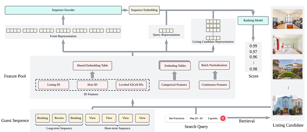
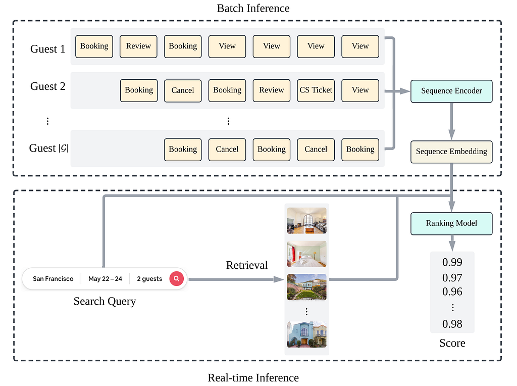
A guest’s interaction with Airbnb doesn’t pause to wait for a nightly batch job. Someone might browse a dozen listings on a Tuesday afternoon, run a new search that evening, and expect the next search to reflect the recent activity; it’s also to Airbnb’s benefit for that to be the case. In our previous post, Personalizing Airbnb search by learning from the guest journey, we described how we built a Transformer-based sequence encoder that creates better, more personalized search rankings for a guest using the booking, review, and browsing data that is most relevant to them — their own. That system ran as a daily batch job: each night it processed the previous day’s activity and refreshed embeddings for guests who had something new to show for it.
That design worked well, but it left a gap. Activity from earlier the same day wouldn’t show up in the embedding until the following day’s run, on top of the pipeline’s own processing lag — in practice, up to nearly two days of staleness. For a guest actively planning a trip, that meant the ranking model was often working from a slightly outdated picture of what they wanted, and the recent activities are often highly relevant to current search needs. This is a limitation that our original JourneyFormer research had already flagged as needing new serving infrastructure to solve.
In this post, we describe how we closed that gap by adding two new capabilities to Chronon, Airbnb’s feature platform: Near-real-time Model Transform and Push Mode. Chronon is an open source project, and these capabilities have been contributed back to our public repo.
Background
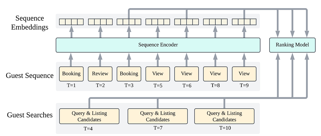
To keep a multi-layer Transformer off the critical serving path, our original design split inference into two stages. Offline, the sequence encoder would run as a scheduled batch job: each night, it would process the previous day’s guest activity and write a fresh embedding to a low-latency store for any guest who had something new to show for it. Online, retrieval was already real-time: the moment a guest ran a search, the ranking model read that guest’s embedding straight out of the store and combined it with the live query to score candidate listings.
This split kept serving latency low while still letting every ranking decision draw on years of guest history — but it meant an embedding was only ever as fresh as the last completed batch run.
Challenges
Moving from daily batch updates to near-real-time updates introduced three potential challenges that we needed to address:
First, staleness had two separate sources: the batch schedule itself, which only ran once a day, and processing lag within that job, which pushed effective staleness closer to two days. Fixing only one of these wouldn’t have been enough to fully close the gap; we needed a pipeline that could react to a guest’s activity as it happened, not simply run more often.
Second, our sequence encoder was built to run as a scheduled inference job over a full day’s snapshot of guest events, not as a service reacting to individual activity events one at a time. Wiring model inference into a real-time pipeline meant rethinking where and how the encoder got called, without duplicating the offline logic used for training.
Third, guest activity signals — page views, searches, and other interactions — arrive as independent event streams. Reacting to any one of them in isolation risked missing the fact that these events need to be merged with a guest’s longer-term profile and routed through the encoder consistently, so the resulting embedding stays comparable to the one produced by the batch pipeline it replaces.
Solutions
We addressed these challenges by building two general-purpose capabilities into Chronon, rather than by building a modified pipeline specific to our use case.
Push Mode in Chronon
The first is Push Mode. Chronon already runs streaming jobs that keep feature values up-to-date as new events arrive. Push Mode extends this by having a streaming job publish a lightweight notification as soon as it commits a new feature value, instead of waiting for something downstream to poll for it. This turns a reactive step into an event-driven trigger: the moment a guest’s activity feature updates, downstream consumers are notified and can act immediately. For our use case, this meant a guest’s newest search or listing view could kick off embedding generation right away, instead of waiting for a scheduled job to notice it.
Near-real-time model transform in Chronon
The second is Near-real-time (NRT) Model Transform, which lets model inference run as part of the same streaming pipeline. Historically, running a model meant either embedding its logic directly into application code or waiting for an offline batch job. NRT Model Transform lets Chronon call an already-deployed model — in our case, the same Transformer sequence encoder from the batch pipeline — directly from within the streaming flow, and write the result back as a feature value that is immediately available for serving.
Integration
Combining the two, our new pipeline works like this: a guest’s activity event, such as a page view or a new search, is captured by a streaming job that merges it with the guest’s existing long-term and short-term sequence data. Push Mode then signals that new sequence data is ready, and NRT Model Transform runs the sequence encoder over it, producing a fresh embedding without waiting for the next scheduled run. The embedding is written to the same low-latency store the batch job uses, so the ranking model retrieves it exactly as it always has — the only difference is how quickly the embedding it retrieves has been updated.
Because both capabilities live in the platform rather than in a use-case-specific pipeline, other teams working on different near-real-time use cases can build on the same foundation.
Results
The impact showed up on two relevant dimensions of our search results: freshness and quality.
On freshness, we replaced a pipeline where embeddings could lag actual guest behavior by roughly two days with one where the typical delay is well under a minute. In practice, updates often land within 10 to 30 seconds of the underlying activity. A guest who views a handful of new listings can now have that context reflected in their very next search.
On quality, offline evaluation showed a +1.67% improvement in Normalized Discounted Cumulative Gain (NDCG) over the daily-batch baseline — a large jump for a ranking system that has already been refined for over a decade, where even gains of a fraction of one percent are considered meaningful. Online A/B tests confirmed an approximately one-third of a percent increase in uncancelled bookings. This confirms something we suspected, but hadn’t measured directly: freshness itself is a meaningful source of ranking quality. The same guest representation becomes more valuable to the ranking model, and to the guest themselves, simply by being more current.
Rather than a one-off integration, Push Mode and NRT Model Transform represent general platform capabilities that we expect to serve as a foundation for other near-real-time modeling efforts across Airbnb. Since Chronon is open source, and since both features are already available in the public repository, their impact extends far beyond Airbnb. With these additions, any team running Chronon to build a near-real-time model is able to build on the foundation we’ve created.
Conclusion
Our previous post described how encoding a guest’s full history — their bookings, reviews, and recent browsing — allows our ranking system to better prioritize relevant listings based on current search intent. This post closes the remaining gap: making sure that understanding reflects a guest’s most recent activity, not just what they did as of last night’s batch run.
By combining Push Mode’s event-driven triggering with NRT Model Transform’s in-pipeline model inference, we turned a daily batch process into a near-real-time one, cutting effective staleness from roughly two days to less than a minute, and improving offline ranking quality by +1.67% NDCG in the process. More broadly, the pattern we used here: react to an event, merge it with existing state, run inference immediately, and serve the result; is one we expect to generalize to other guest-facing models that depend on freshness.
You can learn more about our team’s work on personalization and search ranking by checking out our previous post on sequence modeling the guest journey and other engineering blog posts from Airbnb. To learn more about Chronon, check out our previous blog posts on the project, and browse the code at our repo: https://github.com/airbnb/chronon.
Interested in learning more about our technical journey? Browse our previous publications to see how our systems have evolved. If tackling these kinds of challenges excites you, explore our open roles.
Acknowledgments
We would like to especially thank the following people for their great collaboration (listed alphabetically): Ashish Jain, Ben Mendler, Bin Xu, Casey Getz, Gil Forsher, Han Zhao, Hao Li, Jiawei Yao, Jun Shi, Kedar Bellare, Linyun He, Liwei He, Michael Kinoti, Michael Sestito, Mingyang Xu, Pallavi Adusumilli, Ruirong Yang, Shashank Dabriwal, Sid Reddy, Sophie Wang, Tanya Piplani, Tracy Yu, Vijay Velagapudi, Xiaowei Liu, Yangbo Zhu, Yan Zhang, Yi Li, Yiwei Wang, Zach Barahal, and Zhiwei Wang.
All product names, logos, and brands are property of their respective owners. All company, product, and service names used in this website are for identification purposes only. Use of these names, logos, and brands does not imply endorsement.
How Airbnb’s agent harness transforms unstructured data exploration by encoding scientific methodology into scalable, reproducible, and audit-ready infrastructure.
Ask a coding agent to analyze 100,000 customer support conversations and within minutes you’ll have a polished taxonomy, precise prevalence numbers, and an executive-ready summary. What you can’t see is the investigation that produced them: the methods it chose, the evidence it weighed, how much to trust it, or whether a second request would agree. All that reaches you is the polish. The model is undeniably intelligent, but intelligence without methodology is not science.
LLMs certainly make for confident scientists, but we need them to be responsible ones. Smarter models help, but intelligence has never been the whole of science, in people or in machines. The method is as much the product as the answer. That is the idea behind the agent harness we built for data science: the methodology itself, built as infrastructure around the model. It governs how an AI agent operates, from framing a question to selecting evidence to recording decisions, so results can be reproduced, audited, and challenged, and the method shared, inspected, and built on.
The challenge of unstructured data exploration
In 2025, Airbnb was preparing to launch an AI customer service assistant. Before it could ship, we needed to understand exactly what kinds of situations it would face in the real world. That included rare events that could be risky for AI to interact with, and involved examining their taxonomy and prevalence to create the datasets that would help us build a more responsible product.
The investigative work to do this was rigorous, but the process was deeply artisanal. Months of high-touch iteration went into each investigation, from finding the right data, reviewing samples with experts, and generating representative datasets, and the method was manually curated across notebooks, tables, docs, and individual judgment.
This was fine for one investigation — but as we carried the same investigation into new languages, new geographies, and new LLM-based products at a near-weekly cadence, the workload outgrew the process. To bring the same rigor, thought, and quality at this new pace, and involve more people, we needed to make each investigation less bespoke. In short, we needed a way to replicate the methodology itself.
Insight Miner: Agent harness for unstructured text understanding
Insight Miner starts with the engineering (the queries, the scaled labeling and embedding, the clustering and tracking), so that no one has to learn new infrastructure to run analysis at scale. The core method is well established: extract, embed, cluster. Around that core we assembled the methods we had come to rely on, drawn from internal investigations and industry research: prompt tuning, hard-example mining, contrastive labeling, and how to start with unsupervised exploration then mature into classification. These pieces used to live in separate notebooks, manually iterated and shared by copy and paste. Now they are in one shared package, which gets updated whenever an individual investigation teaches us a better technique.
An investigation begins with a research question in a chat session, with an agent that is at once research partner, executor, and expert in the methods the harness holds. Insight Miner isn’t tied to a single dataset, domain, or question: it runs over any unstructured text source, through whatever lens the question needs, with the same rigor behind every investigation.
As we expanded our community support AI assistant to new languages and countries, we used Insight Miner to carry out investigations that used to take months in just a matter of days. But its bigger impact was ensuring that rigor and speed both increased, instead of trading off.
With this harness, data scientists were able to shift their focus from executing analyses to improving the techniques used for each step of the process. Because the mechanical parts of investigations can scale and parallelize, we are able to spend more time on the careful parts of an investigation: directly inspecting the most ambiguous or strategic data that helps us deeply understand the product, testing hypotheses and groupings, and building a robust qualitative and quantitative understanding of our data and products. Rather than automating analysis, we’re increasing the amount of human judgment in the most strategic parts of it.
Going beyond technical teams
Insight Miner was initially designed as a tool for data science teams. However, it quickly evolved beyond that: a year in, dozens of teams are using it for hundreds of types of investigations. In fact, it has more users outside of technical roles than within them, with a particularly heavy representation among operations and product-insights teams. A UI to make data exploration and agent conversations more accessible further increases expert participation.
Subject matter experts who have never written a line of code have been able to directly conduct scaled analyses rather than waiting on scarce eng or DS resourcing. Projects that were previously unresourced or were informed by the manual review of hundreds of examples can instead use our shared best practices and work across several orders of magnitude more data. Use cases span coding open ended survey answers, evaluating model performance, understanding fraud patterns, and many more.
A new category of infrastructure
Harnesses like Insight Miner are full-stack systems, a new type of infrastructure that must be developed, maintained, evaluated, and continually improved. This type of work is a natural fit for other agentic systems. For Insight Miner, separate agentic systems help us update instructions for new model releases, fold in new best practices, review live use to identify pain points, and watch for, reproduce, and propose fixes for new bugs. These systems form a larger agentic environment reshaping our day to day work in domains well beyond just data science.
A harness can be useful wherever experts carry a methodology worth encoding: legal review, policy analysis, any field where the method is as much the product as the answer. Such systems are critical to adopting AI-first knowledge work. Our CTO has written that as models commoditize, what endures is proprietary data, deep workflow integration, and above all taste. A harness is where all three accumulate. Expert taste becomes the method every team runs, the workflows deepen with every adopter, and the feedback loops are built in: every run can leave the harness improved for everyone.
If this type of work interests you, check out some of our related positions!
All product names, logos, and brands are property of their respective owners. All company, product, and service names used in this website are for identification purposes only. Use of these names, logos, and brands does not imply endorsement.
Project Lighthouse — Part 3: Introducing project-lighthouse-anonymize
The data in Project Lighthouse is powered by privacy-preserving anonymization code. We’ve put this code into open source, and published two new technical papers detailing the scalable algorithms and data quality frameworks behind it.
In 2020, we launched Project Lighthouse, which we developed in partnership with leading civil rights and privacy organizations. As our 2020 announcement details, Project Lighthouse enables us to measure potential disparities in user experiences. This work uses perceived race data that is never linked to individual accounts; we only use this data for measuring potential disparities, and users who want to opt-out can do so by turning off the data use settings in their account’s Privacy page. Our results, shared in 2024, demonstrate how we use these analyses to measure our progress in mitigating those disparities.
Earlier this year, we open-sourced project-lighthouse-anonymize, the Python library that powers Project Lighthouse’s anonymization process. To provide the full technical foundation for this work, we also published two new papers on arXiv alongside the code release. Together with our original 2020 paper, these three papers form a complete story: the foundational methodology, the scalable implementation, and the quality validation framework.
The foundational methodology (2020)
Our original 2020 paper established the privacy-by-design approach for Project Lighthouse and provides the rationale for choosing k-anonymity as the technical privacy model to prevent sensitive attribute disclosure at scale. For an introduction to this paper, see our first blog post on p-sensitive k-anonymity and our second blog post on measurement with anonymized data.
Extensible architecture, using the Strategy Pattern to support k-anonymity and future privacy model extensions
Parallel processing, with a hybrid recursive-queue execution model (combining immediate recursive processing for small partitions with queue-based parallel processing for large partitions)
Other enhancements, including NaN-pattern pre-partitioning (accommodating missing values) and dynamic suppression budget management
This algorithm enables scalable anonymization of large datasets while preserving the ability to use the underlying data for statistical analyses.
Measuring Data Quality for Project Lighthouse (2025)
The second of the new papers, Measuring Data Quality for Project Lighthouse, addresses a critical question: how do you know if your anonymized data are “good enough” for your analysis?
The paper introduces a comprehensive framework for measuring data quality under anonymization, including:
Three primary metrics:
Pearson correlation (preserving linear relationships between original and anonymized values)
Revised Information Loss Metric or RILM (measuring how well the “shape” or geometric size of data is preserved — higher scores mean less distortion)
Normalized Mutual Information v1 or NMIv1 (measuring entropy preservation, essentially how much information content is retained)
Empirical validation methodology: We reframe data quality assessment as a machine learning classification problem, using synthetic datasets to validate that our metrics and thresholds successfully predict when anonymized data will produce statistically valid results
Default thresholds: The paper and library include the specific threshold values we use for Project Lighthouse, which may serve as useful starting points for others implementing similar systems
This framework enables analysts without deep anonymization expertise to confidently assess whether their anonymized data supports valid statistical conclusions.
We continue to invest in trying to combat potential discrimination and bias users may face when using Airbnb, and in taking steps to enable everyone in our global community to use and enjoy Airbnb. We believe that doing so requires transparency in our methodologies, both to build trust with our users and to encourage other companies to do the same.
If this type of work interests you, check out some of our related positions!
Acknowledgements
The Airbnb Anti-discrimination & Equity team is Adam Bloomston, Elizabeth Burke, Megan Cacace, Anne Diaz, Wren Dougherty, Matthew Gonzalez, Remington A. Gregg, Yeliz Güngör, Eeway Hsu, Heesoo Kim, Sara Kwasnick, Joanne Lacsina, Demma Rosa Rodriguez, Adam Schiller, Jessica Simon, Maggie Tang, Skyler Wharton, Marilyn Wilcken. I also want to thank Natalija Fijacko, Lauren Mackevich, Laura Rillos, Jessica Simon, Floyd Smith, and Lei Wei for their role in refining and improving this blog post.
The author acknowledges the use of Large Language Models (LLMs) for assistance with literature review, technical writing, and editing.
All product names, logos, and brands are property of their respective owners. All company, product, and service names used in this website are for identification purposes only. Use of these names, logos, and brands does not imply endorsement.
The Forecasting Data Science team at Airbnb produces many of the forecasts the rest of the company plans around: demand, bookings, cancellations, and a range of finer cuts by market and segment, refreshed continuously across thousands of markets. The targets differ, and the models differ, but they have one thing in common: Other teams build on top of them.
This means a forecast that is casually wrong is not a clean miss, as it might be in an academic setting. That’s because a small bias does not stay small once a lot of decisions are riding on it. So when one of those forecasts starts to drift, what to do about it is not really a methods question. It is a risk question, and an easy one to get wrong, which we have from time to time.
One of these forecasts had been missing, compared to what actually happened after the forecast was released, in the same direction for a couple of quarters. This bias persisted after several routine refreshes. The usual solution would be to fully retrain the model: pull in the recent data, refit the model again, and ship. But we wanted to understand the source of the bias, rather than simply hoping an update would eliminate it.
The easy mistake is treating the choice to “retrain” a model as a single action. It is three separate actions — refitting, respecifying, or holding — and none of them is particularly similar to the others.
Refitting is the cheaper option. Same model, same structure, same features, updated with newer data. This is what most people mean by “retrain.” For the ordinary drift that builds up in a model as the world moves on, it’s usually the right choice.
Saying that this is the cheaper option is not the same as saying that it’s cheap. A refit still has to be validated and shipped. The refitting process can degrade a model that was actually fine if the recent data happens to be unusual. And, given the importance of the production forecast, every refresh is a small risk you are choosing to take. It is the least expensive of the three options, but not a free one. None of this is an argument against refitting. On most cycles it is the right move, and if we had to run one of the three blind, it would be this one. The claim is narrower. A refit is a decision with a price, and pricing it is what lets you notice the cycles where a different option was worth more.
Respecifying is a different animal. You change the model itself: add a feature, drop one, change the structure, the priors, the likelihood. On the production forecast, which so many of our teams plan around, this is a real commitment; you are replacing something you understand, and have watched the behavior of for years, with something partly new that you have not. It is also where almost all the actual improvement lives. Refitting keeps a good model current. Respecifying is how a model that is in some way wrong in its operations is made right.
Holding is the one nobody likes. You look at the miss, decide it does not warrant action, and leave the model alone. This takes the most nerve, because to anyone watching the forecast it looks like you are ignoring a problem. On a forecast that people are relying on, “We decided to do nothing” is a hard sentence to say out loud. It is also, more often than you would think, the correct call.
What we have learned from years of running these models is that the trouble comes from filing all three under one verb. “We should retrain” gets said when any of the three is the actual answer, and the word drags everyone toward the one that feels cheapest, because it is the one with a name.
Most of the time, though, nobody says it at all. Retraining is rarely a decision someone makes because a model is drifting. Retraining runs on a schedule, monthly or quarterly, by convention, because a standing cadence is one less thing to think about. Which means the choice among the three is hardly ever made on purpose. The cadence makes the choice in advance, every cycle, and the cadence always picks refit.
Three ways to hold on too long
Each of the options contained in the term “retrain” — refit, respecify, or hold — has a matching failure, and underneath each sits the same mistake: a model holding onto a shock, or a surprise, after the cause of the shock or surprise is no longer relevant to forecasts. That mistake can grab a blip and treat it as the new normal; keep a crisis assumption after the crisis is over; or build the shock so far into a new model that the model can never move past the shock.
Chasing noise. A forecast misses for a quarter, the residuals look alarming, and someone asks whether we should update the model now rather than wait for the next scheduled run. That impulse is the failure, and it is a specific one. What triggers an off-cycle refit is always a surprise, which means the window you are rushing to absorb is the window you understand least.
A couple of years ago one of our markets ran hot for a quarter against the published forecast, because a large event landed on the calendar and pulled a wave of bookings forward. We refit early. The model took the unusual quarter as the new level, the next two forecasts came in high, and it settled only once the event aged out of the training window. Waiting for the cadence would have meant fitting that spike alongside the quarters that came after it, rather than as the last thing the model saw, which is a much weaker pull.
Figure 1. Illustrative shape of the failure. A one-off spike sits inside the model’s normal range, so holding keeps the forecast on track, while refitting on the spike pulls the model toward it and gives back several quarters of accuracy. The same refit on an ordinary quarter would have cost nothing, which is what makes the reflex hard to see. Synthetic data.
Carrying ghosts. The quieter error, and the opposite mistake. A structural assumption that was true during a shock stays switched on long after the shock has passed, hidden behind a run of refits that all look like routine maintenance. We have had one of these hide in plain sight. During the worst of the COVID disruption, cancellation timing shifted in a way it never previously had, and the model learned from it. Market behavior came back to normal well before the assumption did, and since every refit looked clean, the stale piece sat there until the forecast had leaned the same way for long enough that someone went looking, found the lean baked into the model, and respecified the model to wring out the now-faulty assumption.
Figure 2. When the structure cannot anticipate a turn, refitting only chases it: each quarterly refit lands below the new trend, and the residuals stay one-sided, the signature of a structural problem a refit cannot fix.
Respec-as-panic. The failure of overcorrecting. Something genuinely moves — a foreign exchange rate (FX) swing from a major source market, a regional disruption that reroutes demand — and the reflex is to rebuild. A fresh model, new structure, stood up under deadline.
We have caught ourselves reaching for this solution. An FX move on a major source market threw one of our forecasts off for a couple of months, and the first instinct was to stand up a new model around the new regime. We widened the priors instead, the existing model rode it out, and we avoided a move to a more fragile model, tuned in response to a shock that was already on its way out. (Figure 3)
Figure 3. A temporary shock clears on its own; widening the prior lets the existing model ride through it, while a full rebuild fits the shock and carries new volatility forward.
How we decide now
The rule we now hold to is easy to state and hard to follow. On a standing cadence, the question of whether to retrain mostly answers itself. So the question that matters is which of the three options a given miss calls for: refit, respecify, or hold? And the right answers turns on what changed.
If the process generating the data is still the one the model assumes, and the parameters have just drifted, refit. The structure is fine, it just needs current numbers.
If the process has changed in a way the model cannot represent no matter how you estimate it, respecify, because fresh data cannot help a model being asked to describe a world it has no language for. The tell is direction: a misspecified model misses the same way over and over.
A respecify can cut both ways. It can add structure the model was missing, the way borrowing across geography did after 2020, or it can take structure out, retiring an assumption the world has outgrown.
The second kind is the forgetting, and it is the one teams skip, because adding feels like progress and removing feels like giving something up. But it’s an important tool to remember, and to use, whenever needed.
And if the miss sits inside the range the model already calls normal, hold. In practice this usually means declining to refit off-cycle, on the theory that a surprise you cannot yet explain is the worst possible reason to move a model early. The cadence will get to it. Skipping a scheduled refit is the rarer and more expensive version, since stale parameters have a price of their own, and it is worth it only when you can name the thing in the window that you do not want the model to absorb.
Figure 4. The same decision as a quick triage. The question is never whether to act, but which of the three moves the situation calls for.
There is a more formal version of this that we have written up separately [1][2]. The one-line version is that updating is not free: moving a model toward new data costs something, staying put costs something, and the call is a comparison of the two, at the level of parameters and again at the level of structure.
In production, running real forecasts, the math is not what we reach for. We reach for the three questions above, in order.
The time we got it right
The clearest case we have of making this call correctly is the one from our second post on the Covid era, seen through this lens.
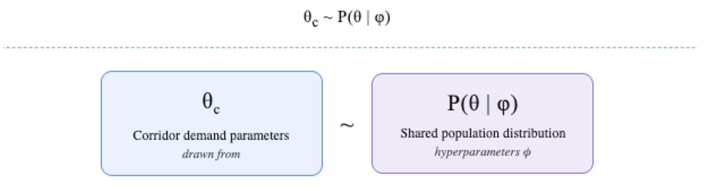
Before 2020, our destination-market forecasts leaned on a hierarchy. Markets with long, stable histories anchored the estimates, and other, “thinner” markets borrowed strength from them, on the assumption that a destination behaves like comparable destinations elsewhere. The borrowing was the structure, and for years it was true enough to be both invisible and unquestioned.
COVID broke the assumption, not the parameters. The shock was larger than anything we had previously experienced. Recovery did not arrive everywhere at once, or in the same shape. Some markets came back fast, while others stayed flat for quarters. Markets s that used to move together were suddenly on different paths. As a result, the “borrowing” of one market’s stability, by other markets that had previously tracked it, which had previously stabilized the forecasts, was now contaminating them. Markets were being pulled toward a kind of average that no longer described any of them.
The instinct was to refit our models with new data, and we tried that. It failed in a way that turned out to be the whole lesson: the estimates did not just shift, they went unstable, swinging quarter to quarter as the model tried to reconcile markets that no longer belonged in the same pool. Over the recovery window, the refit-only error ran about three times the pre-shock baseline, and it would not settle as new data came in.
That instability was the signal. A parameter problem gets noisier at the edges, but holds its shape; this was the shape itself coming apart, which is what a structural problem looks like.
Figure 5. Why pooling broke, and why respecifying fixed it. Left: two markets that used to move together take different recovery paths, so borrowing strength across them now hurts. Right: forecast error over the recovery window; refitting stays high & unstable; changing what the model borrows across brings error back toward the pre-shock baseline.
The fix was a respecification, which is the subject of the previous post, so in one line: we changed what the model borrows across. Instead of pooling by a fixed hierarchy, the prior borrows along geographic adjacency and shared recovery dynamics, so a market draws strength from places actually behaving like it today, rather than places it used to resemble before the crisis. On a held-out recovery window, the respecification cut error by a little over half against refitting, and brought it back to within a couple of points of the pre-shock baseline.
The point for this post is that our new framework, which gives a prominent role to holding, would have told us not to refit. That would have prevented the failed refit that generated so many errors.
The miss was directional, not noisy, so it was not a hold. Fresh data made it worse, not better, which is the signature of a problem in structure and not in parameters, which indicated that the remedy was not a refit. What was left was to respecify.
We got there by trial, and errors, that time. The reason to write the decision down is to get there without the trial the next time, on a forecast where the trial costs a quarter of accuracy that other teams feel downstream.
Why this is hard on forecasts that carry weight
None of this is hard to understand. It is hard to do, and it is hardest precisely on the forecasts that matter most, for three reasons that we keep running into.
Holding looks like negligence. When a forecast a lot of people watch is missing, “We are choosing not to act” is an unpopular thing to say, and the pressure is always toward visible activity. Instead, when we hold, we use the modern, Buddhist-adjacent maxim: “Don’t just do something; sit there.” Refitting, on the other hand, is visible activity. It photographs well even when it is wrong.
Respecifying is expensive, and a little frightening. Replacing the structure of a model that has produced reliable numbers for years means giving up something you understand for something you do not understand yet, and the cost of being wrong is not abstract. That fear is healthy, and it is also why teams under-respecify and let ghosts accumulate.
And the last few years trained the wrong reflex. Forecasting through COVID meant changing models under real pressure, often correctly. Coming out the other side of the pandemic, a lot of teams kept reaching for the rebuild when a refit would do, while leaving pandemic-era assumptions switched on because nobody wanted to touch a model that had survived.
The same period produced both the panic and the ghosts. The discipline now is not how to react fast. It is how to tell the three options apart again, with time to think, on models where being repeatedly wrong is expensive.
Learning to forget
Refitting keeps the model current. It does not keep it honest. What goes stale is not the numbers but the assumptions underneath them, and those are exactly what a refit leaves alone.
A shock makes you add structure to cope: an elevated risk, a wider band, a special case for a world that has stopped behaving. Taking that structure back down once the shock has passed, before it quietly biases everything downstream, is harder than any retrain. It rarely has a deadline. Nobody schedules it.
A good forecasting team doesn’t just learn from shocks. It learns to forget them, when needed, on purpose.
If this type of work interests you, check out some of our related positions.
Acknowledgments
Thanks to Liz Medina, Jess Needleman, Linhan Liu, and Flavio Stanchi for building and improving the forecasting systems described here, and to Peter Coles, Yuanyuan Cui, and Adam Liss for their support of this work and its publication.
Harrison Katz leads Finance Data Science & Strategy at Airbnb. His research focuses on Bayesian methods for compositional and hierarchical time series, Bayesian decision theory, & forecast governance.
All product names, logos, and brands are property of their respective owners. All company, product, and service names used in this website are for identification purposes only. Use of these names, logos, and brands does not imply endorsement.
Rebuilding login and signup surfaced product insights, not just technical challenges. Here’s how we designed Flexible Authentication at the intersection of product intuition and technical architecture.
For Airbnb, logins at irregular intervals are normal. A guest books a trip in January and may not open the app again until summer. A host checks back only when a reservation comes in, and may be busy with other activities when it does. For a two-sided marketplace where a failed login means a lost booking, and lost revenue for both the guest and the host, long gaps between sessions are a structural challenge, not an edge case.
Our authentication system had grown organically over a decade, adding new login methods like Social Login, Email OTP, and Phone over time. We recognized that our users have diverse needs: many, such as hosts, use Airbnb daily, while others visit less frequently, when they are planning trips or traveling. To provide a seamless experience, we needed to ensure we were doing a great job supporting all of these usage patterns, helping users pick up exactly where they left off, regardless of how much time had passed or which device they were using.
In this blog post, we’ll walk through how we rebuilt Airbnb’s authentication flows using a new paradigm we call Flexible Authentication, and how each architectural decision was guided by insights into the user’s experience.
Identify first then Challenge
The ‘Identify first then Challenge’ model was the product insight that reframed the project. Our old system treated authentication as a single question: can this person prove who they are? The real question is more nuanced: given the multiple aspects of the user session, what’s the easiest way for them to verify it?
A traveler in Brazil who registered with a phone number is better served by a WhatsApp one-time password (OTP) than by SMS, since WhatsApp penetration far exceeds SMS in this market. A returning host in South Korea is better served by their Naver login, the leading South Korean identity provider, than by their Google ID. The right challenge depends on the person and context.
Based on this insight, we adopted an Identify first then Challenge model that splits the flow into two distinct stages. First, the person tells us who they are, using whatever method they want. This may be an email address, phone number, or social login. Once we know which account they are trying to log in to, a configurable policy engine picks the challenge that is most likely to succeed. We lead with that challenge and offer all other options as fallbacks.
“Identify first then Challenge” model diagram.
The policy engine can use all available aspects of the user session and the account they are logging into, including historical information, to pick the challenge most likely to succeed. We have only started to scratch the surface of optimizing this policy engine.
The key architectural decision is that the client never decides which challenge to present. The server makes that call, and the client renders whatever screen it receives. This separation lets us tune authentication strategy per-region without shipping new client code across the many devices Airbnb guests and hosts use. This has made experimentation much easier.
Try another way
Our old system had a frustrating failure mode: if you couldn’t complete the challenge presented to you, you were stuck. Forgot your password? You could reset it, but the reset flow was its own journey with its own drop-off points. Couldn’t receive an SMS? Tough luck, go back and enter your email so you can try password login instead.
The product team articulated a principle that became a hard engineering requirement: every authentication screen must offer an escape. No dead ends. If someone can’t complete the primary challenge, they should always see a “try another way” option with all other options they can use to log in.
Every challenge screen has a “Try another way” button that allows the user to select other challenges.
We built this as the Challenge Picker, a server-driven component that accompanies every challenge screen. The server returns not just the primary challenge but a ranked list of alternatives, ordered by predicted success rate for that person’s context. The ranking considers what the person has successfully used before, what methods are registered on their account, and what’s available on their platform. When someone taps “Try another way,” the flow doesn’t restart. It adapts.
Moving faster than our client release cycles
This insight came from a pattern we kept seeing: we’d identify a potential authentication improvement, build it, then wait weeks for app review and rollout before we’re able to even start an experiment. For a flow as critical as login, that feedback cycle was unacceptable.
The solution was to make the authentication experience fully server-driven, with the screen as the fundamental unit of abstraction. Each step (identifier input, challenge, account picker, or error recovery) is a screen defined entirely by server response. The client is only required to serve as a thin renderer that knows how to display a set of screen types and send actions back, with no opinion about sequence, copy, or flow logic.
Because our screens are defined by a server-side schema, our clients (Web, iOS, and Android) can use automatically generated type definitions. This setup ensures engineers can catch mismatches between client code and server requirements immediately during development.
Results
Our former approach had much of the authentication logic on the client. Airbnb supports nearly every client type that there is, so this approach presented many challenges, including anticipating various challenges and reproducing bugs reported across many different kinds of clients. So keeping authentication logic on the server was a big change for us, and it had many beneficial effects.
As we implemented this change, the first thing we noticed was how much code disappeared. By moving screen sequencing and flow logic to the server, our client state management became much simpler. Our transition to a server-driven model allowed us to not only remove client-side logic but also streamline design systems and server-side localization. Together, these initiatives drove a 60% reduction in code and a 100KB reduction in the web client bundle. A smaller bundle is its own win for people on slow connections and constrained devices, but the leaner client mattered most for what it let us do next.
That leanness bought velocity. When the rules that govern a flow live behind a server response rather than inside a shipped binary, changing them no longer requires on-app review and staggered rollout. In the three months since launch we’ve run 20+ experiments against the new flows, and for most that did not require client changes, the turnaround between an idea and a measured result collapsed from weeks to days. We achieved considerable success with the initial launch, and we have been able to iterate quickly on new ideas and changes since them.
The numbers we care about most here are the ones people feel. Time to login has dropped significantly as the flow now leads with the challenge most likely to succeed, instead of one we’d hard-coded in advance. With fewer dead ends, and with a fallback always within reach, the share of visitors who successfully authenticated has risen by 2.6%, from an already high base, which is an improvement that affects millions of sessions. Outages that prevent one challenge from working no longer block users, because they can easily find alternatives.
Because more returning people find their way back into their existing account, the rate of duplicate accounts has fallen by 27%, which keeps trip history and reservations intact across sessions. And as more of those journeys are resolved through challenges a person can actually complete, we send fewer one-time SMS codes, cutting OTP costs by roughly 11%. None of these changes happened in isolation; a faster, more forgiving flow is the same flow that reaches more people, fragments fewer accounts, and spends less in doing so.
Conclusion
There’s a constant flow of new devices and potential new ways to authenticate, and we are always looking for ways to make authentication easier. So Flexible Authentication is a framework for continuous product improvement, not a finished product.
The broader lesson for teams building authentication at global scale is that product insights and engineering architecture aren’t separate concerns. Identify-then-Challenge, the Challenge Picker, and server-driven screens are each direct expressions of our beliefs about how people behave when they’re trying to log in. The architecture’s flexibility, namely its ability to adapt per-region, per-experiment, and eventually per-person, comes from giving the server authority over decisions the client used to make. That pattern generalizes: for any flow where context determines the right experience, moving the decision boundary off the client unlocks the iteration speed needed to act on what you learn.
Interested in working on systems that serve hundreds of millions of people worldwide? Check out our open roles.
Acknowledgments
Flexible Authentication was a cross-functional effort spanning engineering, product, design, content, and data science. We’d like to thank the Identity and Authentication team for building and shipping the system, the product and content design teams for the principles that shaped the architecture, and the data science team for building the measurement infrastructure that lets us keep improving.
This project was a collective effort, shaped by the ideas, care, and hard work of several people. Thank you to everyone who helped bring it to life: Susan Stevens, Husayn Abdul Hakeem, Katie Ta, Nathanael Ji, Miyuan Zhao, Jordan Smith, Antonio Fuentes, Gloria Yang, Tan Tho Le, Kush Baldha, Evan Krasts, Jacob Parsons, Xiao Li, Tatu Sacheri, Jack Bao, James Zhan, Brandon McQuarie, Renal Khabibulin, Alice Lew, Alan Yao, Jing Liu, Chloe Fan, Beth Soucy, Vicki Siolos, Emily Kellner, Gabiella Lalli Martins, Christian De La Paz, Jill Peloquin, Sai Vinay, June Woo Suk, Sindhu Ravichandran, Richa Khandelwal, Arjun Kumar, and Pat Moynahan.
All product names, logos, and brands are property of their respective owners. All company, product, and service names used in this website are for identification purposes only. Use of these names, logos, and brands does not imply endorsement.
Generative AI breaks a lot of the assumptions that used to hold true for software testing. Unlike traditional software, LLM outputs are non-deterministic, and “correct” is subjective. Because so much judgment is involved, you often need an AI to evaluate an AI, which introduces its own potential failure modes. Making matters more complicated, a single interaction with an LLM can chain retrieval, reasoning, tool calls, and generation, each of which can fail independently.
At Airbnb, we build LLM-powered features across our product, with recent launches including review highlights, AI customer support, smart communication features for guests and hosts, and more. Behind the scenes, we also use AI to help us spot trends and understand what’s working, guiding where we improve the product next.
Each product team may have its own evaluation criteria, process, workflows, etc. However, these are built on top of some common foundations and principles. An infrastructure team provides tooling and best practices, incorporating learnings across domains so that they are shared with everyone building products at Airbnb.
In this article, we wanted to share some of these best practices and learnings with the broader engineering community. Please note that the recommendations here are not intended to be prescriptive; there is no one-size-fits all approach when it comes to running evals.
1. Foundation
Evaluating LLM-based systems is challenging work, and this should be planned for at the outset. Without a deliberate strategy, three things tend to happen:
False confidence: A generic “helpfulness” metric scores well, you ship, but it didn’t capture the failure mode people actually hit.
Undetected regressions: A prompt change subtly degrades a dimension you weren’t measuring.
Wasted effort: You build a scaled eval pipeline for metrics that don’t correlate with outcomes.
Expect to spend a meaningful share of your total project effort on evaluation. This is not unnecessary overhead, it’s how you build products that actually work.
1.1 The one rule
When in doubt, look at your data. Manually reviewing your data and building an intuition for what counts as success is always the starting point we recommend to teams. Build your prototype, and run it through 100 examples (synthetic is fine). Then read the outputs. Read the traces and find the model’s mistakes. Categorize them and build an eval.
This single habit will do more for your product quality than any framework, tool, or methodology in this document.
1.2 Eval-driven development
Formalized, that habit becomes eval-driven development (EDD), the GenAI analogue of test-driven development. Rather than predicting every failure upfront, EDD builds the infrastructure and habits to discover, encode, and continuously test for failure modes as they appear. It also forces stakeholders to externalize what “good” means, which shapes the product roadmap.
Five principles anchor EDD:
Define goals and gates upfront. What are you optimizing for? What must be true before you ship? These answers may not be clear right away; you might discover them as part of your data exploration.
Let real errors guide your metrics. Co-develop them with cross-functional partners based on observed failures. Don’t invent them in a vacuum.
Keep your evaluator set small and sharp. 3–5 well-calibrated LLM-as-judge evaluators beat 20–30 noisy ones. Each should target one specific correctness dimension.
Appoint a decision-maker. While what constitutes correctness should be a team discussion, people will sometimes disagree. Include a final (human) decision-maker who makes the ultimate call on what constitutes good vs. bad system behavior.
Collaborate continuously. Have your product partner regularly answer: “Is X better or worse than Y?” and “What’s actually wrong with this output?”
2. The three evaluation methods
Every evaluation you run will use one or a combination of these three methods.
Layer 3: Human evaluation (high resource - validates edge cases, calibrates the stack)
2.1 Programmatic & heuristic metrics
Deterministic, code-based checks that don’t require an LLM call should be your first filter, catching obvious failures before you send anything to a judge or human labeler.
✅ Do: Use structured outputs (JSON schemas) to ensure strict typing.
❌ Don’t: Rely on prompt instructions alone to format data. This breaks downstream data pipelines.
2.2 LLM-as-judge (Virtual judges)
Use a stronger LLM to evaluate another LLM’s output against a carefully designed rubric. This is how you assess nuanced qualities e.g. tone, coherence, faithfulness, relevance, at a fraction of the resources needed for human evaluation.
Rubric design matters. Ambiguity is the enemy. Something like “Is the provided explanation readable and up to our standards?” isn’t likely to be effective — if a human can’t apply the rubric consistently, an LLM certainly can’t.
Here is a simplified example of a single virtual judge’s rubric:
Score the readability of listing explanations. A good explanation sounds
like a friendly travel agent: warm but professional,
simple, natural, grammatically complete.

Score 1 if it reads cleanly.
Score 0 if it has ANY of these problems:

- Tone: too formal/jargony, too casual
("awesome vibes"), too salesy ("amazing!"), or robotic.

- Internal terms: never use internal terminology.

- Formatting: no quotation marks, no bullets, no fragments. End every
explanation with a period - never "!" or "?".

- Grammar: use articles/determiners/prepositions for natural flow
("this home has a pool", "close to downtown"). In a series, use the
article once then drop it: "a backyard, grill, and kitchen" - not
repeated, not omitted entirely.

- Complexity: plain words over jargon ("pool" not "aquatic recreation
area"; "near" not "proximate").

Examples:
- "Host mentions a pool and hot tub available near downtown." → 1
- "The listing mentions a pool!" → 0 (internal term "listing"; ends in "!")
- "This domicile encompasses aquatic amenities." → 0 (complex words; jargon)

Return ONLY:
{
"reason": "<list of [error_type, explanation] tuples as a string, or []>",
"score": <1 or 0>
}
2.2.1 Calibration: Making your virtual judge trustworthy
A virtual judge that hasn’t been calibrated is worse than no judge at all, because it gives you false confidence. Here are the calibration steps we recommend:
Create a golden dataset of 50–100 examples. This MUST include bad examples (not just good ones).
Run your virtual judge against the golden set.
Measure agreement. Target percentages in the high 80s-90s. Possible options to measure disagreement are Cohen’s kappa or Krippendorff’s alpha. (Perfect agreement isn’t achievable — even humans disagree.)
Analyze disagreements. Refine the prompt and update your few-shot examples. Then re-run the loop until you hit the target agreement.
Recalibrate periodically as failure modes evolve.
2.3 Human evaluation
Human judgment remains the gold standard for ground truth, high-stakes domains, and resolving disagreements between automated evaluators.
2.4 Evaluation scenarios and recommended methods
Overall, the rule of thumb is to start with 20–100 rows labeled by subject-matter experts. Move to a scaled annotation workforce only when the rubric is rock-solid and volume is the bottleneck.
And if your experts disagree on a label, stop. Solve human disagreement before automating anything.
3. Evaluating agentic systems
Agentic systems involve multi-step reasoning, tool calling, branching logic and intermediate state transitions. Evaluating only the final output is insufficient: a correct final answer can mask a broken reasoning path, wrong tool parameters, or an inefficient trajectory.
Therefore, you will need to evaluate across three layers:
To achieve this, you can take advantage of the fact that an agent generally pushes traces and spans under an application root. This contains information about the type of agent, the sub agent if invoked, input/output of the agent, tools invoked if any, and more. These traces can be written out to an observability platform or persistent storage.
Then, you can use DFS or another type of tree traversal to reconstruct the trace in memory. This lets you ensure certain subagents were invoked at the right time, the agent called the right tools, etc. And you can scope your evaluation to specific agents/subagents.
4. A practical walkthrough
Here’s what the full process looks like end-to-end, using a fictionalized and simplified version of a real use case.
Scenario: You’re building an AI assistant that answers questions about a travel platform’s support policies.
Step 1: Explore & discover. Run 100 inputs through your prototype and read every output. You find:15 responses generated policy details not in the source documents (faithfulness issue); 8 correct but too verbose (conciseness); 5 refused valid questions (over-refusal); 3 had broken JSON (format).
Step 2: Build evals. Add programmatic checks for JSON validity and length bounds. Write a virtual judge for faithfulness (separate prompt, different model, chain-of-thought) and another for conciseness. Have your PM or subject matter expert label 60 examples, including failures, as a golden set.
Step 3: Calibrate & iterate. Your faithfulness virtual judge agrees with the PM 78% of the time. Not good enough. Analysis reveals the judge is penalizing accurate paraphrases as “unfaithful.” Update the rubric and add few-shot examples. Agreement jumps to 88%. Improve the retrieval step; faithfulness failures drop significantly.
NOTE: Here, we find that when iterating on models and prompts, it’s best to fix one variable at a time. First fix the model and vary the prompt, then fix the prompt and vary the model, then fix both and vary the serving configuration. At each stage, virtual judge results narrow the candidate pool. Then, you can improve the virtual judge(s) using samples from the top candidates. The evaluators and the candidates sharpen each other until both stabilize.
Step 4: Scale & monitor. Scale evaluation across 5,000 examples. Set up production monitoring: sample 5% of live de-identified traffic daily, run programmatic checks + virtual judges, and surface flagged outputs for human review. A weekly PM review closes the loop, with new failure modes introducing new evals and subsequent system improvements.
NOTE: We sample live traffic continuously using privacy-preserving techniques. All data undergoes robust de-identification prior to human review, and usage is strictly purpose-limited to safety and quality assurance, aligning with Airbnb Privacy Principles.
Key takeaways
Look at your data. Read outputs and traces before building anything else.
Avoid generic metrics. Build evaluators for your product’s real failure modes.
Start with 50–100 rows. Fail fast, iterate cheaply.
One evaluator per dimension. No “God evaluators.”
Calibrate to high 80s-90s% agreement before trusting your Virtual Judge at scale.
Use all three methods. Programmatic, Virtual Judge, and human as layered defenses.
Include bad examples in your Gold Set. You can’t test discernment without them.
Evaluate the system, not just the model. Test retrieval, tool calls, the full pipeline. For agents, evaluate the trajectory, not only the final answer.
Mirror evals in production. Pre-production metrics are not one-and-done.
Evaluation is a team sport. Evaluation is about shaping what product success looks like, and that takes contributions from many people. The teams that succeed with AI aren’t the ones with the best models, they’re the ones with the best communication and clearest product vision.
If this type of work interests you, check out some of our related positions!
Acknowledgments
We would like to thank Tania Myronivska, Haozhen Ding, and Sebastian Wickenburg for their thoughtful feedback and contributions to this guide, Jisheng Liang and John Hewson for their guidance and insights, and Min Yi and Yi Li for their constant support.
We would also like to thank Evelyn Xu for their support in authoring this post during their time at Airbnb.
All product names, logos, and brands are property of their respective owners. All company, product, and service names used in this website are for identification purposes only. Use of these names, logos, and brands does not imply endorsement.
Modern observability practice encourages instrumenting every meaningful code path. Over the past 15 years, open-source observability SDKs like Prometheus, OpenTelemetry, and StatsD have made deep instrumentation nearly ubiquitous. These days, most software — open-source or custom — can be made observable by default, assuming you actually collect the data.
Airbnb is no exception. As our products and infrastructure have evolved, each new feature and each new incident has added another layer of instrumentation. Unsurprisingly, we were generating 1.3 billion active time series on average, at 50 million samples every second.
When we made the decision to move from a hosted metrics provider to an internally operated solution, the sheer scale introduced a set of engineering challenges. Our initial mandate was straightforward in principle but challenging in practice: persisting and serving this data performantly.
This blog post walks through several of the key challenges we encountered while building a system capable of operating at this speed and this scale.
Navigating tenancy
Isolating read and writes
There were several possible approaches for organizing tenants. We considered mapping tenants by team, but this was discarded because team ownership of applications changes frequently. With roughly 1,000 services at Airbnb, assigning a tenant to each service or process offered a more logical and stable grouping. This approach enables precise attribution of metric growth to individual applications and also lays the groundwork for future chargeback mechanisms. Key write and read guardrails were established per application, e.g. the amount/rate of metrics ingested, total number of rules, evaluation interval/offset etc.
Shuffle sharding
Shuffle sharding is a technique that isolates different tenants’ workloads and gives each tenant a single-tenant experience in a shared cluster. This improves fault tolerance and isolates failures for both read and writes in scenarios such as node outages. When incoming metrics data is received, shuffle sharding ensures that each tenant writes only to a subset of storage nodes. Similarly, when a query comes in via Grafana, shuffle sharding randomly selects a subset of query workers (the shuffled set). This ensures that no single tenant can overwhelm the entire query layer or fleet of ingesters. The diagram below illustrates that if there is a DDoS or other attack from application A, the first and second shards may go down, impacting B & C, but the data of other applications (D & E) are still preserved in the third and fourth shard.
Strategizing operational aspects
Shifting to a multi-tenant architecture forced us to handle multiple configurations per tenant, leading to significant operational complexity for the team. Key challenges which were identified:
Tenant onboarding involved numerous manual steps across multiple components and required a series of code changes and deployments, often consuming a lot of time
It was unclear which configuration parameters needed adjustment when a tenant approached or exceeded limits.
These challenges were solved with a consolidated control plane. New tenants were automatically onboarded by monitoring new services’ creation, and updates were automatic upon configuration changes, allowing a single deployment for any applicable changes. The second challenge was addressed by exposing only the necessary limits and deriving other limits; e.g., series limits were exposed, but ingestion rate/ingestion burst size was derived based on the series limit.
Observability at scale
Our initial effort to set out and research requirements identified challenges that our effort would have to meet. As a first step in meeting them, we took steps to ensure that we could run single clusters with a high degree of reliability.
Observability requirements and challenges
Our assessment of the existing vendor-based observability backend provided us with a clear understanding of the active time series volume and ingestion rates. As we set out to build a reliable and scalable metrics backend, some key requirements identified were:
The system should be capable of handling over 50 million samples per second and 1.3 billion active timeseries.
It should support up to 10,000 dashboards and 500,000 alerts, while maintaining a p99 query execution time under 30 seconds.
To validate these requirements, we deployed shadow clusters using production traffic. This surfaced a number of challenges:
Reliability issues in both write and read components, primarily due to unpredictable demand (such as spikes in active timeseries) and the absence of robust query guardrails.
Compaction, which optimizes long-term storage by merging small and fragmented time series data, incurred significant delays for large tenants. This adversely impacted query performance and resulted in excessive resource consumption when accessing historical data.
Slow query performance when requests involve a large payload (e.g, more than 5,000 series or when 500MB+ data is being processed). The absolute number may vary depending on the querying system.
Degraded observability across all tenants if the cluster experiences issues, resulting in significant risk of “flying blind” (reduced observability) for these tenants.
Addressing these challenges required a strategic shift: our first focus was to improve the reliability of a single cluster. Building on that, we are moving towards a multi-cluster architecture to establish multiple failure domains and minimize the blast radius of issues, thereby enhancing overall system resiliency.
Running a single cluster reliably
We started with stabilizing writes, followed by reads and compaction.
Writes: We started with benchmarking write components to figure out resource usage based on metrics ingested per second. This helped in capacity planning and component sizing and setting per-replica limits based on ingestion rate and inflight requests.
Write guardrails were set, starting with the maximum number of time series emitted for a tenant. We began with a one-month lookback period, which was continuously adjusted over time.
Reads and compaction: As compared to writes, benchmarking read components presented unique challenges due to query payload variability. We used query sharding to normalize the reads on query workers. Read guardrails, such as limits on the number of fetched series/chunks per query, were set on a per-tenant basis to ensure that a few bad queries would not cause outages. The evaluation query path was isolated from the ad hoc query (dashboards, continuous integration jobs) path due to varied criticality. Autoscaling was enabled for read components, allowing dynamic fleet scaling in response to variable throughput patterns throughout the day. For very large tenants, compaction workloads were sharded, with each worker processing up to eight million series, ensuring data being read is always compacted.
Both writes and reads had stateful components which were made zone-aware and were deployed in three zones to be more fault tolerant during a zonal outage, and less vulnerable to outages in events such as node rotation/deployments.
The outcome
Per-replica limits provided actionable scaling signals for fleet management. Tenant-level controls shielded the system from potentially disruptive behavior. Multi-zone deployments enhanced both fault tolerance and deployment agility. With reliable single-cluster deployment, the strategy was to move to a multi-cluster architecture to achieve a reduced blast radius and to gain flexibility to launch in different regions, which is covered in the next section.
Multi-cluster environment and federation
Due to blast radius and flexibility concerns, we adopted a multi-cluster architecture approach in which we distributed tenants across multiple clusters. Clusterization strategy involved creating dedicated clusters for specialized workloads (such as compute and mesh infrastructure) and multiple application clusters, ensuring that failures in one area did not affect others. Once multiple clusters were created and their respective workloads onboarded, we needed to establish a rollout strategy that followed a progressive approach: starting with test and internal clusters, advancing through application clusters, and finally deploying infrastructure clusters to achieve over 99.9% availability and high reliability. This ensured that workloads are sequenced based on criticality, as shown below:
However, there were multiple concerns which came up as part of adopting a multi-cluster architecture:
Complex metrics discovery and querying: Metrics discovery became increasingly challenging as we introduced the additional complexity of routing reads to the correct cluster, on top of supporting multiple tenants. Many use cases required joining application metrics with host or client metrics, which were sometimes attributed to various clusters, making querying technically demanding.
Operational overhead: Managing numerous clusters meant higher operational complexity, with more resources needed for configuration, maintenance, and monitoring.
We addressed these concerns by building tooling to manage tenant cluster mapping, which was a source of truth for all the components that needed cluster-level awareness. Deployment of stateful apps was automated using Grafana Kubernetes OSS roll-out operators, enabling coordinated, multi-AZ rollouts across StatefulSets within a namespace. This replaced a manual, sequential process that took days, and also reduced configuration drift across clusters. Seamless deployment also helped in reducing configuration drift across clusters.
We leveraged the Promxy OSS project, which is a proxy over Prometheus, and added some custom functionality such asnative histogram support and. query fanout optimization. These enhancements enable cross-cluster querying and alerting, tailored to Airbnb’s needs.
Key learnings
Moving to a multi-cluster architecture, along with seamless deployment strategies, have been instrumental in addressing blast radius concerns and ensuring platform resilience. Below are selected key learnings, some of which we discovered as we started adopting a multi-cluster approach, and some which we discovered later through varied query patterns from customers:
Cross-cluster querying cost: Federated queries are significantly more resource-intensive, typically 5–10x costlier than queries within a single cluster. We encountered multiple scenarios in which a few sets of expensive queries were enough to cause read reliability issues across multiple clusters. This experience led us to adjust aspects of tenant consolidation, particularly in relation to hot read patterns.
Deployment consistency: When using a single-cluster approach, stateful apps were deployed manually, which was operationally intensive as we steered toward multi-cluster deployments. We spent a good deal of time in making OSS Kubernetes rollout operators compatible with Airbnb cloud infra, which involves respecting strict pod disruption budget requirements while rollouts and other node operations are happening. We use automation and standardized deployments, which help to prevent configuration drift and maintain reliability.
Cluster management philosophy:Our single-cluster scaling and stabilization work enabled clusters to self-tune. This approach allowed us to add or replace clusters with minimal additional operational overhead, effectively allowing us to treat clusters as cattle, not pets.
Conclusion
Building a reliable, large-scale observability platform at Airbnb has been as much about architecture and operations as it has been about culture and expectations. We began with a straightforward mandate: persist and serve billions of time series at high throughput. We quickly discovered that true reliability required us to rethink tenancy, failure domains, and dependencies end-to-end.
The work is ongoing. We’re actively exploring ways to further reduce metric volume, optimize cross-cluster querying, and simplify the developer experience, while continuing to scale with Airbnb’s growth. But the principles we’ve leaned on — isolation, automation, guardrails, and independent paths for critical signals — will continue to guide how we evolve the system.
Ultimately, observability at scale is not just about having the most advanced tools or sophisticated dashboards. It’s about designing scalable systems that can clearly communicate what they are doing, why they are doing it, and when something goes wrong. It establishes a continuous feedback loop between systems and teams, empowering rapid learning and ongoing improvement, enabling us to uphold our responsibility to guests and Hosts around the world.
Does this type of work interest you? Check out our open roles.
Acknowledgments
Thank you to the Observability team — Abdurrahman Allawala, Callum Jones, Eugene Ma, Natasha Aleksandrova, Rong Hu, Wei Song, and Yann Ramin— who helped in building this storage system. We would also like to thank the Cloud Infrastructure, Cost, and other partner teams for their invaluable collaboration throughout this project.
We also want to thank Suman Karumuri and Xuan Lu for their support in authoring this post during their time at Airbnb.
All product names, logos, and brands are property of their respective owners. All company, product, and service names used in this website are for identification purposes only. Use of these names, logos, and brands does not imply endorsement.
Picture this hypothetical flow: A host submits an insurance claim about their listing to Airbnb. The system needs to validate the claim, run trust and safety checks, assess estimates, process the payout, and send notifications. Halfway through — after the validation passes, but before the payout — the server crashes.
What happens next?
In a traditional architecture, the answer is often “it depends.” Maybe the operation times out and the guest retries, triggering duplicate processing. Maybe partial state corrupts what comes next. And for workflows spanning minutes, hours, or even days, such as our insurance claim example, interruptions are all too likely.
The industry has developed solutions for this, such as dedicated orchestration clusters and cloud-managed workflow services. However, these solutions come with their own costs: operational complexity, infrastructure dependencies, and architectural constraints.
We needed durable execution without the overhead. This article describes how we built Skipper, an embedded workflow engine now powering critical workflows across insurance, payments, media processing, and infrastructure automation at Airbnb.
Why existing solutions fall short
Before building Skipper, we evaluated existing workflow solutions extensively. Each had merits, but none fit our specific constraints.
The external orchestration problem
External orchestration engines are the industry gold standard for durable workflow execution, providing exactly-once semantics and battle-tested reliability. However, they require dedicated infrastructure — a cluster of servers and a persistence layer, along with operational expertise — to maintain. For our highest-criticality, “Tier 0” services (services which directly impact user-facing transactions), adding a new critical dependency was problematic. An orchestration cluster outage would mean every dependent service would lose the ability to start or advance workflows.
Cloud-managed workflow services eliminate operational overhead but introduce vendor lock-in, regulatory and data-handling requirements beyond our own infrastructure, limits on execution, and the same fundamental concern: a critical external dependency.
Meanwhile, homegrown, queue-based systems avoid external dependencies but trade them for bespoke complexity: each team implementing and maintaining its own retry logic, state management, and compensation flows.
The domain logic problem
Beyond the infrastructure problems, we noticed something subtler; and this isn’t unique to Airbnb, it’s an industry-wide pattern. When teams wire up multi-step processes using queues or ad-hoc async plumbing, the domain logic ends up fragmented. A single business workflow, such as processing an insurance claim, gets scattered across queue consumers, scheduled jobs, callback endpoints, and reconciliation scripts. There’s no single place in the code where you can read what the business process actually does. And to make things worse, each of these fragments tangles domain rules together with infrastructure concerns: retry backoff, deduplication checks, timeout handling, async coordination.
Why we built Skipper
Across Airbnb, teams were running into the same problem independently when trying to solve durable execution. In each case, engineers built something bespoke. These solutions worked, but they shared the same issues: they were expensive to build, difficult to test, and each one re-discovered the same edge cases around idempotency, partial failure, and crash recovery. We were paying the cost of solving durable execution over and over again, and every new implementation carried its own set of subtle bugs.
We stepped back and looked at the pattern as a whole. Instead of having every service re-invent this wheel, we decided to build a shared library. Skipper is a workflow engine that can be embedded directly into any service, with succinct ergonomics, no external runtime dependency, and allowing developers to focus on writing domain logic instead of plumbing code.
Skipper doesn’t enforce architectural purity, but its programming model promotes it. By exposing workflows and actions as plain Java/Kotlin classes, with a minimal, annotation-based contract, Skipper enables developers to write business logic that looks like business logic, not framework boilerplate.
Primitives such as conditional waits, durable retries, and signals are available, but they surface through the same straightforward class structure, rather than requiring developers to learn a separate execution model or wire up infrastructure abstractions. The contract stays out of the way: a workflow method reads like the process it represents, and an action method looks like the service call it wraps. And, because domain rules are cohesive in a single class rather than scattered across infrastructure components, it becomes straightforward to test workflows end-to-end.
Here’s what that looks like in practice: a durable, multi-step business process expressed as a single workflow class, with side effects isolated behind actions and one annotation:
// 1) Invoke it like a normal typed call (no codegen client)
val out = workflow<ChargeAndAccept>("reservation:${req.id}").execute(req)

// 2) Define workflow logic as normal-looking Kotlin
class ChargeAndAccept : Workflow() {
  private val billing = actions<BillingActions>()
  private val reservations = actions<ReservationActions>()
  @StateParam var paymentCaptured = false

  @WorkflowMethod
  suspend fun execute(r0: Reservation): Reservation {
    val r1 = billing.charge(r0)                // durable side-effect boundary
    waitUntil { paymentCaptured }              // durable wait (resumes after restart)
    return reservations.markAccepted(r1)
  }
}

// 3) Side effects live in Actions; one annotation makes it checkpointable
class BillingActions : Actions() {
  @Execute(checkpoint = true)
  suspend fun charge(r: Reservation): Reservation =
    billingApi.chargeAsync(r.id, r.amount).await()
}
Skipper isn’t the first system to offer “write normal code, get durable execution” — other workflow engines do as well — but Skipper’s focus is on removing the adoption friction: fewer required constructs and less setup, so teams that use Java/Kotlin can get to a first durable workflow with minimal ceremony.
Our requirements
We crystallized our requirements through these evaluations:
No new critical dependencies: Tier 0 services cannot add single points of failure
Leverage existing infrastructure: Use the database the service already depends on
Self-service integration: Enable teams to adopt Skipper without dedicated support
Simple programming model: Support rapid development and easy maintenance
Performance neutrality: The workflow engine shouldn’t constrain host service scalability
These requirements pointed toward an embedded architecture: a library that runs within each service, rather than a central orchestration system.
Design philosophy
Five principles guided Skipper’s design.
Succinct ergonomics. Workflow code should read like the business logic it represents. A workflow that “waits for approval, then processes payment, then sends confirmation” should look just like that in code.
No single point of failure. Skipper runs embedded within each host service. If one service’s workflow processing fails, other services continue independently. There’s no central coordinator that can bring everything down.
Leverage existing dependencies. Skipper stores its state in the same database the host service already uses: either MySQL or Airbnb’s internal Unified Data Store. There’s no separate persistence layer to manage.
Self-service ready. Skipper is a library dependency: add it to your build, provide some configuration, and start defining workflows. No complex setup, no dependencies on a central team.
Performance-neutral. Skipper uses separate thread pools, configurable concurrency limits, and efficient hibernation patterns to coexist peacefully with latency-sensitive request handling.
How Skipper works
Skipper’s programming model centers on two abstractions: Workflows and Actions. Workflows define the orchestration logic: what happens in what order, and under what conditions. Actions encapsulate individual operations such as API calls, database updates, notifications. Each action is automatically checkpointed, so the result of an action survives crashes and restarts.
A workflow in practice
On the Airbnb platform, hosts submit photos of their property listings that go through a review process before the listing can go live. In this fictional example, a host submits their photos to be approved for quality and accuracy, then the listing is activated; then, if all looks good, the host is notified. This simplified fictional workflow demonstrates the core concepts of Skipper in action:
class ListingPublicationWorkflow : Workflow() {
    private val actions = actions<ListingActions>();

    @StateField val photosApproved: Boolean? = false;

    @WorkflowMethod
    suspend fun publishListing(submission: ListingSubmission): PublicationResult {
        // Submit photos for review
        val reviewId = actions.submitPhotosForReview(submission.getListingId());
        // Wait for photo review completion (manual or automated)
        val reviewTimedOut = waitUntil(() -> photosApproved != null,
Duration.ofHours(24));
        if (reviewTimedOut || !photosApproved) {
            actions.notifyHost(submission.getHostId(), "Photos require updates");
            return PublicationResult.rejected("Photo review failed");
        }
        // Publish the listing
        actions.activateListing(submission.getListingId());
        actions.notifyHost(submission.getHostId(), "Your listing is now live!");
        return PublicationResult.success(submission.getListingId());
    }

    @SignalMethod
    fun completePhotoReview(approved: Boolean) {
        photosApproved = approved;
    }
}
This code reads naturally: submit photos, wait for photo review, publish. There’s no retry logic, queue management, or async coordination visible in the workflow itself. Signals (@SignalMethod) let external events push data into a running workflow, updating @StateField fields that the workflow’s waitUntil conditions evaluate against.
The following diagram shows how these components interact at runtime:
Because domain logic is cohesive in a single class, testing is equally straightforward; no queues to set up, no infrastructure to mock:
class ListingPublicationTest : SkipperTest() {
    @Test
    fun testListingPublication() {
        val workflow = workflowBuilder(ListingPublicationWorkflow::class.java).build();
        workflow.publishListing(ListingSubmission("listing-123", "host-456", true));
        helper.expectWorkflowToWait();       // workflow waits for photo review
        workflow.completePhotoReview(true);  // photos approved
        helper.waitForWorkflowToComplete();
        val result = workflow.getResult();
        assertEquals(PublicationResult.Status.SUCCESS, result.getStatus());
    }
}
Replay: How durability works
Skipper achieves durability through its replay mechanism with checkpointed actions. When a workflow starts, Skipper executes the workflow method and checkpoints each action’s result to the database. If the workflow needs to wait (via waitUntil), Skipper persists the current state and the workflow hibernates, consuming no compute resources.
When conditions change — a signal arrives, a timer expires, or the service restarts — Skipper replays the workflow method from the beginning. Previously executed actions don’t re-execute; they return their checkpointed results instantly. The workflow picks up from where it left off.
Unlike event-sourced orchestration systems that reconstruct state by replaying an entire event history, Skipper persists state fields directly. There’s no event log to replay, just current state and checkpointed action results. This makes execution leaner, especially for workflows with many signals or long histories, though it trades some auditability for that efficiency. The next section explains how this also translates to minimal runtime overhead in the most common case.
The happy path: Getting out of the way
Most workflow engines impose overhead on every execution, even when nothing goes wrong. External orchestration engines require network round-trips to a central cluster for every activity invocation — the worker executes the activity, then calls back to the cluster to persist the result before the workflow can advance. This is fundamental to their architecture; the cluster is the coordinator.
Skipper takes a different approach. When a workflow starts, two things happen at the database level: the workflow instance is created, and a delayed timeout task is scheduled as a durability guarantee. Then the workflow executes entirely in-process. Actions run as normal method calls on an in-memory execution queue on a dedicated thread pool, checkpoints are batched, and the workflow can run to completion without any further coordination.
The delayed task acts as a safety net: if the process crashes mid-execution, the persistent scheduler picks up the workflow after a lease period expires and replays it. If the workflow completes normally, the timeout task fires harmlessly and is discarded.
The result is that, in the happy case: the workflow runs and all actions succeed, with no crashes; Skipper adds very little overhead (just a few database writes). The workflow executes almost as if there were no workflow engine at all. The engine is only called into action when something goes wrong: a crash triggers a replay, a waitUntil hibernates the workflow, or an error invokes compensation.
This is what makes Skipper viable for latency-sensitive, high-throughput services — durability is guaranteed, but you only pay for it when you need it.
The determinism requirement
Replay imposes one key constraint: workflow methods must be deterministic. Given the same inputs, checkpointed action results, and state fields, the workflow must make the same decisions and call actions in the same order. All side effects, such as API calls, time-dependent logic, and randomness, belong in actions, never in the workflow method directly.
Error handling and compensation
Skipper distinguishes between retryable errors (temporary failures such as network timeouts, which are retried automatically, with configurable backoff) and non-retryable errors (permanent failures such as a declined card, which halt the workflow’s normal flow).
When a workflow fails partway through, you’re left in an awkward state: some actions completed successfully, but the workflow as a whole didn’t. For example, a listing might pass content validation and quality checks, but then fail during photo review submission.
The content validation result is now dangling; the work was done in preparation for a publication that now isn’t going to happen. In traditional architectures, teams handle this with ad-hoc cleanup logic: a scheduled job that scans for orphaned records, a reconciliation script that runs nightly, or manual intervention. These approaches are fragile, often delayed, and easy to forget as the workflow evolves.
We made compensation a first-class primitive to prevent workflow code from getting cluttered with error-handling plumbing that obscures the business logic. The @Compensate annotation lets developers pair each action with a method that undoes its effect. If an action fails after prior actions have succeeded, Skipper automatically executes compensation methods in reverse order (releasing held inventory, refunding charges, reverting state changes), walking the system back to a consistent state. Developers express what “undo” means for each action; Skipper handles the orchestration of when and in what order the undos run. The result is eventual consistency without distributed transactions, and workflow code that stays focused on the business process rather than cleanup choreography.
Key tradeoffs
What we gained
No infrastructure to manage: Skipper runs inside your service. No separate cluster to deploy, monitor, or page on.
Uses existing dependencies: If your service depends on MySQL, Skipper uses that MySQL instance. If it uses Airbnb’s Unified Data Store, Skipper uses that. No new data stores or failure modes.
Simple programming model: Workflows are Java/Kotlin classes. Actions are method calls. Developers use familiar tools and debugging workflows.
Independent scaling: Each service manages its own workflow processing. High load on one service’s workflows doesn’t affect others.
What we traded off
Determinism requirement: The replay model requires deterministic workflow methods, which can be unintuitive for developers new to the pattern.
At-least-once execution: Actions may execute more than once in edge cases (crash after execution but before checkpoint). Actions should be idempotent.
Evolution complexity: Changing a workflow’s structure can break in-flight workflows. Teams need versioning strategies for workflow evolution.
These tradeoffs are inherent to the embedded model; teams needing cross-language support or cross-service orchestration may find a dedicated orchestration system more appropriate.
Production impact
Skipper has been running in production for more than a year, powering 15+ use cases across insurance, payments, media, infrastructure, incentives, and wallet teams. Use cases include multi-step claim processing, policy lifecycle management, resilient transaction orchestration, and scheduled financial operations that can span days or weeks. The Media Foundation team uses Skipper to coordinate video processing pipelines — validation, transcoding, thumbnail generation — surviving pod restarts across multi-hour jobs. Infrastructure teams rely on it for durable Flink job lifecycle management and reliable data pipeline CRUD operations. Across all domains, Skipper guarantees that every workflow reaches a terminal state, even through infrastructure failures, deployments, and infrastructure disruptions. At peak, Skipper has scaled to 10,000 workflows per second on Amazon DynamoDB, enabled by its lean execution model.
Lessons learned
What worked well. The embedded model reduces operational burden dramatically. Teams adopt Skipper without new infrastructure, deployment procedures, or on-call rotations. Supporting multiple storage backends (MySQL and our internal UDS) means that no team is blocked by database incompatibility. And the simple API (“actions are checkpointed, workflows must be deterministic”) accelerated learning, with workflow code reading like straightforward business logic.
What we’d reconsider. Workflow evolution remains the biggest friction point. While we have versioning patterns (create new method versions, migrate traffic, deprecate old versions), better tooling — automated compatibility checking, migration assistants, runtime versioning support — would smooth the experience. Debugging replayed workflows also requires mental model adjustment: engineers must understand that log timestamps and call sequences reflect replays, not original execution. Better observability tooling, particularly replay visualization, would help.
Conclusion
Durable workflow execution is a fundamental capability for reliable distributed systems. Skipper represents a specific point in the design space: an embedded engine that trades centralized orchestration for operational simplicity, running inside services rather than alongside them, using existing databases, and providing a straightforward Java/Kotlin programming model.
This approach won’t fit every situation. But for services seeking durable execution without infrastructure overhead, particularly those where minimizing dependencies is paramount, the embedded model offers compelling advantages. The core insight — that replay-based execution with checkpointed actions can provide durability without coordination services — generalizes beyond Airbnb’s implementation to anywhere you’re building long-running, failure-prone workflows.
If this type of work interests you, check out some of our open roles.
Acknowledgements
Skipper wouldn’t have been possible without the support and contributions of many people across different teams. Special thanks to Navjot Sidhu, Musaab At-Taras, Mini Atwal, Gary Leung, Harshit Gupta, Alex Zhang, Gerum Haile.
All product names, logos, and brands are property of their respective owners. All company, product and service names used in this website are for identification purposes only. Use of these names, logos, and brands does not imply endorsement.
When an incident hits, teams lean on observability to answer the only questions that matter: what’s broken, and why? Monitoring systems are designed to help you answer these questions, and they usually do.
But what happens when your observability stack is dependent on the same systems that are failing? In that moment, the dashboards go dark, alerts stop firing, and the tools meant to guide recovery become part of the outage.
This is an increasingly common challenge as organizations consolidate onto shared platforms like Kubernetes, service meshes, and other common infrastructure components. At Airbnb, where thousands of services rely on shared infrastructure to deliver a reliable experience for guests and hosts, we traced a key reliability risk back to a circular dependency: our metrics pipeline was built on the same systems it was meant to observe.
Reliability is foundational to how we build trust and deliver exceptional experiences for our global community. Airbnb’s core values include being a responsible, reliable host to millions of guests and hosts around the world. Breaking that dependency chain became essential to operating responsibly at scale and sustaining trust.
In this blog post, we’ll walk through how we identified and eliminated dependencies in Airbnb’s metrics platform. We’ll start with why circular dependencies pose such a risk to observability, then dive into the specific design patterns we used to break them across compute, networking, and meta-monitoring. The takeaway is a set of practical approaches you can apply to make your observability stack more reliable than the systems it observes.
The hidden risk: Circular dependencies in observability
Reliable observability isn’t just about collecting data — it’s about ensuring that the observability stack itself is more reliable than the systems it monitors.
At Airbnb, platform teams provide shared infrastructure that lets developers deploy, operate, and run services with minimal friction. Our team relied heavily on those foundations — and that’s where we hit a subtle snag: our observability stack depended on the same systems it was supposed to monitor. In other words, we had circular dependencies.
Fixing this wasn’t optional. Left unsolved, it undercuts a core purpose of observability: enabling engineers to diagnose root causes when something goes wrong. If the system that detects outages relies on the very infrastructure that is failing, visibility disappears exactly when it’s needed most.
Our solution was simple in principle: give every internal customer a redundant, highly available path for collecting metrics. Just as important, we drew a clear line around our responsibilities: we didn’t try to guarantee the availability of metrics for systems that weren’t our internal customers, and we didn’t design for redundancy across those external fault domains.
Isolating compute: Dedicated clusters without the overhead
Among the many stakeholders of our metrics platform, the Airbnb Cloud team was one of the most critical. Airbnb operates Kubernetes clusters for everything from personal dev environments to the production workloads powering Airbnb.com, and our system had to meet the Cloud team’s expectations for metrics availability.
When considering where to run our observability components, we effectively faced two extremes:
Run Observability on shared production clusters. This minimized our operational overhead, but tightly coupled us to the very applications we needed to monitor.
Operate our own Kubernetes clusters. This provided full isolation but required deep operational expertise and ongoing maintenance — work the small but mighty Observability team wasn’t eager to take on.
Neither extreme worked. The first introduced circular dependencies, jeopardizing our availability targets; the second imposed undue operational burdens.
Our “just right” solution was to isolate our workloads onto dedicated Kubernetes clusters. These clusters aren’t shared with product or infrastructure applications, but they’re still administered and maintained by the Cloud team. This preserved Kubernetes as a managed foundation while reducing shared failure domains.
To keep this setup reliable, we coordinate changes with the Cloud team so that only one major change lands at a time, and so that changes are validated on lower-priority clusters before reaching operational clusters. This struck the balance we needed: high availability for our internal customers with minimal operational overhead for our team.
Rethinking networking: Breaking free from the service mesh
Observability data is uniquely high-volume. At Airbnb’s scale, we send orders of magnitude more observability traffic than business traffic, which makes networking a key foundation of our observability stack.
Airbnb uses Istio as its service mesh, and while Istio is excellent for many infrastructure benefits, it wasn’t the right fit for our observability workloads. The immediate challenge was obvious: we couldn’t rely on the same data plane for monitoring product and infrastructure applications as for business traffic. That would create a circular dependency — metrics for the data plane would depend on that same data plane to be delivered.
The second issue was more subtle: observability traffic behaves very differently from typical business traffic. It’s far larger and (arguably) demands higher availability and priority. Our service mesh was originally designed around business workloads, not a world where every service continuously pushes telemetry to a central store. Sharing the same transport channel meant that as usage grew, congestion could make metrics unavailable, eroding critical debuggability for both platform engineers and product developers. Worse, telemetry spikes could also consume shared capacity and degrade or disrupt application traffic, directly impacting Airbnb.com availability.
The first major step was to rethink the network path altogether. To break free from the service mesh, we built a custom Layer 7 network ingress layer based on Envoy that load-balances traffic and routes read and write requests to the right backends. Running this proxy independent of the shared compute layer added fault tolerance and shielded our ingest path from service-mesh failures.
You might wonder why we chose to manage our own networking layer but not our own compute layer. For compute, Kubernetes was already a mature, managed foundation operated by the Cloud team, and adding dedicated clusters for observability was a relatively small increment to their existing footprint. The networking layer was different: our service mesh couldn’t cleanly isolate and prioritize observability traffic from business traffic at our scale, and the features we needed — strict prioritization, isolation, and custom routing for telemetry — sat squarely within our team’s domain. Owning this layer gave us the control we wanted and, compared to running Kubernetes ourselves, it was a much more straightforward surface to operate.
Decoupling from the service mesh also unlocked important new capabilities. Airbnb runs over 1,000 services, each mapped to its own tenant in a single, global user space. Our custom load-balancing tier makes this practical: we map each service name to a specific cluster backend, and every request must include a tenant header that informs routing. This header-based routing was a key motivation, relieving clients of complex configuration and ensuring even, predictable load distribution.
Finally, managing our own network layer gives us the flexibility to implement powerful custom features. For example, we can mirror metrics to alternate destinations for testing or enforce fine-grained access controls, which is critical when working with external vendors or specialized use cases. This extensibility continues to pay dividends as the platform evolves.
Monitoring the monitors
Once we’d built resilience into the core layers of our metrics infrastructure, a natural question followed: how do we know when the metrics engine itself is having issues? To answer that, we added another layer whose purpose is to monitor the monitors — a concept often called meta-monitoring.
At Airbnb, we run a separate set of Prometheus instances dedicated to monitoring our observability stack. These Prometheus servers alert us when a component misbehaves. To avoid correlated failures, they run on Kubernetes nodes isolated from the observability stack and in different availability zones. Each Prometheus instance is part of a high‑availability set, as are the corresponding Alertmanagers, and we ensure no Prometheus–Alertmanager pair can land on the same shared infrastructure, further reducing shared fault domains.
This naturally raises the next question: how do we know if the meta-monitoring layer is down? Spinning up yet another monitoring stack would just lead to an infinite regress.
Instead, we use a Dead Man’s Switch — a mechanism that sends a steady signal. The recipient of the signal can assume something is wrong when the signal disappears. In our setup, we maintain an alerting rule that always fires as long as Prometheus is scraping correctly. Alertmanager continuously sends these alerts to an external AWS SNS topic, and a CloudWatch alarm monitors the rate of incoming messages. If they stop — because Prometheus is down, scraping has stalled, Alertmanager can’t send, or something else has degraded — the CloudWatch alarm triggers and on-call is paged.
Together, these components form a robust signal chain that surfaces issues in the meta-monitoring layer itself, helping ensure that our “monitoring of the monitors” is protected against silent failures.
Conclusion
Reliable monitoring requires designing for uncomfortable moments such as partial outages, degraded networks, and failing dependencies — exactly the conditions where traditional observability architectures often go blind. In this post, we covered how we strengthened reliability by eliminating circular dependencies: running observability workloads on dedicated (but managed) Kubernetes clusters, separating telemetry transport from the service mesh with a purpose-built proxy tier, and adding meta-monitoring backed by a dead man’s switch to avoid silent failure.
These approaches generalize well beyond Airbnb. Any organization can improve monitoring reliability by mapping critical dependencies, intentionally isolating failure domains, and ensuring there is always an independent path for the signals that drive paging and incident response. The specific technologies will vary, but the principle holds: treat monitoring as a production system whose availability must exceed that of what it observes. Doing so preserves visibility during incidents, speeds recovery, and helps teams operate services with the confidence their users — and their business — depend on.
If this type of work interests you, check out some of our related positions.
Acknowledgments
Thank you to the Observability team — Callum Jones, Eugene Ma, Natasha Aleksandrova, Rishabh Kumar, Rong Hu, Wei Song, and Yann Ramin — and our partners across the company who helped make this a reality.
We also want to thank Suman Karumuri and Xuan Lu for their support in authoring this post during their time at Airbnb.
All product names, logos, and brands are property of their respective owners. All company, product and service names used in this website are for identification purposes only. Use of these names, logos, and brands does not imply endorsement.
We’re excited to announce the 1.0 release of the Viaduct. This release marks a shift from Viaduct being an Airbnb-internal tool that happens to be open source to a true community-driven project with a stable public API. The 1.0 release includes substantial new features and enhancements which we describe in the Viaduct blog.
Viaduct is for platform engineers building a company-wide data API, service owners who want to contribute to a shared graph without spinning up their own server, or engineering organizations that have outgrown a single GraphQL service.
What is Viaduct?
Viaduct is Airbnb’s data-oriented service mesh, a GraphQL-based system that provides a single interface for accessing and interacting with any data source. For years it has supported Airbnb’s data infrastructure, allowing product engineers to access data efficiently and safely, while enabling service owners to decouple implementation details from the API surface.
What is a data-oriented service mesh?
A Viaduct service mesh is defined in terms of a GraphQL schema consisting of:
Types (and interfaces) describing data managed within your service mesh
Queries (and subscriptions) providing means to access that data, abstracted from the service entry points that provide the data
Mutations providing ways to update data, again abstracted from service entry points
Why Viaduct?
Viaduct was built to solve a specific problem faced by most organizations that adopt GraphQL strategically: decentralized development of a central schema.
Why a central schema?
A central schema provides a single, consistent interface to the full range of an organization’s data and capabilities. Instead of every client needing to know which backend service to call, they interact with one unified graph that connects all of an organization’s domains. This makes APIs easier to discover, enables richer cross-domain queries, and provides a consistent place to enforce policies, observability, and schema governance.
Why decentralized development?
A central schema only works if it can evolve quickly. The domain experts who understand each part of the business must be able to design and implement the parts of the schema they know best. A central team cannot own everything, and shouldn’t try to. The challenge is giving teams autonomy over their own domain contributions while preserving the coherence and stability of the shared schema.
Viaduct solves this through multi-tenancy. A shared multi-tenant runtime hosts independently developed and tested tenant modules, each owning a portion of the schema. A team wanting to contribute simply creates a directory for their module, defines their schema definition language (SDL) and resolvers, and they are ready to serve. There is no need to set up or operate a separate GraphQL service, manage router composition, or become experts in GraphQL infrastructure. Teams focus on domain logic; the platform handles execution, scaling, and integration.
Viaduct and GraphQL Federation
We’re frequently asked how Viaduct compares with GraphQL Federation. Both address the same problem — decentralized development of a central schema — but they take different approaches.
Federation distributes development through services. Each team owns and operates its own GraphQL subgraph server; those subgraphs are composed by a federation router into a single unified graph. Viaduct distributes development through modules. A shared multi-tenant runtime hosts tenant modules that define and implement portions of the schema.
Federation distributes development by distributing servers. Viaduct distributes development by distributing modules.
We don’t see Viaduct as an alternative to federation, but as a complement to it. Viaduct can participate as a subgraph within a federated architecture. In a large organization where hundreds of teams contribute to the overall graph, a federated approach requires running hundreds of independent subgraph servers. With Viaduct, organizations can instead run a smaller number of Viaduct instances, each hosting many closely related tenant modules. Federation can then compose those instances into a larger enterprise graph.
Community
The “1.0” designation for Viaduct is a commitment to stability. Until now, Viaduct has evolved rapidly to meet internal needs, often with breaking changes managed through our internal monorepo tooling. Public release required a different approach. We have applied @StableApi, @ExperimentalApi, and @InternalApi annotations across all public surfaces, and we run Kotlin’s binary compatibility validator in CI to catch breaking changes before they ship. Viaduct is now published to Maven Central with automated releases and Dokka-generated API documentation.
We are committed to developing Viaduct in the open. Our intent is to involve the community in major architectural decisions before code is written, not after. Our first public discussion is the Connections RFC on GitHub, and we plan to continue in that direction. Our goal going forward is to be a genuine community project, not simply an internal project that happens to be open source.
Whether you are looking to unify your data layer, contribute to the core engine, or build on top of the graph, now is the time to get involved. Begin with Getting Started →
If this type of work interests you, check out some of our open roles!
GraphQLConf 2026
Heading to GraphQLConf next week? Check out four Viaduct-powered conversations by Airbnb engineers on May 20th.
This talk explains how probabilistic testing exposes hidden bugs in complex GraphQL systems — demonstrated by Airbnb’s launch of a new GraphQL engine — and shows how you can use the same approach to harden your own systems.
A look at how Airbnb’s Viaduct system lets each team easily monitor and debug its own code — using built-in ownership tags, automatic alerts/dashboards, and cost-aware tracing — so everyone can treat their part of the shared service as if it were their own.
We will cover how we architected our sharding solution and how it improved our operational abilities. You will gain a clear understanding of how our implementation tradeoffs have fared over time, key production insights gathered since rollout, and strategies to evolve a GraphQL gateway towards greater isolation without fragmenting the API surface.
Producing valid and realistic mock data for prototyping and testing has been an unsolved challenge for years. Mock data is tedious to write and maintain, but attempts to improve the process such as random value generation and field stubbing fall short as they lack essential domain context to make test data realistic and meaningful. In this talk, I’ll share how we’ve reimagined GraphQL mocking at Airbnb by combining existing GraphQL infrastructure, rich product and schema context, and LLMs to generate convincing, type-safe mock data simply by adding a directive (@generateMock) to a field or operation.
Whether you’re fine-tuning a single service or running a multi-tenant gateway, these sessions will equip you with practical strategies to build robust, observable, and developer-friendly GraphQL systems. See you on May 20th!
Acknowledgments
Thanks to the entire Viaduct team, and especially Aileen Chen and Raymie Stata, for the tireless work on Viaduct Modern.
All product names, logos, and brands are property of their respective owners. All company, product, and service names used in this website are for identification purposes only. Use of these names, logos, and brands does not imply endorsement.
Knowledge graphs offer a natural and powerful way to represent relationships between entities. Many real-world systems are fundamentally about connections.
Airbnb’s identity graph captures relationships between users in a graph database. The identity graph serves aggregated insights that enable user identity resolution and relationship understanding. These capabilities support a wide range of Trust and Safety use cases, from detecting suspicious activities to identifying linked accounts. Over time, the identity graph has grown into one of the largest and most complex graph data products at Airbnb, both in terms of scale and the complexity of queries it supports.
In 2024, Airbnb began investing in a new, internally managed, paved-path graph data platform to build a unified knowledge graph infrastructure. Airbnb’s identity graph became one of the first systems to adopt this platform. In this post, we’ll walk through the foundations and challenges of the identity graph, introduce the architecture behind the graph infrastructure, and highlight several key optimizations that emerged during the onboarding process.
Airbnb’s identity graph
Airbnb’s identity graph is a critical foundation layer, playing an important role in Trust and Safety applications. It contains two major components:
Graph data storage: a storage layer composed of a graph database and a key–value (KV) caching layer. It models users and relationships as vertices and edges. Most data is ingested in near real-time through asynchronous events and served through low-latency, real-time service calls.
Graph service: this service provides a unified interface for accessing graph data. It retrieves data from underlying sources, including the graph database, applies aggregation logic or models as needed, and serves the results to downstream customer services.
Evolution of the identity graph architecture
The identity graph architecture progressed through three major iterations. It started with a relational database for user and entity data, paired with a KV store holding JSON‑encoded edge lists, a pattern that became difficult and expensive to scale as graph density increased. A third‑party SaaS graph database replaced the KV store in 2021, improving horizontal scalability but introducing long‑tail latency, operational instability, and limited ability to tune performance or enforce fine‑grained access controls. As part of ongoing system enhancements, the system was migrated to a graph infrastructure: an internally managed, high‑performance graph platform built to support low‑latency, large‑scale graph workloads.
A number of challenges persisted during the evolution of the identity graph:
Scalability: The identity graph consists of 7 billion nodes and 11 billion edges. The data is fast-growing, at a speed of roughly 5 million new edges per day, which imposes a huge scalability challenge on the write side.
Query complexity: The graph read queries typically contain 4–8 hops for the majority of identity graph use cases, posing a huge challenge in meeting the latency requirements of critical data flows.
Long-tail latency: Naturally, the density of the graph data structure varies within each subgraph, and hitting high fanout nodes during the graph traversal can significantly increase the amount of data accessed, which would result in huge performance degradation. The P95 and P99 of graph queries can grow disproportionally long compared to P50.
Stability: Slow queries can take up a large amount of resources during their executions, which can result in stability issues in graph DB performance.
Airbnb’s graph infrastructure
Before the centrally managed graph infrastructure, graph adoption at Airbnb was fragmented. Teams typically fell into one of four anti-patterns, each with significant operational overhead:
Relational “graphs”: Modeling nodes and edges in SQL tables, resulting in expensive joins during traversal.
Offline graphs: Building graphs in the data warehouse, which limited data freshness to daily snapshots.
DIY open source: Self-managing community versions of graph DBs, leading to high operational toil.
Managed PaaS: Using third-party vendors, which introduced vendor lock-in and performance bottlenecks.
To solve this, we built an internal graph infrastructure, a paved-path, multi-tenant platform designed to bring our use cases together under a single, supported infrastructure.
The tech stack: JanusGraph + DynamoDB
Graph databases vary widely in storage design, schema models, and query languages. We evaluated options based on four requirements:
Scalability for online queries
Expressive schema and query capabilities
Fit with Airbnb’s infrastructure and operational model
A visible, extensible codebase
We chose JanusGraph (a distributed, open-source graph database built on Apache TinkerPop), with DynamoDB as the storage backend and OpenSearch for indexing. JanusGraph’s labeled property graph model provides strong schema support, and Gremlin enables expressive traversal queries.
This combination offers a unique advantage: Storage separation. Because JanusGraph supports pluggable storage backends, we were able to leverage the scalability and reliability of AWS DynamoDB for the persistence layer while maintaining full control over the graph logic layer. This allowed us to iterate quickly on graph features without reinventing the wheel on distributed storage operations. Moreover, we have the ability to evolve the storage layer over time as our internal persistence platform matures.
Architecture & optimizations
Airbnb’s knowledge graph infrastructure provides a managed experience where each tenant (such as the identity graph) operates in an isolated namespace. We built a management service on top of JanusGraph to handle schema enforcement, index management, and schematized Thrift APIs.
To meet Airbnb’s latency requirements, we made several key optimizations to the core JanusGraph engine:
Optimized transactions: JanusGraph’s default locking can be heavy. We implemented a custom transaction strategy leveraging DynamoDB’s conditional writes and transaction APIs to ensure data integrity with lower overhead.
Parallel query execution: We improved the getMultiSlices interface to fetch data in parallel, significantly reducing latency for high-fanout queries.
Observability: We integrated Airbnb’s distributed tracing into our internal fork, closing the observability gap present in the open source version.
This architecture now supports critical use cases across the company, including fraud detection, inventory knowledge graphs, and data lineage.
The migration
We moved from a vendor-provided solution to an internally-built solution based on the open source Apache Tinkerpop graph computing framework, which includes the Gremlin graph query language. The change has delivered considerable improvements in performance and reliability.
The identity graph service consists of four applications: two for event-based data ingestion and bulk loading, another two for data serving and pre-computation of complex graph queries. For both the internal solution and the previous third-party vendor solution, read and write traffic are isolated in the graph computation engine layer.
Both graph engines also support Gremlin, enabling us to benchmark Gremlin queries side-by-side when serving shadow traffic. After benchmarking, internal graph infrastructure was used to start serving production traffic before the vendor solution was deprecated.
Client-side query optimization
Even though both graph engines support the Gremlin query language, they applied very different optimizations over TinkerPop query steps during the query planning phase. Thus, during the migration, identical Gremlin queries produced significantly different performance between Airbnb’s graph infrastructure and the third party vendor. To address this and enhance the performance of graph queries, optimizations were made on both the JanusGraph side and the client side.
Client-side optimization included a series of query rewriting improvements, including:
Removal of Path steps: Path steps in Gremlin, such as Path or SimplePath, are not optimized as batched queries within JanusGraph, and many of the queries would fall back to slow, non-batched backend queries, which can occupy large connections in the backend storage thread pool. Thus, the path steps are removed wherever possible, and replaced with a series of conditional queries to ensure the returned results are acyclic.
Side-effect step optimization: Aggregation within side-effect steps may not be fully optimized within JanusGraph query planning strategy, resulting in non-batched substeps. Thus, side-effect steps were modified to minimize the amount of computation.
Gains from the migration
Integrating the identity graph with the internal infrastructure has delivered meaningful improvements in performance, stability, and scalability:
Performance: The new, internal solution outperforms the previous third-party vendor in all graph query patterns. This led to huge improvement in the latency of the end-to-end read API, which typically involves multiple graph queries. Significant P99 latency reduction also demonstrates our success in reducing long-tail latency in complex graph queries.
System stability: The previous vendor’s solution required periodic manual instance reboots to maintain optimal performance.These reboots are no longer needed with the internally hosted solution. Plus, our ability to manage the new solution internally yields shorter response times for incidents and more transparent incident investigations.
Scalability: The new, internal service supports auto-scaling. During load tests, the write queries per second (QPS) was successfully scaled to ten times the previous solution’s write QPS.
Conclusion and future plans
Airbnb’s knowledge graph has demonstrated significant improvement in both query performance and system stability compared to the third-party vendor identity graph we had been relying on. Enabling multi-step queries in a broader range of queries in JanusGraph has improved overall query performance, while client-side query optimizations helped greatly in shrinking long-tail query latency. Our ability to manage the new system internally enables faster and more transparent incident investigations.
If this type of work interests you, check out some of our open roles.
Acknowledgements
Special thanks to Pawan Rathi, Zach Fein, Cong Zhao, Peter Li, Haiyang Han, Jisheng Liang, Abhishek Ravi, Yi Li, Adam Kocoloski, Kaushik Srinivasan, and everyone else who supported this project. The infrastructure upgrade would not be such a huge success without contributions from these people.
We also want to thank Primus Lam and Rajan Jon for their support in authoring this post during their time at Airbnb.
All product names, logos, and brands are property of their respective owners. All company, product, and service names used in this website are for identification purposes only. Use of these names, logos, and brands does not imply endorsement.
Almost every forecasting system is built on the same implicit assumption: the future will resemble the past. You train on historical data, you validate on holdout periods, and you trust that past patterns will at least roughly indicate future performance. When this assumption breaks, the model does not gracefully degrade; it fails confidently. It produces precise, well-calibrated intervals around the wrong answer.
The acute phase of COVID, from early to late 2020, was a clear illustration of this, and we wrote about it in a previous post. But the more interesting forecasting problem was not the shutdown. It was everything that came after.
The period from late 2020 through 2022 was not a single coherent regime. It was a sequence of overlapping, asynchronous changes: vaccine rollouts that reached some markets months before others, border reopenings that followed their own country-level timelines, reclosures triggered by new variants that hit different corridors (a pairing of the traveler’s origin city and destination city) at different moments.
Demand was not recovering uniformly. It was rebounding unevenly across every corner of the world, in ways that had no historical precedent and no single governing pattern.
The standard response to a shock is to wait for each affected market to accumulate its own post-shock data and retrain locally. But Covid was among the biggest shocks the travel industry has faced in decades. With markets worldwide reopening and reclosing on staggered schedules, waiting for markets to settle meant forecasting blind for months at a time, across all markets, just when timely projections were most needed, in the circumstances.
So we started building something different. When we could not simply look backward in time for relevant examples, we looked sideways across geographies instead.
The insight: geography as a time machine
The key observation was that the recovery was not happening everywhere at once. It was unfolding sequentially, and messily, often punctuated by further reclosings and reopenings. Vaccines reached some markets in early 2021 and others months, a few quarters, or many quarters later. Some borders reopened in spring and reclosed by autumn. Demand in one corridor could be surging while an adjacent corridor was still effectively shut.
This sequential, asynchronous structure was operationally painful. But it contained more information than might have been obvious on initial consideration.
One of the clearest signals we track is the mean lead time for bookings: how far in advance guests book relative to their travel dates, measured as a ratio against the same period in a baseline set in 2019, the last fully pre-pandemic year. When there is a disruption, and the pandemic as a whole was the largest disruption we’ve ever seen, lead times compress sharply as travelers shorten planning horizons for the trips they do take, then lengthen again as conditions stabilize.
The figure below shows this signal for Europe and North America across the major phases of the pandemic. The key observation is not the shape of either curve in isolation. It is the lag between them.
Europe’s first wave of booking lead time compression hit in February 2020. North America’s came roughly four to six weeks later, but following the same trajectory. The reopening recovery was partial in both regions, because the travelers who returned first were booking short-lead-time trips rather than resuming normal planning horizons. And when vaccine rollout arrived, the direction reversed: North America turned the corner in December 2020, while Europe was still in its second wave trough, and did not begin its recovery until February and March 2021.
Figure 1. Mean booking lead time as a ratio vs. 2019 baseline, Europe and North America, Feb 2020 to Jun 2021. Each region cycled through similar phases, but on its own timeline. Phase labels reflect the different timing that applies to each region.
Once we could see how demand responded to reopening in one of the two markets, we had a genuine signal about how demand was likely to respond when the other market reopened later. It was not a perfect signal. The markets were distinct, the timing varied, and the traveler mix was somewhat different. But the underlying dynamics were related.
Travelers responded to reopened borders, to restored flight routes, and to lifted entry requirements, in ways that were not completely idiosyncratic to each corridor. Corridors in the earlier-reopening market were ahead of the later-reopening market in time, but they were observing the same underlying phenomena.
Doing the math for demand increases with reopening
In Bayesian terms, the structure is as follows. A brief glossary: c is a corridor; θ_c denotes the demand parameters for corridor c; φ denotes hyperparameters shared across all corridors; and w(c, c’) denotes the similarity weight between corridors. Each corridor has demand dynamics governed by corridor-level parameters θ_c, drawn from a shared population distribution:
where φ are hyperparameters estimated jointly across all corridors and y_{c,t} is the observed demand signal in corridor c at time t. This is a standard hierarchical setup.
The innovation is what happens when a change hits corridor c at time τ_c, and a similar corridor c’ experiences the same change later at τ_{c’} > τ_c. Rather than waiting for local data in c’ to accumulate, the posterior from the early-affected corridor (the updated belief about its parameters after observing local data) becomes an informative prior for the late-affected one:
Figure 2. Schematic of the prior propagation mechanism. Corridor A’s shock arrives first and its posterior updates. That posterior propagates to corridor B before B’s shock arrives, providing an informed starting point rather than a blank slate.
You are not extrapolating from the past. You are propagating observable evidence from one part of the world to another, in real time.
How it worked in practice
We did not design this system in advance. We built it as events unfolded.
By mid-2020 it was becoming clear that the recovery was not going to be a single global event. Areas were going to open and close on their own timelines, and our models, which had been designed for a world with a stable shared regime, were not equipped for a world where each corridor was effectively in a different phase of the same phenomenon at any given moment.
The first version wasn’t perfect, but it gave us something concrete to build on. We started by identifying corridors where meaningful demand data had returned, where borders had reopened enough to observe actual traveler behavior, and using those as reference points for similar corridors that were still closed or just beginning to reopen. The process was manual, and heavily dependent on human judgment, at the start.
Over time we formalized the process. Airbnb operates across a wide range of origin-destination corridors globally, and that breadth is what made the approach tractable at scale.
The core idea was simple: not all corridors are equally informative about one another. A market with similar traveler composition, similar reliance on international versus domestic demand, and similar accommodation mix should receive a stronger prior from an early-recovering corridor than one that differs substantially on those dimensions. We weighted the information transfer accordingly, so the signal flowed most strongly between corridors that were genuinely structurally similar.
The system earned its keep across all of it: the initial reopenings, the reclosures triggered by new variants, and the uneven rollout of vaccines across regions. In each phase, some corridors were ahead of others, and the ones ahead had something useful to say about the ones that were not yet there. The information was never perfect, but it was available immediately, rather than weeks or months later; that timeliness was often the entire point.
The result was that we could generate informative forecasts across the corridor network throughout the recovery period, including in markets where local data was thin, at precisely the moments when Finance needed the most reliable read on where demand was heading.
Why Airbnb’s data structure made this possible
This approach is not universally available. It requires a specific data structure that Airbnb happens to have.
First, you need enough geographic breadth and granularity for the information sharing to be meaningful. The approach works because some markets are ahead of others in time, and because structurally similar markets exist to borrow from. The more corridors you observe, and the more resolution you have within each one, the richer the signal you can propagate. Airbnb’s global footprint across a wide range of origin-destination pairs gave us enough diversity to find genuinely informative analogues for almost any market we needed to forecast.
Second, you need consistent data across those corridors. The measurements you take in one region need to be directly comparable to the priors you set in another. Airbnb’s booking data is collected in a consistent format globally, which means a demand response measured in Europe translates cleanly into a prior for Asia-Pacific, without a translation layer.
Third, you need a modeling framework that can incorporate informative priors at the corridor level and update them as local data arrives. A standard time series model estimated on a single corridor’s history cannot do this. A hierarchical Bayesian framework that treats corridor-level parameters as draws from a shared distribution can: the prior propagation across geographies is a natural extension of the hierarchical structure.
The framework generalizes beyond COVID
We built this during the pandemic recovery, but the underlying logic applies to any change that rolls out sequentially across geographies or market segments. The change does not have to be a crisis.
Consider how a platform introduces new product features. A new payment plan option, a change to cancellation policy, or a new booking flow does not launch everywhere simultaneously. It typically rolls out to a subset of markets or corridors first.
The early markets are a source of information about what to expect when the feature reaches the next wave. If the first corridors to receive a new payment plan show a measurable shift in booking lead times or cancellation rates, that signal can inform the priors for corridors where the feature has not yet launched. You are not waiting to observe the effect everywhere before you can say anything; you are propagating what you already know into relevant forecasting.
The same logic applies to regulatory changes, which rarely hit all regions simultaneously. Or to commodity price shocks: an energy price spike hits origin markets with high fuel-cost sensitivity before it ripples through to destinations, and the corridors that feel it first carry information about how demand will shift when it arrives elsewhere. Or to any macroeconomic or geopolitical development that affects different origin-destination corridors at different moments, which in travel is most of them.
In each of these cases, the question is the same: is your modeling infrastructure set up to learn from the early-signal markets in real time, and to propagate that learning before the change arrives everywhere else?
At Airbnb, this approach has become a standing part of how we think about forecasting when demand conditions are shifting unevenly across markets. It does not apply to every problem. But when the environment is evolving sequentially, and structurally similar corridors exist to borrow from, waiting for local data is no longer the only option.
What we learned
Three things stand out from building and operating this system.
Geographic structure is underutilized information. Most forecasting teams treat each market or region as an independent problem. The shared dynamics across geographically and economically similar corridors are a source of signal that is almost entirely ignored in standard approaches, but which are likely to provide actionable information. This matters during any sequentially-rolling change, not just crises.
Sequential rollouts are an underused source of signal. The instinct, when a change hits some markets before others, is to treat the unaffected markets as a separate problem until local data accumulates. The more useful instinct is to identify which markets were affected first and treat them as leading indicators. This reframe shifts you from “we have no data yet” to “we have early evidence from analogous markets.”
Bayesian hierarchical models are a powerful tool for this problem. The prior-propagation mechanism is not a hack or a workaround. It is exactly what hierarchical Bayesian models are designed to do: share information across related units while allowing local data to update the shared prior as it arrives. As observations accumulate in a later-affected corridor, the update follows the standard form:
The balance between the propagated prior and the local likelihood shifts automatically as data accumulates. Early on, when c’ has little local data, the prior from similar corridors dominates. As observations arrive, the local likelihood takes over and the corridor estimate converges toward its own experience; no manual tuning required. The information sharing is heaviest when it matters most, and gracefully recedes as it is no longer needed.
In addition to long-lasting disturbances due to Covid, the world has not been short of disruptions since 2020. Many of them have arrived with their own geography, their own timeline, and their own reasons why the historical record was not quite the right guide. When disruptions do unfold sequentially across a heterogeneous corridor network, that is exactly the structure this framework is designed to exploit most effectively. It will not be the right tool every time. But it has been the right tool often enough that we have stopped treating it as a crisis response and started treating it as standing infrastructure.
We did not plan to build this system. We built it because the alternative, waiting for each market to tell its own story on its own schedule, could not keep pace with rapidly evolving conditions. That turns out to be a reasonable description of how most useful forecasting infrastructure gets built.
If this type of work interests you, check out some of our related positions.
Acknowledgments
Thanks to Liz Medina and Jess Needleman for building and improving the forecasting systems described here, and to Carolina Barcenas, Yuanyuan Cui, and Adam Liss for their support of this work and its publication.
Harrison Katz leads Finance Data Science & Strategy at Airbnb. His research focuses on Bayesian methods for compositional and hierarchical time series, Bayesian decision theory, & Forecast governance.
All product names, logos, and brands are property of their respective owners. All company, product, and service names used in this website are for identification purposes only. Use of these names, logos, and brands does not imply endorsement.
In our previous post, we explored Airbnb’s dynamic configuration system, Sitar, with a focus on service architecture and configuration change safety. Now for the harder question: once a config change is committed, which happens several times each minute, how does it actually reach the thousands of Airbnb’s service instances reliably, quickly, and without redeploying the services?
This post describes sitar agent: a lightweight Kubernetes sidecar that runs alongside every subscribed service pod, continuously synchronizing the latest configurations from the service backend and making them available on the local filesystem for reads. In this post, we will first go through the configuration delivery life cycle, and then discuss some key design choices for the sitar-agent sidecar.
Config delivery life cycle
The diagram below illustrates the end-to-end journey of a configuration change, from the developer-facing layer to the production service fleet.
Sitar config delivery lifecycle
Step 1 — Config creation/update
Developers create or update configuration values through either Git flow or the web UI. These changes are committed to the Sitar Service, where they are stored with full versioning, change logs, and ACL enforcement.
Step 2 — Hourly snapshot upload
The Snapshot Service periodically packages the full state of all config groups and uploads compressed snapshots to AWS S3.
Step 3.1 — Preload snapshot from S3 (on pod startup)
When a production service pod starts, the sitar-agent sidecar runs first. It downloads the latest snapshot for each subscribed tenant’s configs from S3 to the mounted disk (shared between sitar-agent and the main container). This allows the agent to bootstrap from a known-good state without fetching every config from the Sitar Service from scratch on every restart. Preloading the snapshots from S3 enables faster restarts, makes the service resilient to transient Sitar Service unavailability, and avoids load spikes during deployments.
Step 3.2 — Preload latest config from Sitar Service (on pod startup)
After loading the S3 snapshot, the agent performs an initial sync with the Sitar Service to catch up on any changes published since the last snapshot. Once this step succeeds, the agent signals readiness, unblocking the application main container from starting.
Step 4 — Periodic update
After startup, the agent enters a continuous polling loop (order of seconds with jitter). On each cycle, the sitar agent queries the Sitar Service for changes across all subscribed groups.
Step 5 — Read config
The application main container reads configurations from the mounted disk through the Sitar client library, which maintains an in-memory cache. The client detects file changes and refreshes its cache transparently.
With the delivery lifecycle in mind, the following sections walk through the major architectural choices that shaped the sidecar’s design.
Key design decisions
In 2024, the sitar-agent underwent a full rewrite from Ruby to Java, Airbnb’s mainstream JVM language, giving the team an opportunity to modernize the architecture alongside the language migration. The snapshot-based S3 preload introduced in the previous section is one outcome of this effort: it dramatically reduces cold start time for the pod and decouples startup reliability from Sitar Service availability. The rewrite also led to several other deliberate design decisions around reliability, performance, and operational safety. The sections below walk through each of these choices.
Requirements for the Sitar System
Before diving into specific design choices, it helps to understand the constraints that shaped every decision. At Airbnb, dynamic configuration delivery isn’t just a convenience: it controls critical features across thousands of services. That means configs must always be available, even when the Sitar Service itself is down; a slightly stale value is tolerable, but an unreadable config is not. At the same time, when an engineer pushes a change, it needs to reach every subscribed service within tens of seconds, not minutes. Making that work at scale is non-trivial: with tens of thousands of pods fetching updates simultaneously, the system has to absorb that load without degrading. And since Airbnb’s service fleet spans Java, Python, Go, Typescript, and Ruby, the solution needs to serve all of them, ideally minimizing the effort of maintaining separate per-language implementations.
The above requirements for reliability, performance, scalability, and multi-language support aren’t independent. As you’ll see, most of our design decisions, described below, come back to balancing one against another.
Main container vs sidecar
The question of whether sitar-agent should run as a sidecar container or a process in the main container surfaced as a key architectural decision during the Java rewrite. We evaluated the pros and cons of each option as follows:
Pros of moving to the main container:
Cost reduction. This is the main driver for moving to the main container: running the agent as a library eliminates the per-pod JVM overhead, allowing memory and CPU to be shared with the main container.
Reduced operational surface. One fewer container means one fewer component for service owners to configure and tune. However, this advantage weakens when considering Airbnb’s multi-language service fleet.
Cons of moving to the main container:
Multi-language complexity. Airbnb service languages span Java, Python, Go, Typescript, and Ruby. A library approach would require the existing sidecar logic to be implemented in all languages, significantly increasing development and maintenance effort.
No isolation. Bugs or resource spikes in sitar logic can crash or starve the main container, and vice versa. This coupling increases incident blast radius and complicates resource attribution during debugging.
Operational noise. Having the logs for Sitar and its cpu/memory usage mixed with the main process logs and its metrics makes it harder to debug both sitar and main process issues.
Optimizability. Having a separate container allows the container to be optimized for its purpose, and eases testing and debugging.
Decision:
Despite the cost savings and reduced operational surface which would result from moving the sitar-agent logic to the main container, the projected savings were insufficient to justify the tradeoffs in reliability and operational overhead, and the development overhead of supporting the sidecar logic in multiple languages. We therefore decided to maintain the sitar-agent as an isolated sidecar container.
The pull model and server-side optimization
Sitar-agent fetches configuration updates by polling the Sitar service every 10 seconds. This is a pull model: the agent drives the update cycle by periodically asking the server for changes. This pull-based architecture, while being simple and easy to maintain, generates unnecessary load on the server when there is no update needed.
A push-based architecture change can greatly reduce the server-side load and change propagation time, at the expense of a more complicated architecture. In order to keep the current simple architecture while reducing the service-side load, the sitar system implements the following optimizations:
Since the sitar config is mostly changed manually, which takes longer than several seconds, a slight delay in config update delivery is acceptable. Therefore, a server-side cache with a short TTL (10s) is a great way to reduce sitar server-side processing. Most of the sitar-agent calls to services hit the cache layer without triggering heavy server-side compute or database access, thus greatly reducing the resource usage of handling requests.
When there is a cache miss and the request actually triggers database access, it passes along a token (last scanned db row), which tells the service to skip scanning for changes before the last fetch, thus greatly reducing server-side processing and database access time during each periodic pull.
Given the above optimizations, the sitar-service can scale and perform quite well in handling the pull request from all service pods at Airbnb, and we can preserve the simple, stateless server-with-pull architecture.
Decision:
For sitar’s use case, polling latency on the order of seconds is acceptable; dynamic config is not a real-time signaling mechanism, and most config changes are manual, making a few seconds of propagation delay inconsequential. The pull model’s stateless simplicity is a strong operational advantage at Airbnb’s scale. The team elected to keep the pull model and invest instead in reducing per-poll cost.
Local datastore selection
Sitar-agent maintains a local on-disk key-value store that the main container reads from. The legacy datastore is a Sparkey-backed internal implementation, with a thin layer around the Sparkey datastore for concurrent coordination. As the usage of Sitar continues to grow and evolve, the mismatch of the Sparkey-backed datastore and sitar’s needs have become evident:
Sparkey is purpose-built for write-once, read-many workloads with no support for multi-thread read-write coordination. This requires a wrapper around the Sparkey datastore for concurrent coordination to support sitar’s frequent write to the datastore, adding to complexity and potentially becoming a source of latent bugs.
Sparkey doesn’t include native concurrency support by design, and we needed an external locking mechanism that locks the entire datastore file on write. As update frequency increased across the datastore, this lock contention began to limit concurrent read/write performance.
Since Sparkey’s design requires re-indexing of the entire datastore on each write, writing frequently to the Sparkey backed datastore became increasingly expensive. However, as Sitar has become widely used across almost all Airbnb services, the write to the datastore is very frequent; we see updates in configs in almost every pull cycle (every ~10 seconds)
Sparkey has limited multi-language support: it does not have implementations in all languages Airbnb services require, and supporting all languages in Airbnb would require complex interop.
The team evaluated and benchmarked two candidates to replace the legacy Sparkey-based datastore: SQLite and RocksDB. A matrix of experiments were run across varying dataset sizes, read QPS, and memory allocations, fixing two of the three dimensions and varying the third in each run. We also researched community support, open source activity, supported languages, and adoption breadth of both. The following summarizes our findings:
SQLite:
Pros:
Mature, widely-adopted library with officially maintained bindings for Java, TypeScript/Node.js, Python, Go and Ruby: all languages used by sitar’s service consumers.
Built-in write-ahead logging (WAL) mode supports concurrent reads during writes, eliminating the need for a custom concurrency wrapper.
Simple operational model: a single file, no background compaction or tuning required.
Read and write performance is dramatically better than the Sparkey-backed datastore, and sufficient for sitar’s workload.
Cons:
Read latency is 2–3x slower than RocksDB, and increases linearly with data size.
Write latency also increases with larger data sizes.
RocksDB:
Pros:
Best raw read/write performance across all test dimensions.
Consistent read high-QPS performance; tested up to 1500 ops/sec with minimal degradation.
Cons:
A more complex operational model; requires tuning of compaction, block cache, column families, and memory settings.
The multi-language library ecosystem is less mature and less uniformly maintained than SQLite’s.
Higher operational burden for a team without deep RocksDB expertise.
Decision:
In our tests, both RocksDB and SQLite significantly outperform Sparkey-backed datastores for our workload across all three test dimensions: data size, memory allocation, and read QPS. While RocksDB delivers better raw performance, sitar-agent’s workload operates comfortably within SQLite’s envelope. SQLite’s first-class multi-language library support, native WAL-based concurrent access model, and simpler operational footprint made it the better overall fit for a team supporting multiple language runtimes. The team selected SQLite as the replacement for the Sparkey-backed datastore.
Safe migration from Sparkey to SQLite
Operational safety was a top priority. Beyond extensive testing, we also we relied on two mechanisms to keep the rollout safe:
Shadow reads: Before migrating each service, we ran a shadow read-and-compare phase; services continued reading from Sparkey while SQLite results were fetched in parallel for validation.
Feature flag-gated gradual rollout: We migrated incrementally, starting from the least critical services and progressing toward the most critical. Some critical Tier 0 services were onboarded last, with dedicated coordination at each step.
Conclusions
Sitar-agent sits at the core of Airbnb’s dynamic configuration delivery system. This post walked through how it works and the key tradeoffs we navigated during the Java rewrite: between cost and isolation, simplicity and push-based efficiency, and raw performance and operational practicality. Every decision came back to the same constraints: configs must always be available, changes must propagate quickly across a fleet of tens of thousands of pods, and the solution must work across Airbnb’s polyglot service stack without compounding the maintenance burden.
If this type of work interests you, check out some of our related positions!
Acknowledgments
Our progress with Sitar would not have been possible without the support and contributions of many people. We’d like to thank Craig Sosin, Nikolaj Nielsen, Daniel Fagnan, Alex Edwards, Nick Morgan, Carolina Calderon, Hanfei Lin, Yunong Liu, Lucas Rosa Galego, Yann Ramin, Denis Sheahan, Richa Khandelwal, Swetha Vaidy, Adam Kocoloski, Adam Miskiewicz, and all the other engineers and teams at Airbnb who joined design reviews and offered valuable feedback, as this work would not have been possible without them.
All product names, logos, and brands are property of their respective owners. All company, product, and service names used in this website are for identification purposes only. Use of these names, logos, and brands does not imply endorsement.
How Airbnb’s data engineers and analytics engineers built a consistent and flexible data modeling framework to support the expansion into Homes, Experiences, and Services.
With the May 2025 Summer Release, Airbnb redesigned its app, relaunched Experiences, and debuted Services, pushing us beyond our traditional Homes focus. For the data teams, this meant rapidly evolving a decade-old infrastructure to integrate two brand-new product pillars. Our data engineers and analytics engineers rose to the challenge by building a consistent and flexible framework to serve as a robust and scalable data foundation for the next decade of growth.
But getting there wasn’t straightforward. This fundamental shift surfaced a critical question for our data organization: How do you evolve your offline data architecture to support new product lines without introducing disorder in vital analytics services?
We knew the approach we took would have long-lasting implications. A fragmented strategy risked creating data silos, inconsistent analytics, and a tangled web of technical debt that would likely slow down future innovation. In this post, we’ll take you behind the scenes to share key decisions that we made, the framework that emerged, and the lessons that helped reshape our offline data warehouse for the future. Note that we focus specifically on our offline data warehouse (the analytics-oriented data infrastructure owned by our data engineers and analytics engineers) rather than the online data systems that serve the app directly, as the two domains have fundamentally different requirements, constraints, and design philosophies that warrant separate treatment.
The core dilemma: separate vs. monolithic
The first and most critical question was how to structure offline data for the new, three-product world, with Homes, a refreshed Experiences product, and the new Services offering. This involved a trade-off between two main approaches:
Separate data models: This approach creates distinct sets of tables for each product line, keeping the data for each business clean and highly tailored, but incurring a higher incidence of duplicated logic across models.
Monolithic model: This approach combines all product lines into a single, unified set of tables to maximize code reusability and ensure consistency, but risks becoming unwieldy and less well-suited to the unique attributes of each product.
It became clear that neither approach was universally superior. The optimal choice depended heavily on the specific business domain. A model that was perfect for guest data, for example, would be suboptimal for payments data.
We chose a path that balanced consistency with flexibility. We established a framework that combined firm, centralized principles with decentralized modeling guidelines, empowering each data team to make the right choice for its domain.
Our three foundational principles
To ensure a baseline of consistency across all teams, and to keep the door open for any new product categories that emerge in the future, we established three foundational principles. These principles ensured that no matter which modeling path a team chose, the results would be consistent, scalable, and easy for all data consumers to understand:
Principle 1: No hybrid data models. A domain’s data model had to be either completely separate by product type or completely monolithic. We viewed this choice between two distinct paths as key for future scalability. It was important to avoid confusing, inconsistent situations down the road where some products might use combined data tables while others do not.
Principle 2: Consistent identifier naming. To ensure reliable table joins and prevent confusion, we established a strict convention where the structure of primary identifiers was directly dependent on the modeling choice. Teams using separate models were required to use product-specific IDs (e.g., id_experience, id_service). In contrast, teams using a monolithic model had to use a generic product descriptor ID (e.g., id_product_listing) and include a product type column (e.g., dim_product_type) to differentiate between Homes, Experiences, and Services.
Principle 3: Clear namespace organization. We used namespaces to define clear placement for every table. Core, product-specific tables were placed in dedicated product namespaces while monolithic, cross-cutting tables lived in a global namespace. This structure was supplemented by team-specific namespaces, giving individual teams the flexibility to manage their own assets and intermediate tables.
These principles set firm boundaries for our modeling efforts and ensured a consistent foundation across the company.
The modeling guidelines
With the foundational principles in place, we gave each team a set of guidelines to help them decide how to model their data. This empowered them to pick the right model for their specific domain, using a common set of considerations.
Shared vs. unique product attributes: Do the different product lines (Homes, Experiences, and Services) share a common set of data attributes? Or are there many unique attributes for each product line that would make a unified model impractical?
Future evolution: Will this model scale if we add a fourth product line? A fifth?
Upstream alignment: How does the online production database structure its data?
Downstream consumers: How will analysts and data scientists query this offline data?
Code maintainability: Does one path lead to cleaner, more modular code?
Data volume & performance: Can the model handle the scale of the new data that’s being added efficiently?
Compatibility: How can we maximize backward and forward compatibility with the existing data and ensure future changes for Experiences and Services do not impact resiliency of the models powering the Homes product line?
Business Continuity: How can we ensure accurate reporting for existing key metrics after introducing new data into the models, especially considering the relatively low volume of data that is processed initially and the need to handle unexpected values?
These guidelines provided a framework for every domain team to use in analyzing their specific situation.
Putting the framework into action
When teams applied this framework to their specific data, a clear pattern emerged. While every guideline played a role, one question in particular proved to be the most decisive factor: Do the product lines share mostly common data attributes, or do they have significant unique attributes?
Separate data models: for product-specific logic
Teams working on features closest to the user experience found that the product attributes were too distinct to combine. They overwhelmingly chose to build separate models to capture the unique nature of each product, particularly as we introduced several new concepts with our Services product. Some examples include:
Listings: The biggest conceptual change came from the introduction of Service offerings. These are distinct activities or variants nested under a single parent Service listing. For example, a fitness host might offer yoga, pilates, and strength training, or a chef might offer several different menus. This many-to-one relationship between offerings and a parent listing was a new core concept that had no parallel in our Homes or Experiences products, making a separate data model necessary.
Availability: For Service providers, we introduced the concept of business hours. Previously, hosts set availability with specific calendar dates (for Homes) or specific start times (for Experiences). Business hours allowed a guest to book at any time within a set timeframe (e.g., Mon-Fri, 9am-5pm). This required us to change our data models to translate these flexible hours into discrete, bookable time slots for guests.
Location: Prior to this launch, listings for Homes and Experiences were generally at a single, fixed location specified by the host. With Services, a host could have guests travel to them, or they could choose to travel to their guests. This introduced the need for a Service area, allowing hosts to designate the geographic areas they were willing to travel to. This flexible, radius-based location concept required its own data model.
Guests: The redesign of the app created entirely new user journeys. The way a guest interacted with the app, from the homepage and search all the way through the checkout steps, differed across product types. By its nature, interaction data has very high volume, which risks performance degradation. To accurately capture these distinct funnels and user behaviors, and ensure scalability and performance, separate data models were necessary.
Monolithic data model: for cross-cutting concepts
While product-facing domains chose separation, other teams managing more foundational, cross-cutting concepts found that a monolithic model was a much better fit.
Messaging: On Airbnb, a message thread is the common unit of analysis, and it can occur between guests and hosts, guests and customer support, or even between guests. Messaging can span multiple product types within a single thread. Separating the data models by product type would fragment these conversations, create operational challenges, and make it impossible to get a holistic view, so a monolithic approach was the choice.
Payments: Our payments data models are largely product-agnostic by design. They are built to handle transactions, refunds, and payouts, regardless of what product is being purchased. New product types like Services could be onboarded within the existing monolithic data models with minimal changes.
Customer support: Much like messaging, customer support requests can span multiple product types. A guest might contact support with an issue that involves both a Home they stayed in and a Service they booked. A monolithic model was the only way to maintain a single, unified view of a user’s support history.
This clear delineation, choosing the separate models approach for product-specific logic and monolithic models for cross-cutting concepts, allowed us to successfully model our new, complex business landscape. The framework gave us the flexibility we needed within a consistent and scalable structure.
Navigating the challenges of standardization
Designing a framework on paper and implementing it across a large, fast-moving organization are two very different things. To make this initiative successful, we would need to navigate two significant, real-world challenges.
Creating the foundation of actionable insights
Our offline data warehouse doesn’t exist in a vacuum. Upstream online data models and their corresponding event logging were rightly optimized for the immediate needs of running the app, such as transactional speed and stability, rather than the structural clarity that is ideal for offline analytics.
As a result, the raw data flowing into our warehouse was often structured in ways that were not ideal for analytics. This reality underscores a core tenet of our data strategy: the offline data warehouse must act as a crucial translation layer. Taking the raw production data and transforming it into a standardized, reliable source of truth is a key function performed by our data engineers and analytics engineers, enabling our downstream consumers to surface insights quickly and accurately.
Managing data debt while making progress
The new standards gave us a clear vision, but they also highlighted legacy tables and dashboards, especially from the older version of Experiences, that no longer met the criteria. Migrating and deprecating these assets is always a massive undertaking. These tables often have hundreds of downstream consumers, so the process requires extreme care, involving extensive communication, dual pipeline runs for validation, and a painstakingly slow deprecation cycle to avoid breaking the business processes that depend on each asset.
These challenges are the reality for any data organization supporting rapid product innovation. Months after our initial launch, we continue to refine our translation layers and to carefully migrate legacy assets.
The takeaway
The journey to a multi-product data architecture was as much about people and process as it was about technology. By establishing clear principles while empowering teams with a flexible set of modeling guidelines, we successfully navigated the data complexity of launching the new Services product line and overhauling the existing Experiences product line, while ensuring that functionality within the core Homes product line was not placed at risk.
This journey reinforced a key principle of data modeling at scale. The best answer is rarely “one size fits all.” It’s about creating a system that balances central consistency with domain-specific flexibility, and having the discipline to not only build for the future but also to thoughtfully address the past. It’s a continuous effort, one that has already paid dividends in scalability, clarity, and our ability to deliver insights quickly and accurately.
If this type of work interests you, check out some of our related positions!
Acknowledgments
This was one of Airbnb’s biggest product releases ever and the data work behind it was a true team effort. Thanks to all who contributed big and small.
All product names, logos, and brands are property of their respective owners. All company, product, and service names used in this website are for identification purposes only. Use of these names, logos, and brands does not imply endorsement.
Training an LLM is the easy part. The hard part is designing experiments and evaluations that you can trust enough to know whether the new model is actually an improvement.
Shipping a production LLM system means iterating fast on improvements to something that is, by construction, non-deterministic. Models drift, judges disagree with themselves, references regenerate as different strings, and bugs may persist until the next release, because retraining takes weeks. Most of this friction comes from infrastructure challenges, not model quality, and the fixes come from classical software engineering techniques.
At Airbnb, we built reliable LLM infrastructure by addressing four layers. Three correspond to engineering enhancements we’ve made; the fourth is the integration layer that ties the rest together — the one that is easiest to overlook, because each individual component looks fine in isolation. The approach rests on two observations: the seams are where things break, and finding those breaks requires exercising the full path, not just validating each component in isolation.
Figure 1. The four layers of the production LLM stack. Bounded model mutation requires trustworthy measurement, and end-to-end validation requires the eval foundation to be fast enough to run on the combined path.
Layer 1: Name it before trying to remove it
Layer 1 is diagnostic framing of evaluation noise. This layer addresses two different sources of indeterminacy: data and judging uncertainty.
Classical ML metrics are deterministic: F1, BLEU, and accuracy return the same number on the same input. With LLMs in the evaluation loop, that assumption dies. Judges score identical inputs differently across runs, and LLM-generated references regenerate as different strings.
A two percent score movement can mean the model improved, the judge drifted, the references shifted, or some combination. We cannot tell which without naming which kind of noise we are looking at.
The question is not only, “Which average is higher?,” but “Where do the systems differ, and are those differences meaningful, stable, and product-relevant?” Meaningful, as we use it, means surviving perturbation: the conclusion holds when we rotate judges, version metrics, and re-stratify samples. Formal significance testing is a complement, not the whole answer; a difference that passes a t-test but flips under judge swap isn’t a difference worth shipping on.
We use the frame of dual indeterminacy: noise in LLM evaluation has two potential sources, each requiring separate diagnoses & fixes. Abbasi Yadkori et al formalizes this separation, showing that epistemic uncertainty (model/judge limits) and aleatoric uncertainty (task ambiguity) require different detection strategies, and that conflating them produces wrong conclusions. Specifically, methods that fail to separate them misclassify high-entropy responses as hallucinations. Ling et al. (2024) extends this to the in-context learning, demonstrating that epistemic uncertainty is the more actionable signal, while aleatoric uncertainty reflects properties no judge improvement resolves.
In practice, the two kinds of uncertainty can appear together. A generated answer may depend on missing user preferences (aleatoric) while the judge lacks domain knowledge to verify it (epistemic). Some judge disagreements are fixable; others reflect properties of the task.
In our setting, roughly three-quarters of LLM-generated references differ across labeling runs on identical inputs, and the same judge drifts about one percent across runs on the same dataset. When the real signal is one to three percent, much of what we observe is noise — and not the kind more samples will resolve.
Naming the sources isn’t enough; we need to tell them apart in a given experiment. That requires judge outputs stable across runs on identical inputs. Layer 2 makes that possible.
Layer 2: A deterministic evaluation foundation
The instinctive responses to a noisy judge are probabilistic: sample and majority-vote, or model the noise Bayesian-style. Both fall short. Majority voting converges toward the judge’s central tendency, not toward accuracy. Bayesian methods need a centralized store for priors and per-sample posteriors across runs; effectively the same infrastructure as a per-sample cache, but without the reproducibility you get for free by caching.
Repeated sampling is effective at identifying examples where judges’ scores vary significantly (judge-sensitive examples). For instance, a stable case shows low variation (e.g., [0.78, 0.80, 0.79, 0.81, 0.78]), while an unstable case shows high variation (e.g., [0.45, 0.83, 0.52, 0.88, 0.60]). However, applying this method broadly is resource-prohibitive because the evaluation resource burden scales quickly with the number of examples, systems, and judges.
The simpler move is to stabilize the inputs to the judge rather than model around its instability. When we instrumented the workload, more than half of model outputs across candidates were identical strings. So most experimental changes only affect a subset of inputs, and candidates sharing a base model diverge only on contested examples. Most reference outputs would also have matched had we not regenerated them. The noise we experienced was largely generated by the testing process itself.
We built a per-sample cache on both axes:
References: Keyed by sample identifier (eg text or more) and reference-generation configuration.
Judge scores: Keyed by sample, model output, judge configuration, and metric.
Identical inputs return cached results. Evaluation becomes deterministic, more efficient, and comparable across runs, which is exactly what Layer 1 needs to diagnose whether a disagreement is epistemic or aleatoric.
Keying at the experiment level (not the infrastructure level) also makes partial progress durable: a job failing at example 8,000 will resume from the cache. Each new candidate and metric runs against existing cached outputs for free. Reproducibility at this stage is not a convenience; it is a precondition for the next layer.
Layer 3: bounded, scoped model mutation
Once evaluation is deterministic and fast, the bottleneck shifts from “Can we measure whether this change is an improvement?” to “Can we make a small change quickly?” Full adapter retraining is the wrong tool because it is neither quick nor safe. A LoRA adapter is a small set of extra weights trained on top of a frozen base model; its rank sets how much capacity it adds, with higher ranks learning more but costing more to train. On an 8-billion-parameter base model, training a high-rank adapter (a few hundred in LoRA terms) takes days, and every weight change risks regressing inputs that were already working.
The research gives us both the justification and the warning. Meng et al. (NeurIPS 2022) shows factual behavior in transformers is partially localized; targeted weight updates to specific MLP modules can succeed without disturbing unrelated behavior. Cohen et al. (TACL 2024) shows the limits: even precise edits produce ripple effects on logically related knowledge. Pletenev et al. (2025) puts a practical boundary on it; LoRA adapters can absorb targeted corrections reliably up to a few hundred examples, beyond which reasoning degrades and the model becomes overconfident in hard-to-detect ways.
Our solution is the micro adapter: a small LoRA patch — rank less than 50, well below the few-hundred range used for full retraining — layered on top of an existing shared adapter without modifying its weights. The patched adapter learns only the minimal correction for a specific bug, trains in under an hour on one GPU, and ships as a software hotfix would: scoped to one issue, validated behind two gates (no regression on expert-reviewed domains; high-uncertainty outputs flagged for human review), canary-deployed with automatic rollback. The loop runs under a same-day turnaround.
Each micro adapter is self-contained in isolation, but stacked patches interact: a direct case of the rule in Sculley et al. ( 2015) rule, captured in the acronym CACE (changing anything changes everything). Three lifecycle rules keep the stack from drifting:
Fuse co-triggering patches. Patches firing on overlapping inputs share relational neighborhoods; learnable fusion resolves the subspace interference that naive stacking creates (Gao et al., 2024).
Retrain on accumulation. When the number of patches against one category approaches the empirical ceiling given in Pletenev et al., fold the patches into a clean retrain.
Unload unused patches. Every loaded patch needs revalidation when upstream changes. Patches not triggered in a defined window are unloaded automatically.
This layer only works because Layer 2 exists. Without deterministic evaluation, the same-day turnaround collapses; there is no time to validate behind two gates if validation itself takes a day.
Layer 4: end-to-end validation at the seams
This final layer is the layer that is easiest to overlook, because each of the individual components upstream is likely to look fine. We had validated language detection, preprocessing, the modeling layer, and the serving path. Yet the combined production behavior was still capable of surprising us, because none of the component-level checks exercised the full path under realistic conditions.
Component-level confidence creates false assurance at the seams. This is a known failure mode of ML-enabled systems. Kästner et al. (2021) argues that ML components resist the compositional reasoning that makes traditional software testable. They carry no formal specifications, so their interactions at the seams can only be observed empirically. Sculley et al. (NeurIPS 2015) identifies the same structural problem through the CACE principle: in ML pipelines, components are entangled in ways that make isolated validation insufficient. Validating each part does not remove the need to validate the whole.
The fix is unexotic: a small set of representative inputs are run through the entire production path, with quality and tail-latency measured on the combined configuration. This is done using the same eval framework that powers Layers 2 and 3, so deterministic measurement applies end-to-end. Selecting truly “representative” inputs is what matters, and this is best performed by combining traffic-weighted sampling with deliberate over-representation of the tail — the locales, input modalities, and historically incident-prone patterns that individual component tests most often miss.
We stratify across the highest-volume traffic segments, include the long tail of locales and input modalities where component coverage is weakest, and explicitly seed the set with regression cases from prior incidents. The set is small enough to run efficiently on every release candidate, and broad enough that bugs which occur at the seams surface before deployment. These bugs include language detection misclassifying a code-mixed input, preprocessing truncating a field the model relied on, and latency spikes from cache-warmth interactions.
When the foundation is strong enough, an end-to-end pass is not a separate project; it is one more invocation of infrastructure that you already trust.
Conclusion
The four layers are a dependency stack, not a checklist. Deterministic evaluation makes same-day fixes possible. Same-day fixes make micro-adapter discipline tractable. End-to-end validation only means something when the measurement underneath it is trustworthy. Remove any one layer and the others degrade.
The deeper lesson is about where the leverage actually is. The field’s instinct (and our own, early on) is to reach for model improvements when systems feel unreliable. But the debt accumulates at the seams, not in the components.
LLM pipelines are not categorically different from the ML pipelines described a decade ago in Sculley et al. They are pipelines with a nondeterministic component in the middle, which makes the seams harder to reason about, but all the more important to test.
The novelty in the field is real. The leverage is still in the boring, well-understood patterns of systems engineering, applied with judgment to where the new failure modes actually live.
If this type of work interests you, check out some of our open roles.
References
Abbasi Yadkori, Y., Kuzborskij, I., György, A., & Szepesvári, C. (2024). To Believe or Not to Believe Your LLM: Iterative Prompting for Estimating Epistemic Uncertainty. NeurIPS 2024. https://openreview.net/pdf?id=k6iyUfwdI9
Hu, E., Shen, Y., Wallis, P., Allen-Zhu, Z., Li, Y., Wang, S., Wang, L., & Chen, W. (2022). LoRA: Low-Rank Adaptation of Large Language Models. ICLR 2022. https://arxiv.org/abs/2106.09685
Ling, C., Zhao, X., Zhang, X., Cheng, W., Liu, Y., Sun, Y., … & Chen, H. (2024). Uncertainty Quantification for In-Context Learning of Large Language Models. https://arxiv.org/pdf/2402.10189
Meng, K., Bau, D., Andonian, A., & Belinkov, Y. (2022). Locating and Editing Factual Associations in GPT. NeurIPS 2022. https://arxiv.org/abs/2202.05262
Cohen, R., Biran, E., Yoran, O., Globerson, A., & Geva, M. (2024). Evaluating the Ripple Effects of Knowledge Editing in Language Models. TACL 2024. https://arxiv.org/abs/2307.12976
Kästner, C., Kang, E., & Apel, S. (2021). Feature Interactions on Steroids: On the Composition of ML Models. arXiv:2105.06449. https://arxiv.org/pdf/2105.06449
Pletenev, S., Marina, M., Moskovskiy, D., Konovalov, V., Braslavski, P., Panchenko, A., & Salnikov, M. (2025). How much knowledge can you pack into a LoRA adapter without harming LLM. Association for Computational Linguistics. https://doi.org/10.18653/v1/2025.findings-naacl.243
Acknowledgments
I am grateful to the colleagues and reviewers who shaped this work through technical discussions, infrastructure support, and feedback.
Special thanks to Yashar Mehdad, Nikolaj Nielsen, Haotian Li, Richa Khandelwal, Dan Miller, Jisheng Liang, Julie Xiang, and Atul Kale for their guidance and support at different stages. I’m also grateful to Yi Li for the support and review that helped bring this work forward. I also appreciate the broader ML and infrastructure teams for the discussions that helped refine the ideas in this article.
All product names, logos, and brands are property of their respective owners. All company, product, and service names used in this website are for identification purposes only. Use of these names, logos, and brands does not imply endorsement.
Planning a trip on Airbnb rarely happens in a single session. A guest searching for a place to stay in San Francisco might browse dozens of listings over several days, leaving behind a trail of views. Typically, over a period of years, that same guest will have accumulated many previous bookings, reviews, and the occasional cancellation. Taken together, these events reveal a great deal about what that guest values in a stay. For years, Airbnb’s search ranking captured this through hand-crafted features: aggregated statistics such as total past bookings or average listing price. These worked well, but as the feature count grew into the hundreds, the approach became harder to scale and increasingly limited in expressiveness. In this blog post, we describe how we built a sequence modeling system that encodes the full guest journey using a Transformer, learning richer representations of guest preferences to deliver more personalized search results.
An example of a guest journey, which is typically long, exploratory, and complex.
Challenges
Event sequences per guest present three core challenges. First, they are dominated by listing views, which account for the vast majority of all events — some guests accumulate hundreds of thousands of them — making raw sequences computationally intractable to model directly.
The distribution of event types, with the majority being listing views.
Second, unlike social media platforms, which optimize for engagement, Airbnb optimizes for booking conversion. Bookings are rare, compared to events, and deliberate, whereas a listing view could reflect genuine intent or simply idle browsing. Building a model that generalizes from these sparse, noisy signals to surface the listings most relevant to a guest is fundamentally different from social media engagement modeling. Third, training a sequence model on hundreds of millions of search-label pairs is expensive; targeted optimizations are needed to reduce costs and improve the throughput of model training.
Solution
Designing the guest sequence
How to tackle this challenge, which is also a rare opportunity to use Transformer technology to improve guest experience?
After research into similar use cases, we came up with a plan of action. Rather than modeling all events uniformly, we split the guest sequence into two parts:
The long-term sequence captures infrequent but informative events from the past seven years: bookings, reviews, cancellations, and other past interactions. We cap this sequence at 80 events.
The short-term sequence captures listing views from the past 21 days. We cap the short-term sequence at 200 events.
The 80-event and 200-event capping thresholds are set so that only the longest 2% of sequences are truncated. Together, the two sequences give the model both depth from a guest’s booking history and the immediacy of their most recent browsing activity. Events are encoded using a shared feature pool with a unified embedding table [1] for high-cardinality IDs such as listing and host identifiers, along with hierarchical geographic IDs.
An overview of our solution.
Making training & serving efficient
We’ve implemented three strategies that, together, deliver roughly a 4x improvement in training throughput. The most impactful is batching of searches. Consider a guest who performs three searches — at T=4, T=7, and T=10 — interspersed with events at other timestamps. Because our encoder uses a causal mask, it processes the sequence cumulatively. The embedding produced at position T=3 captures everything the guest has done up to that point, making it the correct sequence representation for the search at T=4. Similarly, no events are ignored between searches: the embedding at T=6 captures the entire sequence from T=1 through T=6 to serve the search at T=7, and the embedding at T=9 captures the full history up to T=9 to serve the search at T=10. Rather than running the encoder three separate times from scratch, we run it once over the full event sequence and route each search to its corresponding intermediate embedding, allowing three searches to share a single encoder forward pass.
An illustration of batching of searches.
The other two strategies reduced padding waste. (Data is processed in fixed chunks, and empty space in actual data is filled with zeros, referred to as “padding.”) To minimize padding within batches, we bucketize sequences by length. And to eliminate padded searches from the ranking model, we use sparse calculation of searches.
The serving design reflects the same efficiency principle. Running a multi-layer Transformer encoder over a full guest sequence — spanning up to seven years of events and 21 days of views — at query time would be expensive. Instead, we decouple the two stages of inference. The sequence encoder runs as a daily batch job, processing event history and storing the resulting embeddings for guests who have generated new events. When a guest performs a search, the ranking model retrieves their stored embedding in real time and combines it with the live search query, then uses the information to produce scores for the retrieved listing candidates. This split keeps latency low at serving time, while still incorporating the full depth of a guest’s history into every ranking decision.
An illustration of model serving.
Three milestones
Before rolling out any changes, we rigorously evaluate them using A/B testing, where guests are randomly but consistently assigned to either our current model or a new model. These tests typically run for three weeks, during which we closely monitor key business metrics and “guardrail” metrics to ensure there are no unintended negative side effects. A new model is only launched if there is strong, statistically proven evidence that it improves the guest experience without failing any safety checks.
Following this standard, we rolled out the system in three stages.
First, we tested the system with the long-term sequence alone, establishing that sequence-learned guest representations could meaningfully improve our existing ranking system.
Second, we added the short-term view sequence, which introduced data scaling challenges that are addressed by the efficiency strategies above.
Third, we introduced a setwise ranker [2, 3], co-trained with the sequence encoder. Unlike a pointwise ranker that scores each listing independently, the setwise ranker considers a set of candidates together, allowing it to reason about relative differences across listings. Combined with the rich guest representations from the sequence encoder, it can make more personalized ranking decisions by jointly understanding the guest’s travel history and how the retrieved listings compare to each other.
Results
Offline, the long-term sequence alone improved Normalized Discounted Cumulative Gain (NDCG) of booking labels by +0.44% over our existing system. Adding the short-term view sequence brought the combined improvement to +1.48%. The setwise ranker added a further +2.3% improvement in offline ranking quality. In total, the improvement added up to 3.78%. At Airbnb, where the ranking model has been refined over more than a decade, a 0.3% improvement is considered significant. This substantial improvement means our model can rank the listings a guest likes higher, which may potentially help guests find what they want more easily.
Online A/B tests confirmed the gains. With the long-term sequence alone: +0.31% uncanceled bookers (guests who have booked), +0.38% views. Adding the short-term sequence: +0.55% uncanceled bookers, +0.82% uncanceled nights, +0.90% views — all statistically significant. The rise in views suggests that the model is effectively surfacing listings that capture guests’ interests, which directly translates into the higher booking conversions we observed. The setwise ranker delivered a further +0.28% uncanceled bookings and +0.32% booking requesters.
We also applied the system to promotional email listing ranking. Using the same sequence embeddings, without any architecture changes, produced +0.16% uncanceled bookers, +0.23% uncanceled nights, and +5.04% email clicks — demonstrating that the guest representations generalize beyond search.
Conclusion
What we built learns directly from the full arc of a guest’s relationship with Airbnb; their past trips, recent browsing activity, and everything in between. Moving from hand-crafted feature aggregation to learned sequence representations gives our ranking system access to a kind of guest understanding that was previously out of reach: not just what a guest has done across their history at Airbnb, but what those actions suggest about what they are looking for right now. The results across search ranking and promotional emails, which are two independently iterated surfaces, validate that this signal is both powerful and general.
The work is far from finished. We are exploring near-real-time sequence embedding updates, richer event types such as wishlists and map interactions, target-aware ranking, generative recommender, and continued improvements to setwise ranking. Each of these directions builds on the same foundation: the more faithfully we can represent the guest journey, the better we can connect guests with homes they will love. For a deeper technical treatment, see our KDD ’26 paper JourneyFormer: Encoding Airbnb guest journey with sequence modeling [4].
Interested in learning more about our technical journey? Browse our previous publications to see how our systems have evolved. If tackling these kinds of challenges excites you, explore our open roles.
Acknowledgments
We would like to especially thank the following people for their great collaboration and for continuing to advance sequence modeling at Airbnb (listed alphabetically): Ashish Jain, Gil Forsher, Hao Li, Haozhen Ding, Jiawei Yao, Kedar Bellare, Linyun He, Mingyang Xu, Pallavi Adusumilli, Pengyu Hou, Shashank Dabriwal, Sid Reddy, Sophie Wang, Tanya Piplani, Vijay Velagapudi, Yangbo Zhu, Yan Zhang, Yi Li, Yiwei Wang, Yuli Han, and Zhiwei Wang.
References
[1] Coleman, Benjamin, et al. “Unified embedding: Battle-tested feature representations for web-scale ML systems.” Advances in Neural Information Processing Systems, 2023.
[2] Tang, Jie, et al. “Learning to Comparison-Shop.” ACM International Conference on Information and Knowledge Management. 2025.
[3] Haldar, Malay, et al. “Beyond Pairwise Learning-To-Rank At Airbnb.” ACM International Conference on Information and Knowledge Management. 2025.
[4] Zha, Daochen, et al. “JourneyFormer: Encoding Airbnb Guest Journey with Sequence Modeling.” ACM SIGKDD Conference on Knowledge Discovery and Data Mining. 2026.
All product names, logos, and brands are property of their respective owners. All company, product, and service names used in this website are for identification purposes only. Use of these names, logos, and brands does not imply endorsement.